Blog
I'm Bianca, interior designer, photographer and visual creator based in Aachen (Germany). This blog features insights on architecture, interior design, food and products. I love Italian food and anything chocolate. I love visual details, and often remember everything I see along the way! Sign up here to sign up for my newsletter, and receive an alert when a new blog is posted.


The Golden Age of Design - 1950s interiors
There is a reason why, more than seventy years later, we are still gravitating toward the sleek lines and optimistic colors of the 1950s. The post-war era wasn't just a time of rebuilding; it was a revolution of style. It was the birth of Mid-Century Modern, a movement that traded heavy, dark Victorian furniture for light, airy, and functional design.
There is a reason why, more than seventy years later, we are still gravitating toward the sleek lines and optimistic colors of the 1950s. The post-war era wasn't just a time of rebuilding; it was a revolution of style. It was the birth of Mid-Century Modern, a movement that traded heavy, dark Victorian furniture for light, airy, and functional design.
Whether you're a die-hard vintage collector or just looking to add a touch of "Mad Men" glamour to your apartment, here is what made the 1950s the ultimate decade for interior inspiration.
1. Form Follows Function (with a Smile)
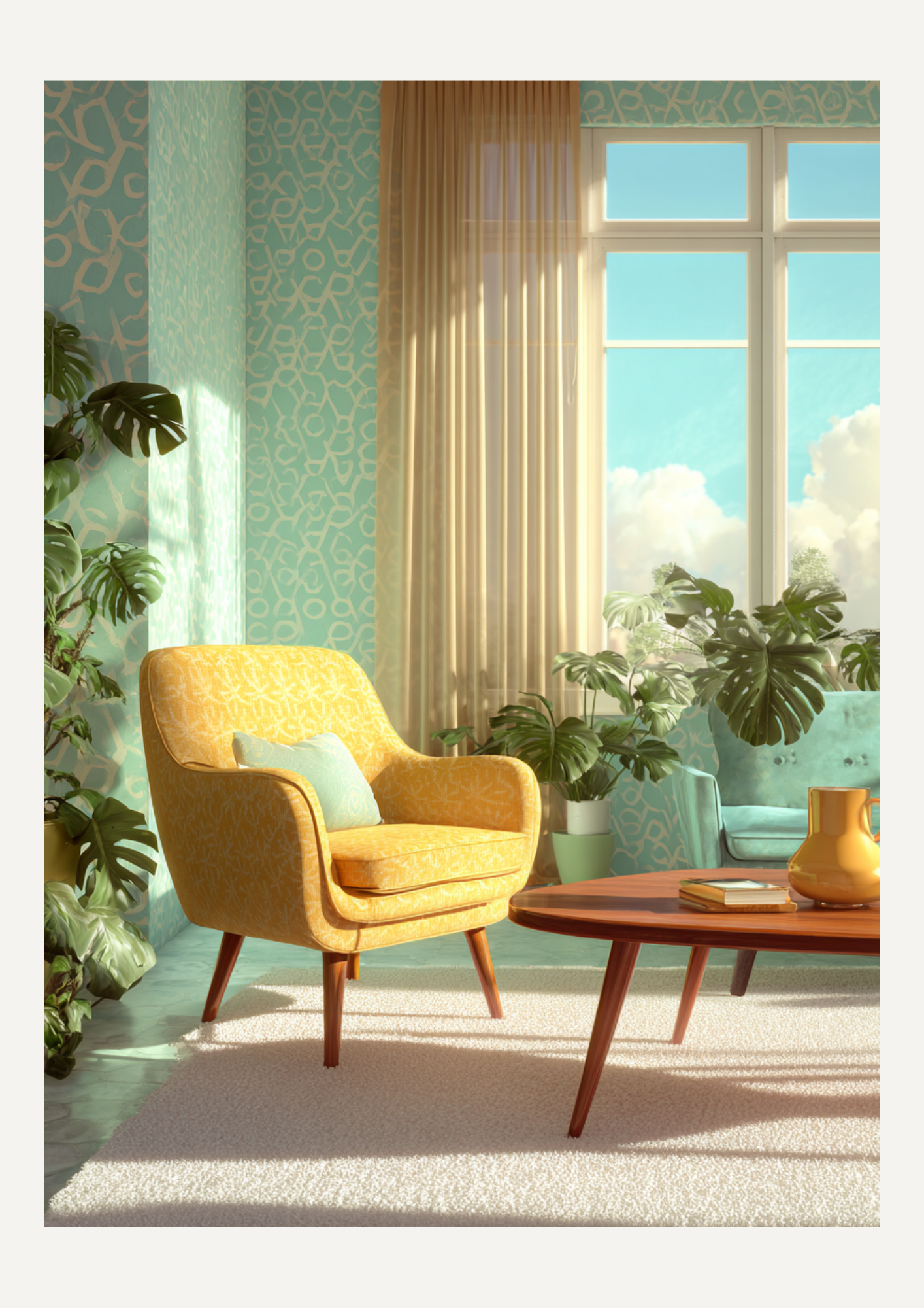
In the 1950s, furniture became "slender." Designers like Charles and Ray Eames or Cees Braakman began using materials like bent plywood, plastic, and steel. The heavy skirts of sofas disappeared, replaced by tapered "peg" legs that lifted furniture off the floor. This created a sense of space and flow that made even small post-war homes feel expansive.
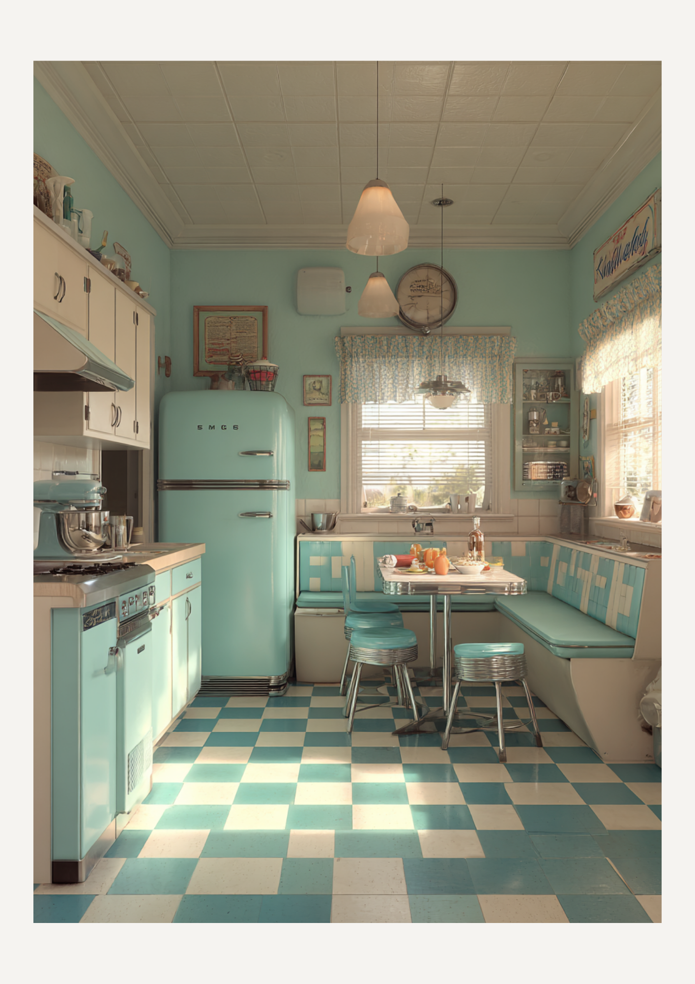
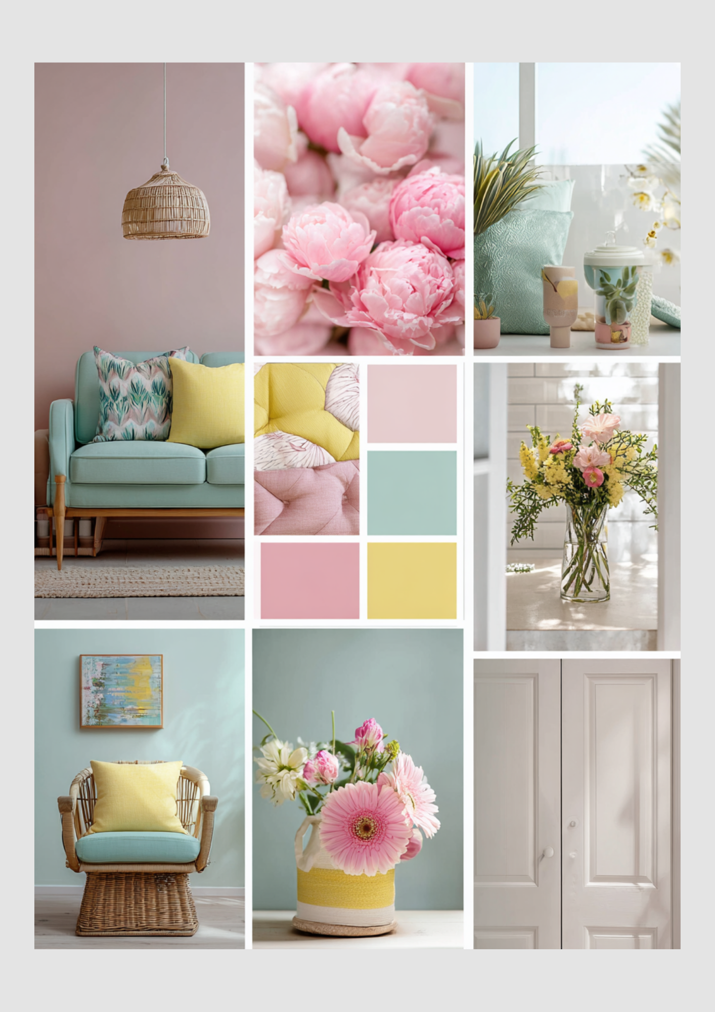
2. The Palette: Pastels and Pops of Primary
The 1950s color story is a tale of two halves. On one side, you had the "Candy Coat" kitchen: mint greens, pale pinks, and baby blues that made the heart of the home feel fresh and clean. On the other side, living areas often featured bold, sophisticated accents of mustard yellow, burnt orange, and charcoal gray. It was a time of experimentation—fearless and fun.
3. Bringing the Outdoors In
This decade saw the rise of the "picture window." As suburban homes sprouted up, people wanted to feel connected to their gardens. This led to the popularity of:
Indoor greenery: Large-leafed plants like the Monstera (which is still a superstar today).
Natural textures: The use of warm teak, oak, and walnut wood.
Organic shapes: The iconic kidney-shaped coffee table is the perfect example of design mimicking nature.
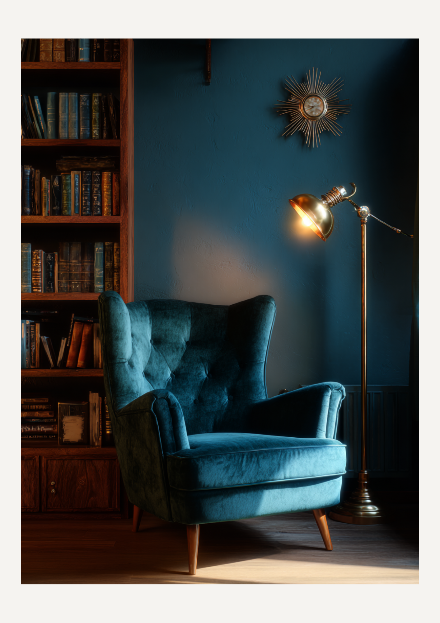
4. The "Atomic" Influence
The 1950s were obsessed with the future and the space race. You can see this in the "Atomic" patterns found on wallpaper and textiles—think starbursts, boomerangs, and abstract geometric shapes. These patterns added a sense of dynamic energy to every room.
How to Get the Look Today
You don't need to turn your home into a museum set to enjoy this style. The beauty of Mid-Century Modern is how well it plays with others.
Start small: A sunburst clock or a pair of tapered-leg nightstands can transform a room.
Mix textures: Pair a velvet sofa with a sleek wooden coffee table.
Keep it airy: The 1950s philosophy was about "breathing room." Avoid clutter and let your furniture's silhouette do the talking.
The 1950s weren't just about nostalgia; they were about looking forward with hope and creativity. Perhaps that’s why we still feel so at home in them today.

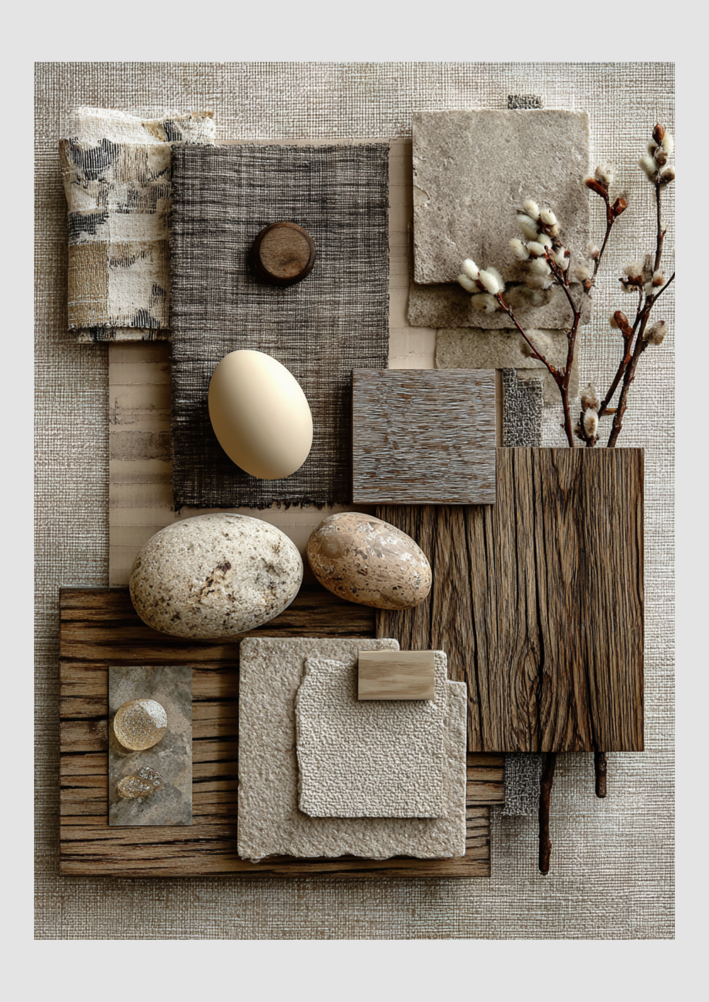
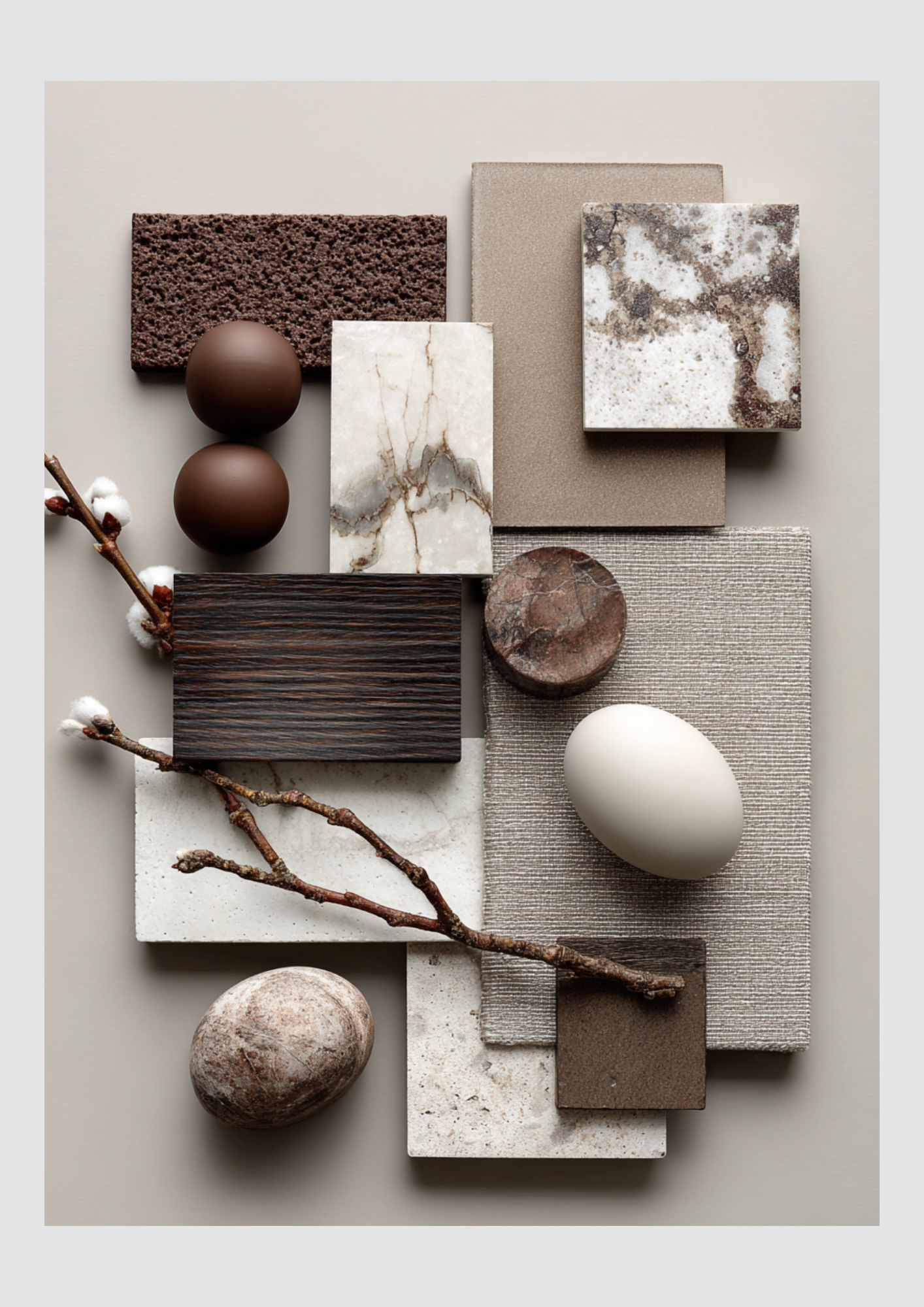
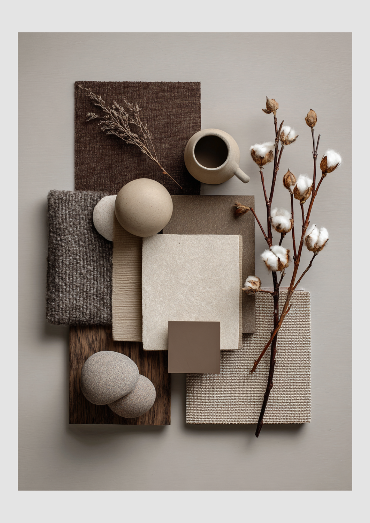
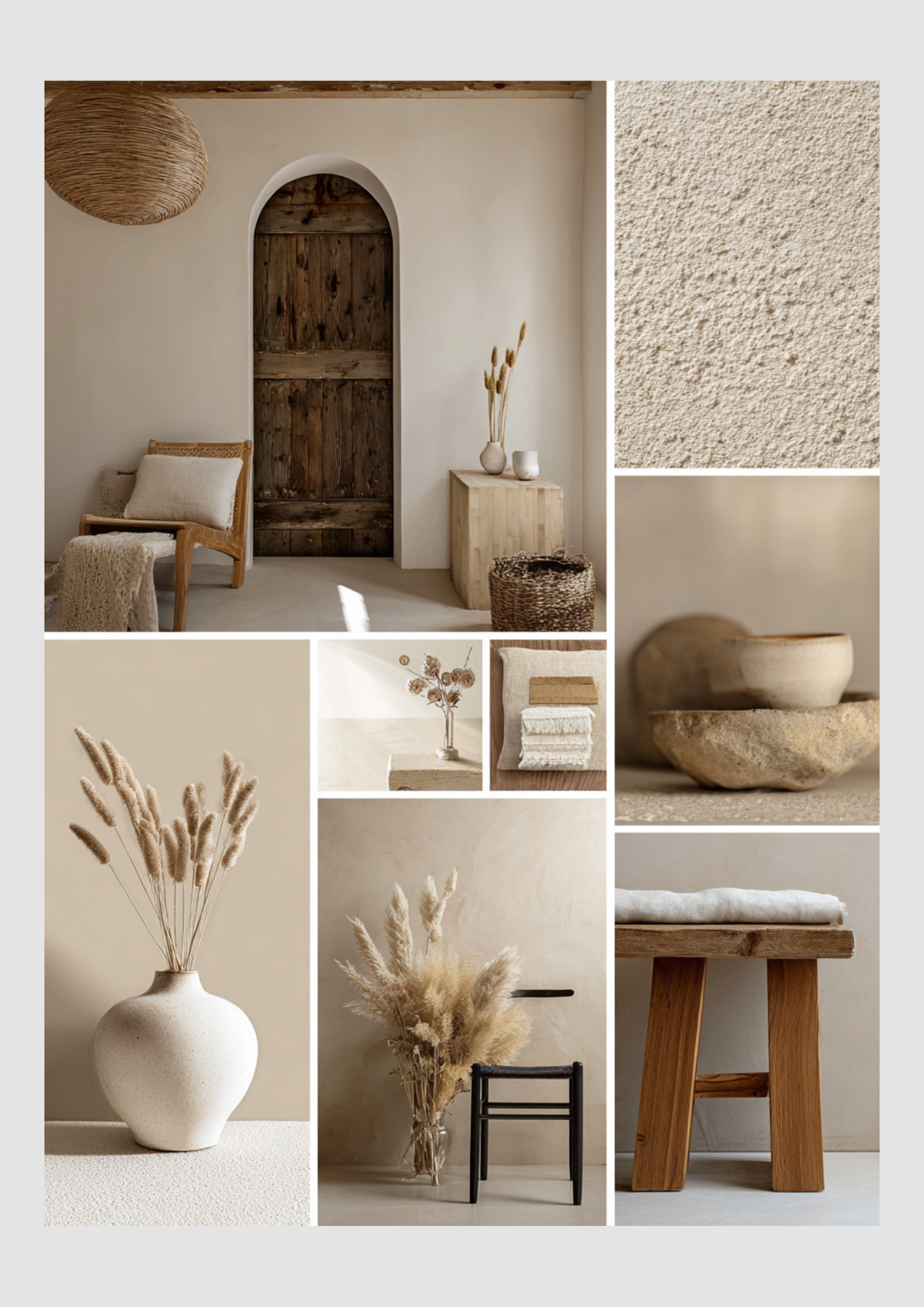
Serene Sanctuary: A Mood Board Guide to Japandi Design
Japandi is the perfect marriage of two design philosophies: the functional warmth of Scandinavian hygge and the minimalist tranquility of Japanese wabi-sabi. The result is a style that is clean, calming, and deeply rooted in natural materials, muted colors, and intentional craftsmanship.
This guide demonstrates how to apply this serene, minimalist-yet-warm aesthetic to your kitchen, bedroom, living room, and bathroom.
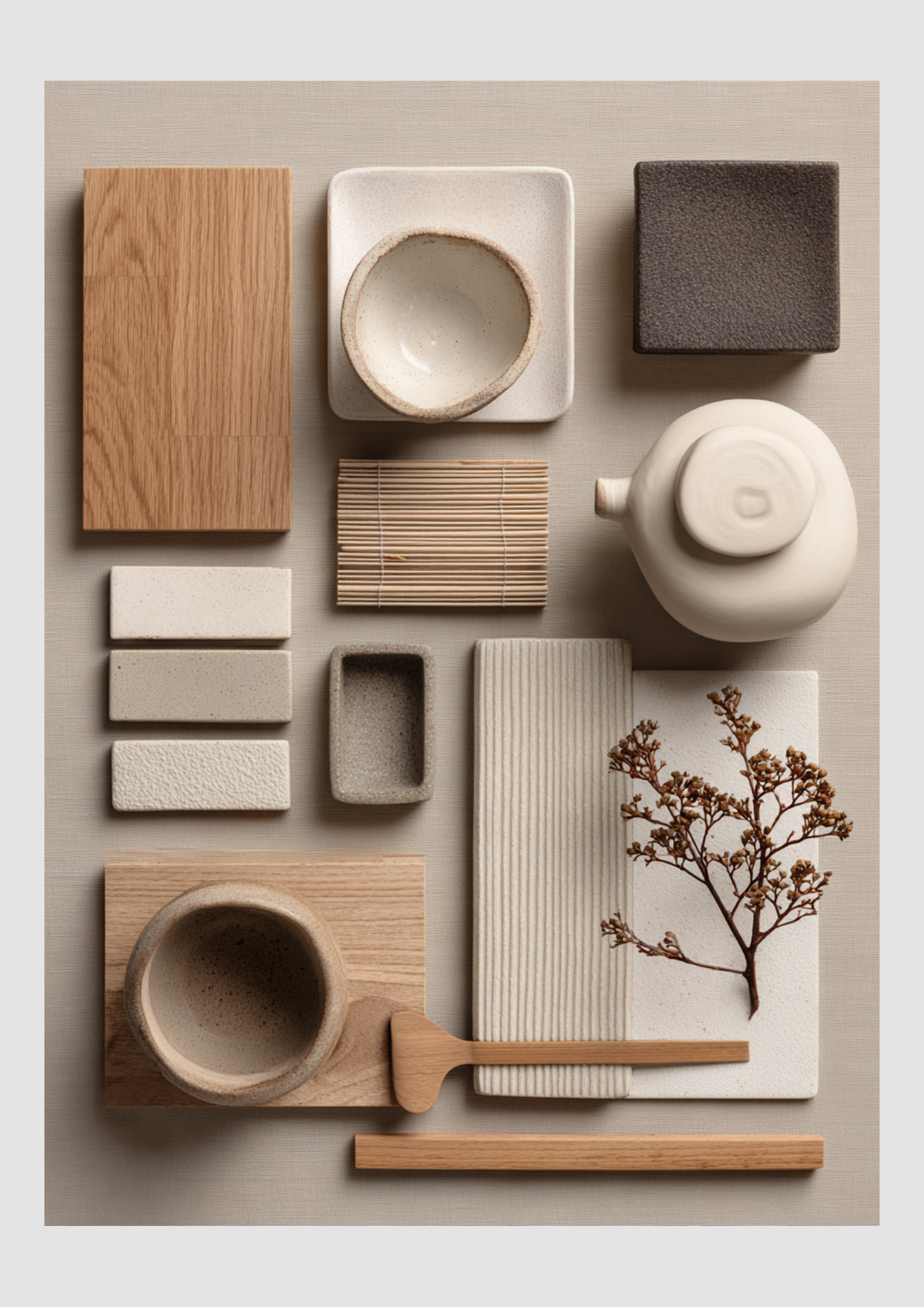
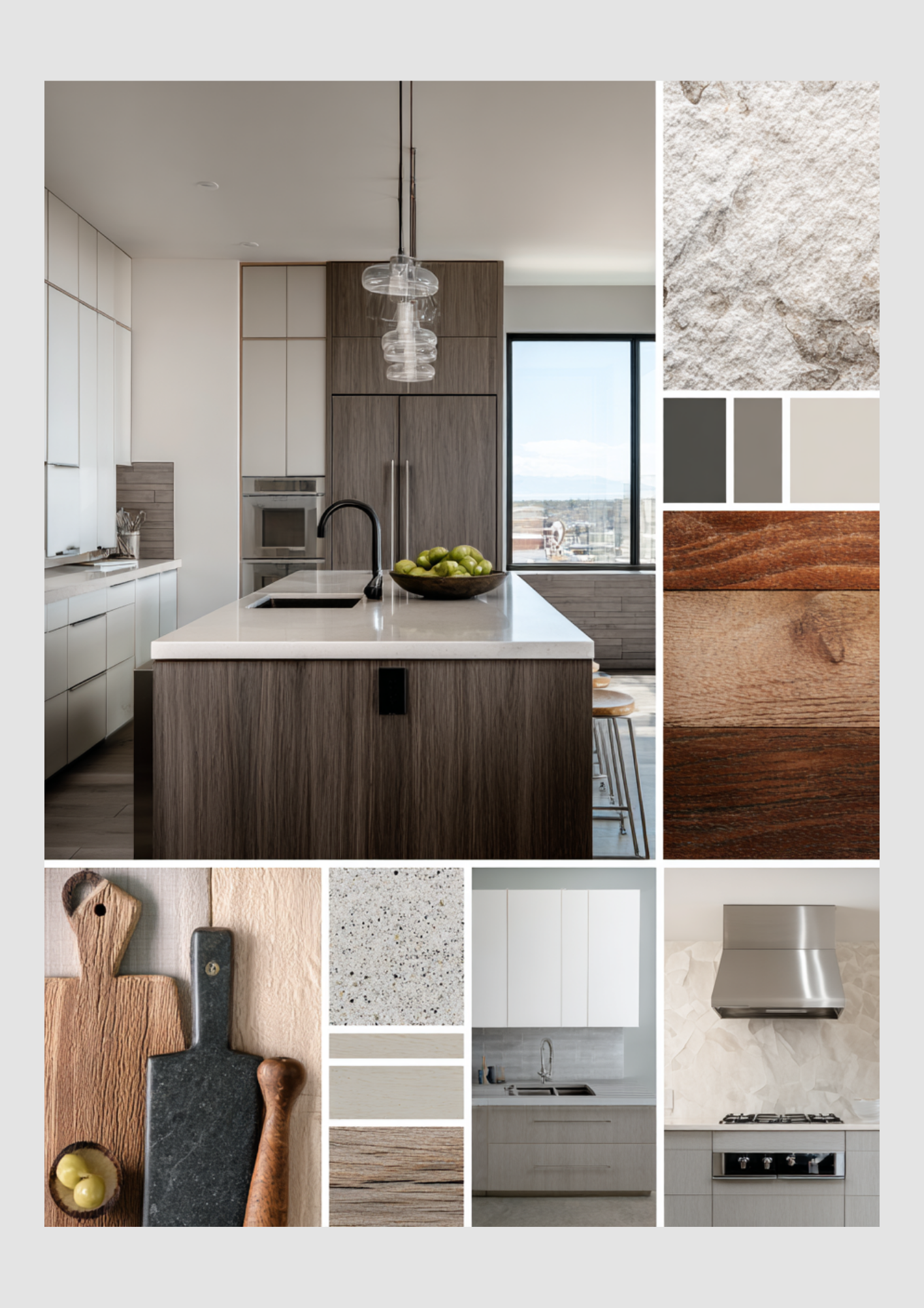
Intentional Living: Japandi Kitchen Inspiration
The Japandi kitchen prioritizes simplicity, raw texture, and the celebration of everyday objects.
Key Elements:
Light Woods: The primary material is light oak or blonde wood, used for cabinet fronts, cutting boards, and accessories. The wood should feel raw, not highly polished.
Wabi-Sabi Pottery: Display handcrafted, slightly imperfect ceramic and clay bowls and teapots in soft, matte finishes (off-white, cream, pale grey). The imperfections add character.
Muted, Earthy Tones: The color palette is strictly neutral: off-white, bone, sand, and taupe, with a possible accent of dark charcoal or black for contrast.
Minimalist Texture: Introduce texture through woven elements (like a bamboo mat), ridged or ribbed surfaces (for backsplashes or cabinet panels), and coarse, matte stone.
Clutter-Free Surfaces: The key to this look is extreme minimalism. Keep countertops clear, allowing the materials themselves to be the art.

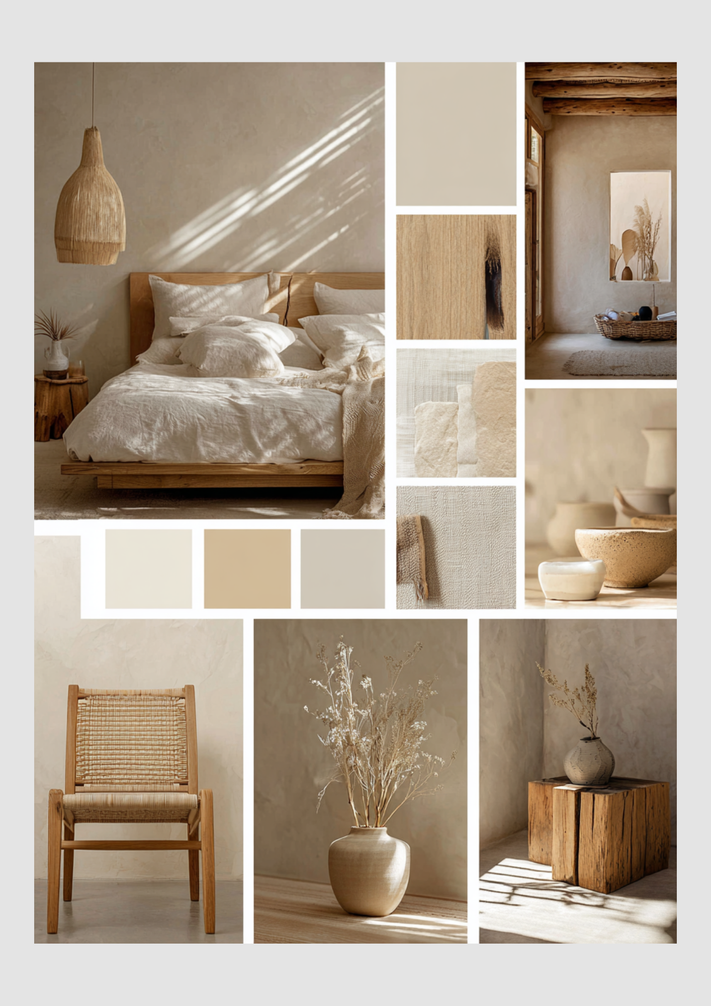
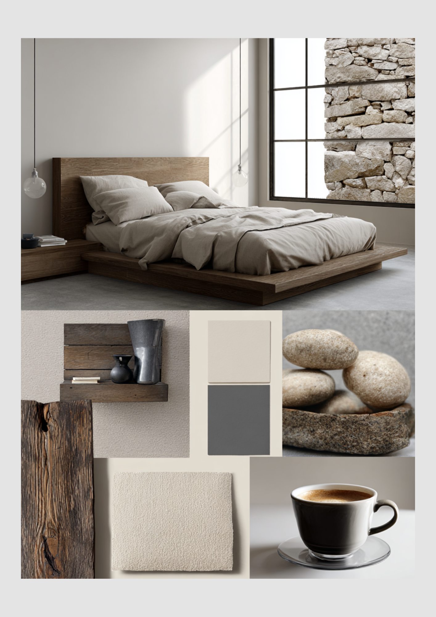
Earthy & Restorative: Japandi Bedroom Retreat
The bedroom is designed as a calm, restorative space, emphasizing low-profile forms and natural, tactile comfort.
Key Elements:
Low-Profile Furniture: The bed should be a simple, low-lying wooden platform frame. This mimics traditional Japanese design, fostering a closer connection to the ground.
Layers of Linen: Bedding is done in cream, beige, or off-white linen with subtle, natural wrinkling. Layering throws and pillows in similar, muted tones adds Scandinavian softness.
Textured Walls: Walls are finished in a matte, textured plaster or paint—no stark white. The gentle shadows and natural imperfections enhance the wabi-sabi feel.
Woven Accents: Lighting fixtures, like a large, low-hanging pendant made of woven rattan or wicker, introduce an organic, gentle texture and cast beautiful shadows.
Natural Decor: Decor is minimal: simple, large ceramic vases and small, rustic wooden stump side tables.
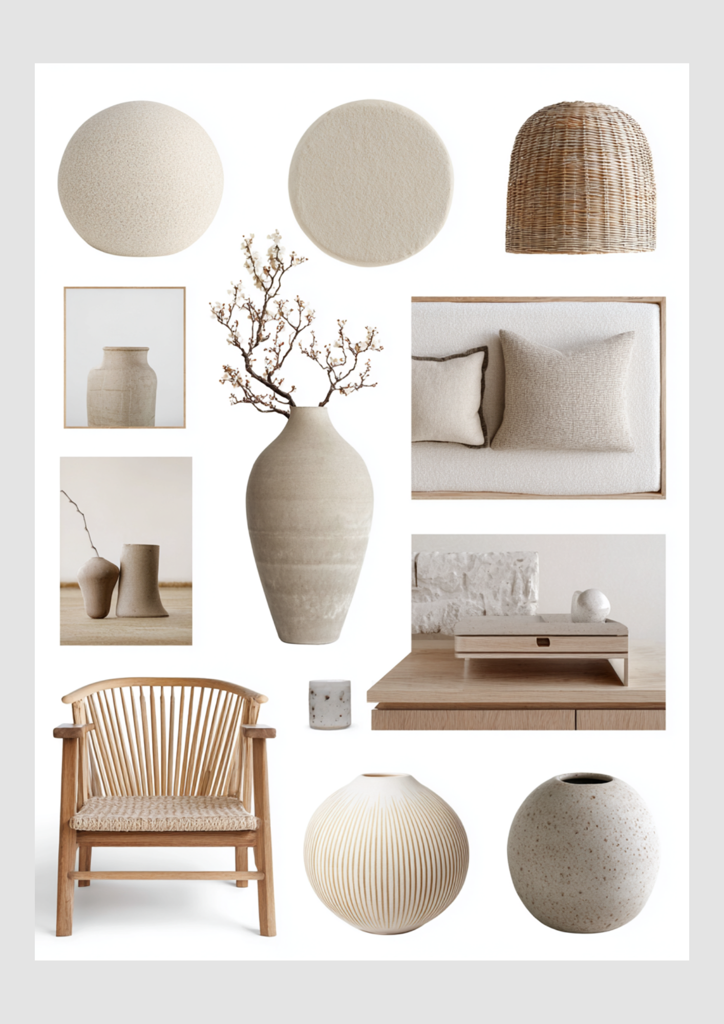
Balanced Harmony: Japandi Living Room Style
The Japandi living room is an airy, light-filled space where every object is functional, beautiful, and in balance.
Key Elements:
Simple, Sculptural Seating: Choose wooden armchairs with clean lines and natural woven seats (like rattan or paper cord). Upholstered pieces are low-slung and covered in neutral, textured fabrics.
Curated Ceramics: Use handcrafted vases and pottery in oversized, sculptural shapes. These become the artistic focal point against the neutral backdrop.
Natural Light: Maximize natural light. Window coverings should be sheer or non-existent to keep the room bright and airy.
Subtle Floral Elements: A simple branch of delicate, dried flowers or cherry blossoms in a large, unglazed vase provides a touch of natural elegance without fuss.
Soft Textures: Use wool or cotton rugs in cream or beige, often with a simple fringe, to add warmth and define the space.
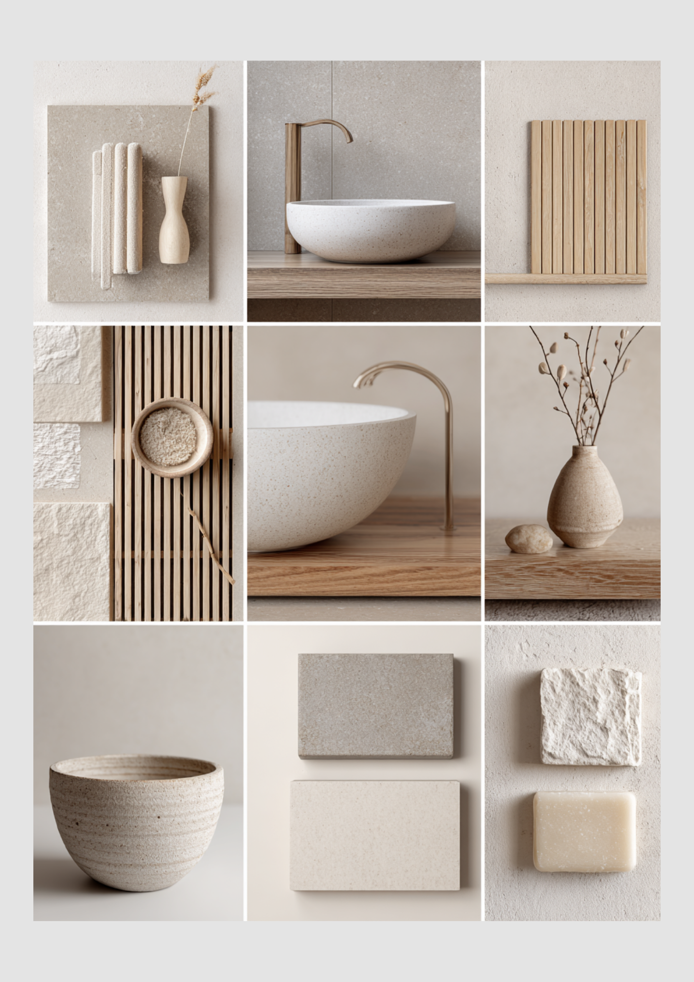
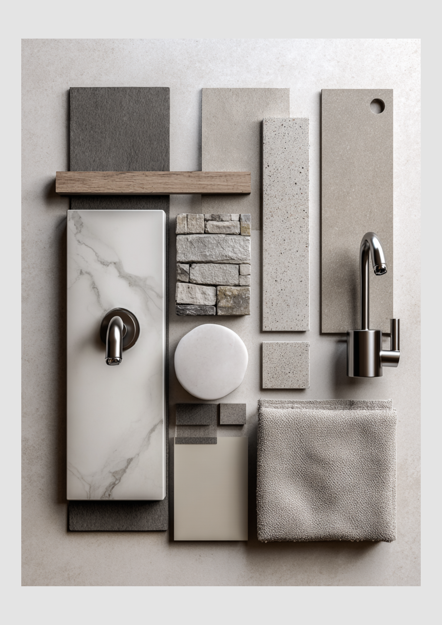
Calm & Clean: Japandi Bathroom Design
The bathroom is a spa-like area that celebrates natural stone, wood, and clean lines.
Key Elements:
Stone & Concrete Finishes: Use matte, light beige or grey stone for floors and walls. Look for finishes that have a raw, slightly rough texture.
Clean Wood Accents: Incorporate slatted or ribbed wood panels as wall accents or vanity fronts. The slats add visual rhythm and warmth.
Minimalist Basin: A simple, smooth, speckled, or matte white bowl sink rests directly on the wooden vanity top.
Aged Brass Fixtures: Faucets and hardware in a subtle, brushed brass or soft gold finish add a touch of quiet refinement without the formality of polished chrome.
Organic Accessories: Decorate sparingly with handmade soap bars, small wooden vases, and simple, dried grasses.
By focusing on light woods, raw textures, a neutral color palette, and a commitment to essentialism, you can create a beautiful and calming Japandi home that fosters a sense of peace and balance.
Modern Minimalism: A Mood Board Guide to Urban Tranquility
Embrace the serene sophistication of modern minimalist design. This aesthetic strips away the unnecessary to highlight texture, natural light, and high-quality materials. The core palette features neutrals like cream, beige, and charcoal grey, balanced with the warmth of natural wood and stone.
Use this guide to translate these mood boards into beautiful, cohesive spaces across your home.
Clean Lines and Contrast: Modern Kitchen Inspiration
The kitchen mood board exemplifies sleek functionality combined with rich, natural contrast.
Key Elements:
Handle-Free Cabinetry: Opt for smooth, handle-free cabinet fronts in a crisp white or light neutral. This contributes to the clean, seamless look that is the hallmark of modern design.
Warm Wood Island: Introduce warmth and a grounding element with a kitchen island faced in dark, rich, horizontal-grain wood veneer. This prevents the space from feeling too stark.
Monochromatic Hardware: Select a matte black faucet and sink to provide sharp contrast against the light countertop.
Textural Backsplash: Move beyond subway tile. Use stacked stone or a lightly textured tile in a neutral tone (taupe or pale grey) to add subtle depth without overpowering the minimalist lines.
Design Tip: Keep countertops clear and organized. A simple bowl of fresh fruit or a natural cutting board display becomes a focal point against the clean surfaces.
Architectural Calm: Modern Bathroom Design
The bathroom mood board is a masterclass in combining contrasting textures and shapes for a grounded, zen-like feel.

Key Elements:
Textured Walls and Floors: Use materials like terrazzo, concrete-look tiles, or a finely textured stone in soft greys and beiges for the main surfaces.
Layered Stone Accents: Incorporate a feature wall or accent area with stacked, dry-fit ledger stone to introduce a rustic, raw element against the polished surfaces.
Sleek Marble: Use a rectangular slab of white marble with soft grey veining as a backdrop for the shower fixtures. This elevates the space with a hint of luxury.
Dark Metal Fixtures: Choose a brushed or matte dark nickel/chrome finish for all faucets and hardware. The sleek, geometric shape of the fixtures reinforces the modern look.
Muted and Textured: Modern Living Room Style
The living room embraces soft forms and layered textures, creating an inviting space that retains its minimalist structure.
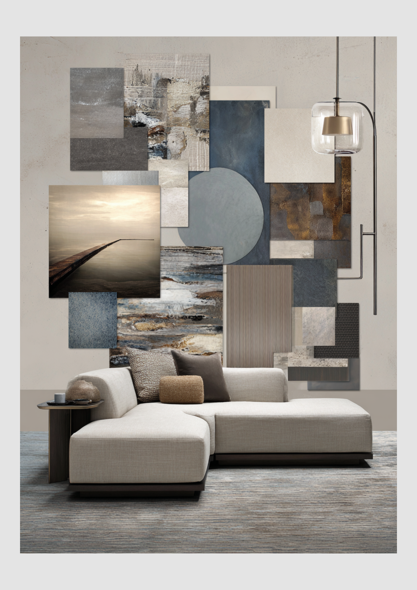
Key Elements:
Sculptural Furniture: Invest in a low-profile, sectional sofa with a minimalist, clean silhouette upholstered in a light, neutral fabric (cream or pale linen).
Layered Industrial Textures: The accent wall features a curated collage of mood pieces—abstract art, textured wallpaper, fluted wood, and dark stone. This shows how to bring a complex, moody depth into a neutral room.
Moody Accents: Utilize deep, muted tones like slate blue, charcoal grey, and rust for pillows and artwork.
Ambient Lighting: Select a unique, sculptural pendant light with dark metal and glass to act as a piece of functional art.
Natural Serenity: Modern Bedroom Retreat
The bedroom mood board focuses on creating a restful, calming atmosphere through low forms and organic materials.
Key Elements:
Low-Profile Bed Frame: A Japanese-inspired, platform bed frame in natural wood (like walnut or oak) grounds the room and emphasizes the clean, horizontal lines.
Soft, Monochromatic Bedding: Use bedding in soft, comforting materials like linen, in tones that match the surrounding walls (taupe, pale greige). The texture of the fabric provides visual interest.
Raw Stone Feature: A natural stone wall or accent piece introduces a timeless, organic texture, creating a beautiful contrast with the modern window frame.
Minimalist Lighting: Simple, clear glass pendant lights suspended from the ceiling keep the look uncluttered and airy, acting as a minimalist alternative to bedside lamps.
By prioritizing quality materials, functional forms, and a neutral, textural palette, you can successfully bring the sophisticated calm of Modern Minimalism into every corner of your home.
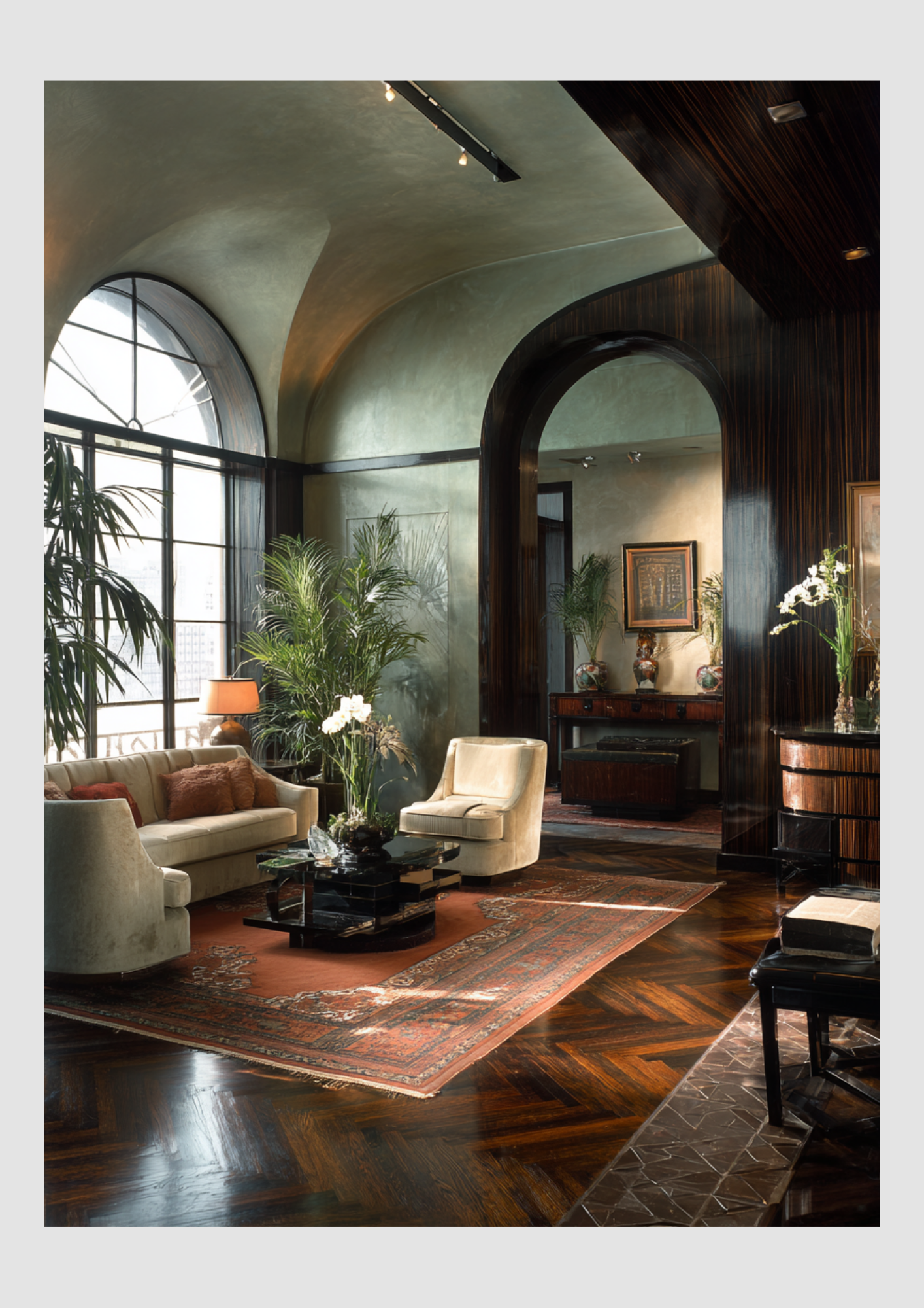
Design in Transition: The 30s & 40s
The transition from the 1930s to the 1940s represents one of the most dramatic shifts in interior design history. It moves from the high-glamour, industrial "machine age" of the 1930s to the resourceful, "make-do-and-mend" sentimentalism of the 1940s.
The transition from the 1930s to the 1940s represents one of the most dramatic shifts in interior design history. It moves from the high-glamour, industrial "machine age" of the 1930s to the resourceful, "make-do-and-mend" sentimentalism of the 1940s.
1930s: The Age of Streamline Moderne
While the 1920s were about "Art Deco" opulence, the 1930s introduced Streamline Moderne. This was a sleeker, more aerodynamic version of Deco inspired by the growing obsession with travel and speed (ocean liners, airplanes, and trains).
Key Shapes: Aerodynamic curves, horizontal "speed lines," and rounded corners.
Materials: Extensive use of chrome, glass block, mirrored surfaces, and early plastics like Bakelite.
Color Palette: Dominated by cool neutrals—cream, ivory, and taupe—punctuated by high-contrast "Hollywood" jewel tones like emerald green, sapphire blue, and ruby red.
Furniture: "Skyscraper" bookcases, tiered furniture, and the introduction of bent plywood (notably by Alvar Aalto).
The Vibe: Futuristic, cinematic, and polished. Think of a high-end 1930s hotel lobby or a "Hollywood Regency" dressing room.

1940s: Resourcefulness & The "Home Front"
World War II fundamentally changed home design. Luxury materials like metal and rubber were diverted to the war effort, leading to a shift toward traditionalism and utility.
The "Make Do and Mend" Era: Furniture was often second-hand or made from available woods like oak and walnut. To refresh old pieces, homeowners used floral slipcovers and heavy ruffles.
Patterns: This decade was the height of florals, chintz, and gingham. Patriotic color schemes (red, white, and blue) were also common.
Materials: Wood became the primary material again. Linoleum floors were popular in kitchens, and wall-to-wall carpeting became an affordable luxury for the living room.
Layout Changes: The 1940s introduced the open floor plan. Families began to favor informal "family rooms" and "eat-in kitchens" rather than formal dining rooms.
The Vibe: Sentimental, cozy, and patriotic. It was less about looking "modern" and more about creating a safe, comfortable sanctuary.
Key interior differences at a Glance
Primary Style
30s: Streamline Moderne / Art Deco
40s: Traditional / Early Mid-Century
Metals
30s: High-shine Chrome & Nickel
40s: Very little (saved for war)
Wall Decor
30s: Geometric wallpaper, mirrors
40s: Floral wallpaper, framed photos
Kitchens
30s: Laboratory-white, sterile
40s: Whimsical, colorful (Rooster motifs)
Focus
30s: Sophistication & Luxury
40s: Comfort & Practicality
Why this shift happened
The Great Depression (1930s) pushed designers to find cheaper ways to look "expensive" through mass-produced materials like chrome and glass. However, the start of WWII (1940s) created a longing for the "good old days," causing a massive return to traditional, floral, and wooden styles that eventually paved the way for the Mid-Century Modern movement of the 1950s.
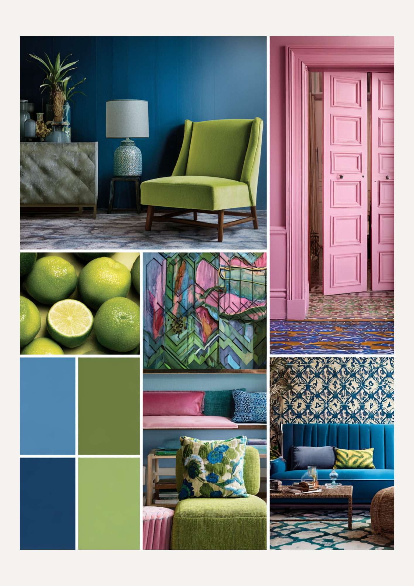
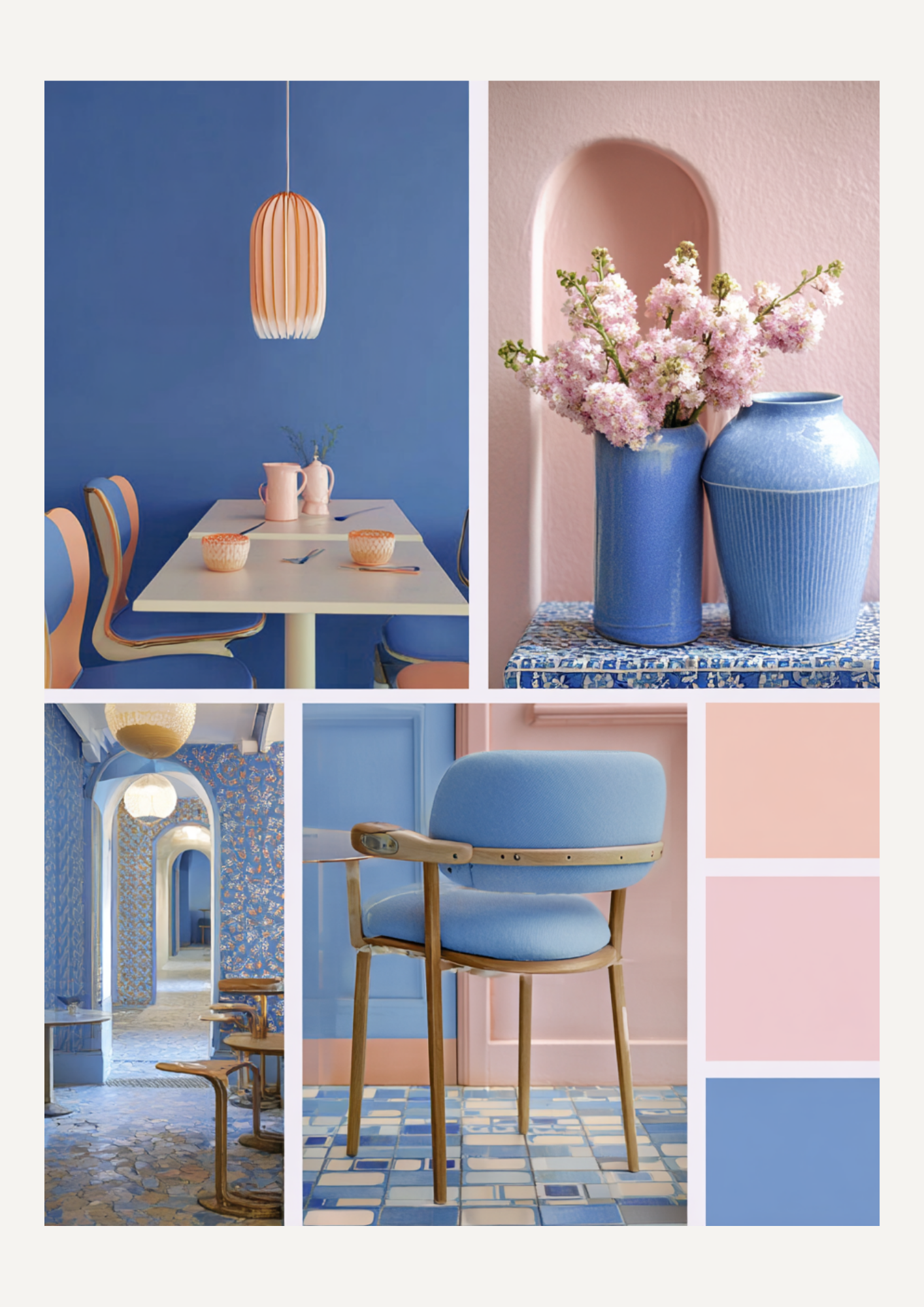
The New Neutral: Dopamine Decor Meets Retro Punch
Forget "sad beige" and quiet luxury. We are officially entering the era of Dopamine Decor—where the only rule is that your home should make you feel like a kid in a candy store.
If you’re looking to revitalize your space for 2026, we’ve found the ultimate "it-girl" palette. It’s a high-contrast blend of Retro Cobalt Blue, Earthy Matcha, and Sweet Pastel Pink. This trio balances high-octane energy with nostalgic comfort.
The Power Palette Breakdown
Why does this specific combo work? It’s all about the tension between "cool" and "warm," "vibrant" and "soft."
Color: Retro Cobalt Blue
The vibe: Electric, confident, and slightly 80s.
How to use it: Statement velvet sofas, lacquered side tables, or bold checkerboard rugs.
Color: Matcha Green
The vibe: Organic, grounding, and "New Mid-Century."
How to use it: Large-scale plants, corduroy pillows, or painted window frames.

Color: Pastel Pink
The vibe: Soft, playful, and light-reflective.
How to use it: Linen bedding, scalloped mirrors, or neon wall signs.
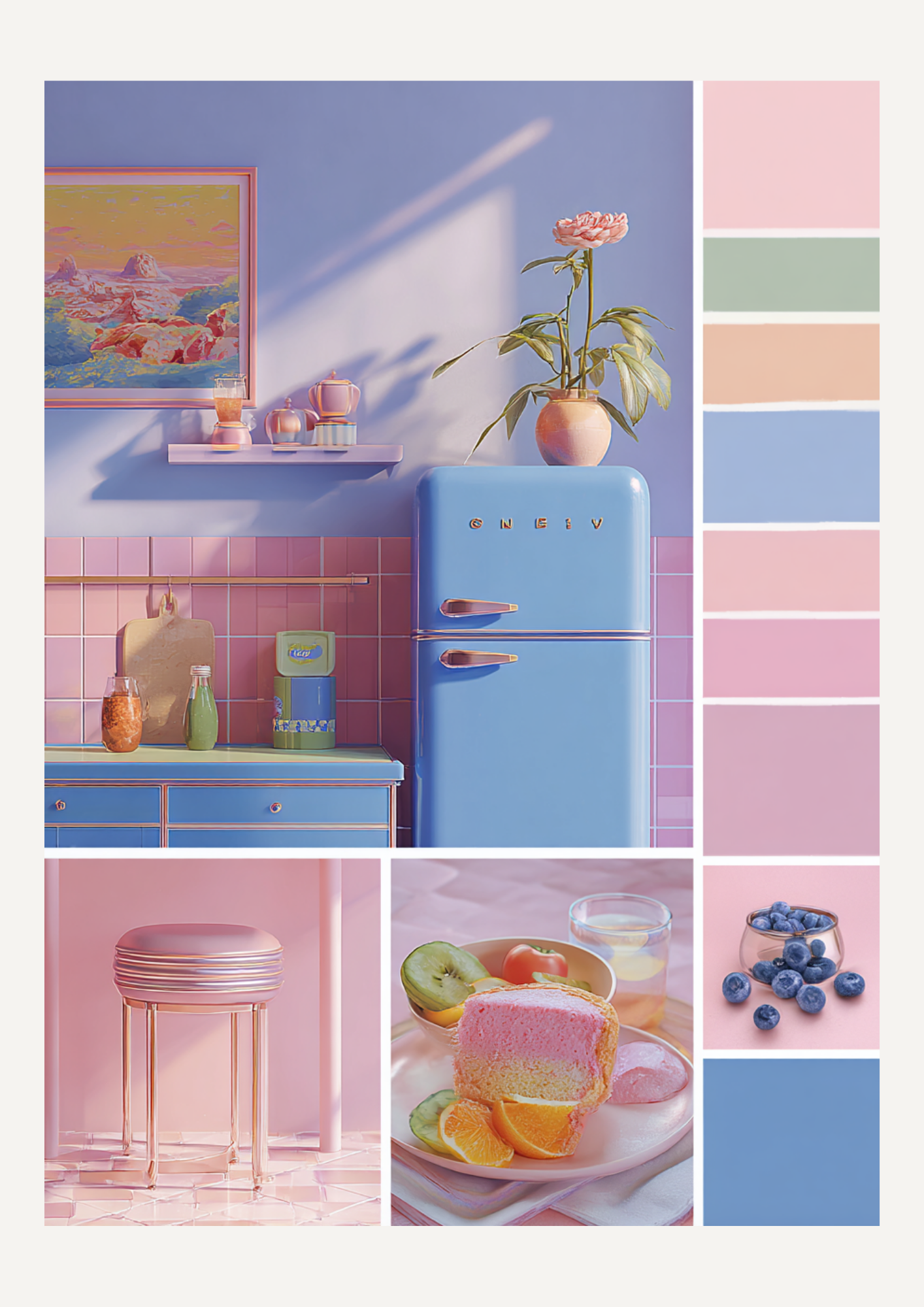
3 Ways to Style the "Matcha-Blue-Pink" Aesthetic
1. The Scandi-Retro Living Room
Start with a Matcha Green accent wall or a large modular sofa. Layer in Pastel Pink through abstract art and "wiggly" candles. Finally, ground the room with a Cobalt Blue coffee table book or a glass vase. The blue acts as an anchor, preventing the green and pink from looking too much like a nursery.
2. The Kitchen of Joy
Ditch the white tiles. Imagine Matcha cabinets paired with Cobalt Blue hardware. Add a Pastel Pink SMEG fridge or toaster to soften the look. This creates a space that feels curated, lived-in, and incredibly energized for your morning coffee.
3. The "Soft Girl" Bedroom with an Edge
Keep the base soft with Pastel Pink walls and Matcha linens. The "dopamine" hit comes from the lighting—try a Cobalt Blue mushroom lamp or a chunky blue knit throw. It’s cozy, but it has a personality.
Pro-Tip: Texture is Everything
Dopamine decor can feel flat if everything is matte. To make these colors pop:
Mix Chrome accents with the Cobalt Blue.
Pair Velvet textures with Matcha Green.
Use Glossy Ceramic for your Pastel Pink pieces.
"Your home should be a collection of things you love, not a catalogue of trends you think you should follow."

From Vision to Reality
A Tour of Our Favorite Pinterest Boards
We all know that feeling—you open Pinterest for "just a second" and suddenly two hours have passed, you’ve planned a three-course meal you’ve never cooked, and you’ve redesigned your entire living room.
Pinterest is more than just a digital scrapbook for us; it’s where our wildest ideas start to take shape. Today, we’re stepping out of the "scroll" and putting the spotlight on 5 boards that are currently fueling our creativity.
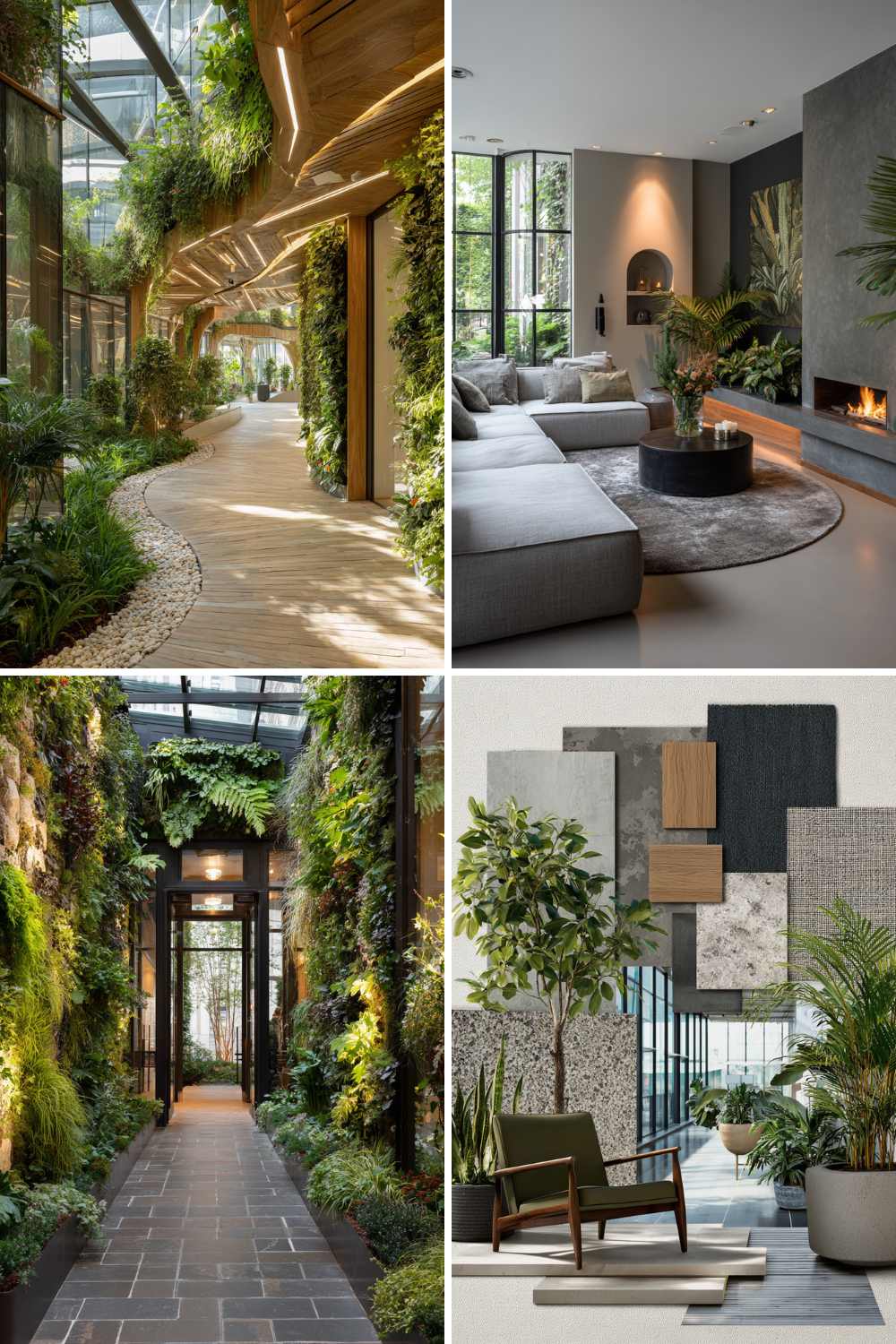
Biophilic design: Bring nature into your home
Looking for a breath of fresh air? Dive into our Biophilic Design board and discover how to transform your living space using organic materials, lush greenery, and natural light. It's more than just decor; it’s about creating a home that breathes with you.
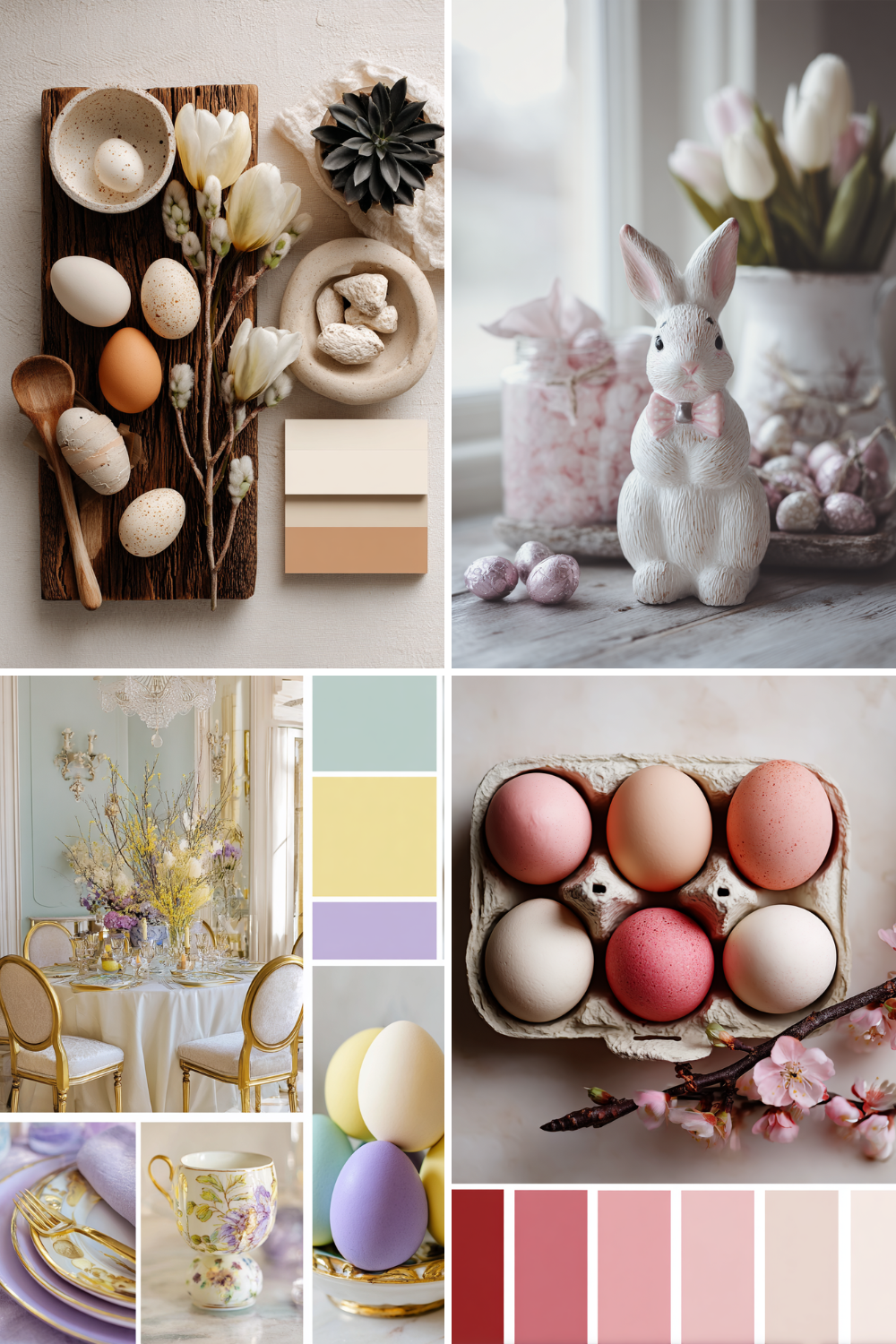
Forget the bright neon colors. This year, we’re curating a modern Easter. Think neutral tones, minimalist decor, and sophisticated tablescapes that bring a touch of class to your spring celebrations. Get inspired by our latest pins for an elevated, chic holiday.
Is your home ready for a change of pace? Discover how to bring the outdoors in with our curated Spring in your Interior board. From airy living room updates to vibrant floral arrangements, we’ve gathered everything you need to brighten your space and embrace the energy of the new season.
Think black interiors are cold? Think again. Our Modern noir living board explores how dark walls and moody furniture can create the ultimate warm, cozy sanctuary. Discover the perfect balance of light and shadow, featuring stunning black and grey tones that breathe luxury and comfort into any space.
Looking for the ultimate escape at home? Discover how monochrome palettes and crisp linen textures can transform your space into a calm, high-end sanctuary. Our The art of white living board features curated decor and sculptural furniture designed for a clean, intentional lifestyle. Elevate your home with the beauty of pure simplicity.
We are constantly pinning new finds every single day. If you want to see what’s inspiring us in real-time, come hang out with us over on Pinterest.
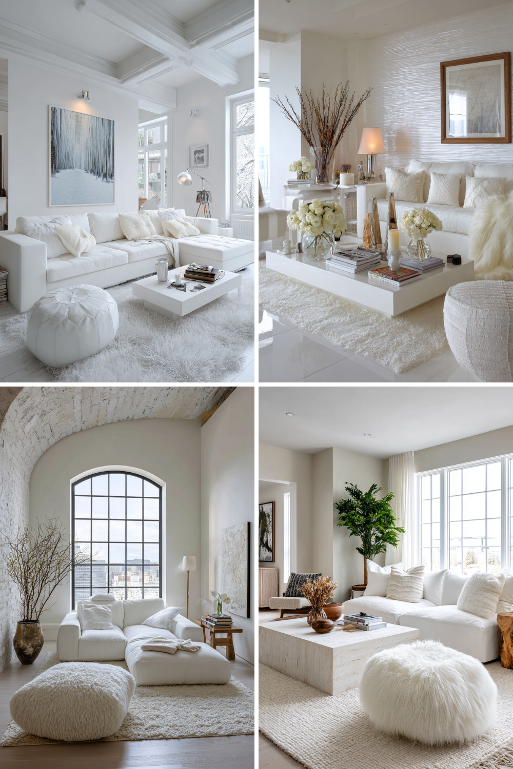
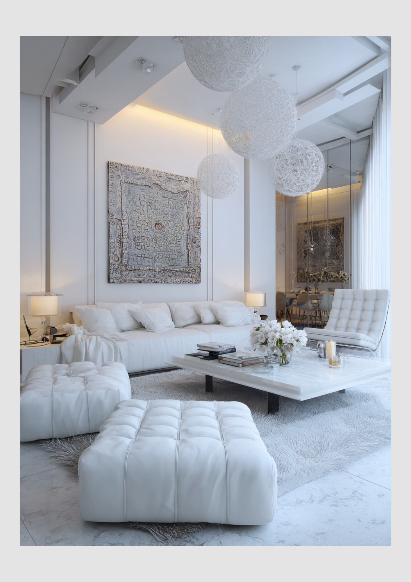
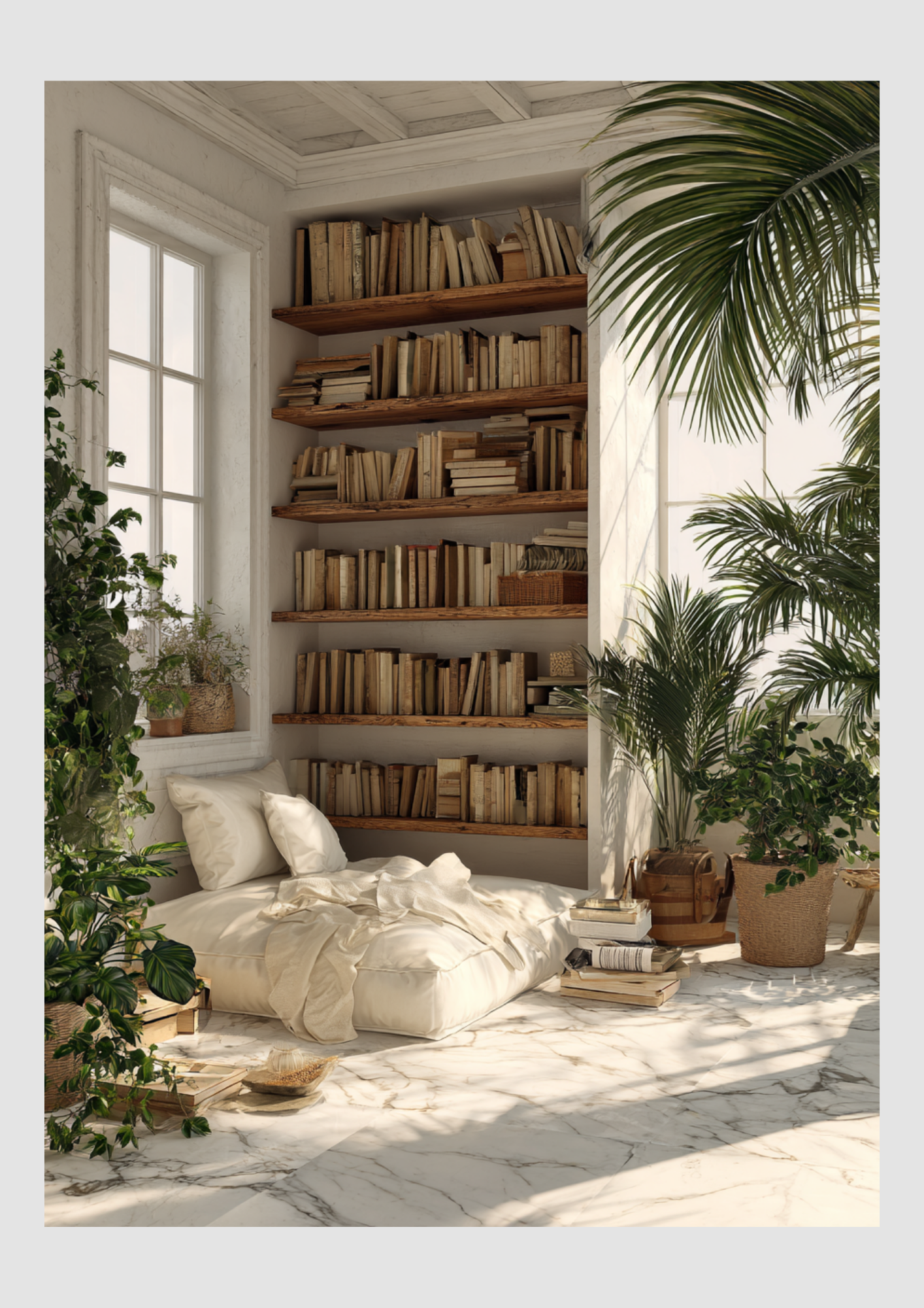
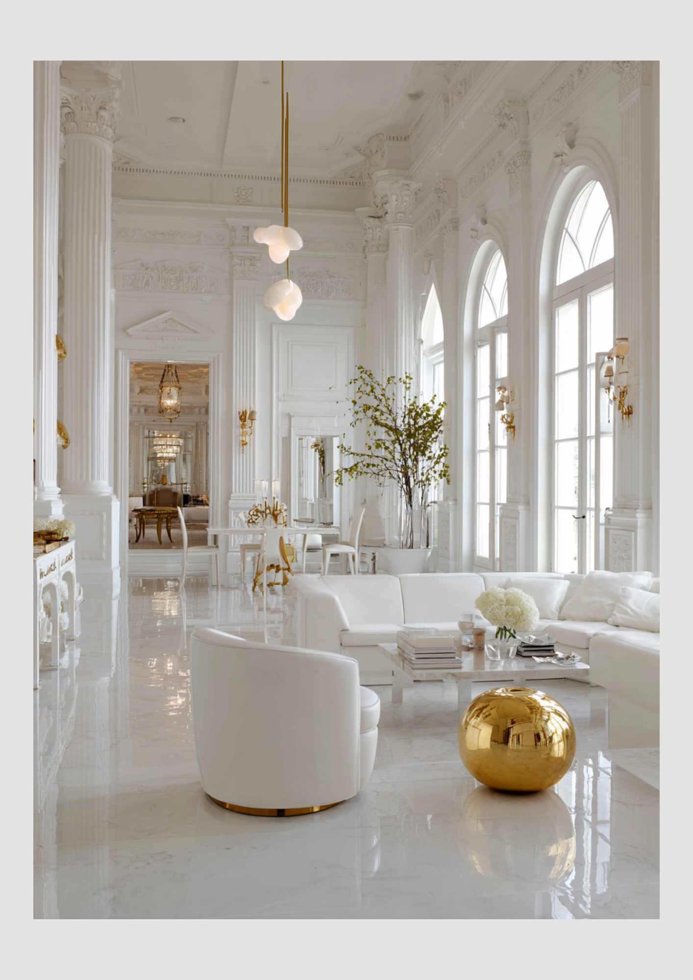
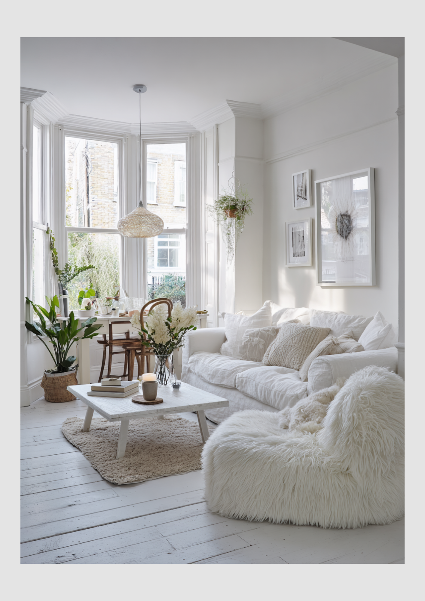
Beyond the Blank Canvas
When you think of a white interior, do you see a sterile gallery or a serene sanctuary? In the world of interior design, white is the most misunderstood "color" in the palette. It isn’t the absence of design; it is a deliberate choice that prioritizes light, space, and timeless elegance.
Whether you are renovating a canal house or styling a modern apartment, here is why white is your best friend and how to make it work for your home.
Why White Interiors are the Ultimate Design Power Move
When you think of a white interior, do you see a sterile gallery or a serene sanctuary? In the world of interior design, white is the most misunderstood "color" in the palette. It isn’t the absence of design; it is a deliberate choice that prioritizes light, space, and timeless elegance.
Whether you are renovating a canal house or styling a modern apartment, here is why white is your best friend and how to make it work for your home.

1. The Psychology: Why White Works
White has a profound impact on how we feel within our four walls. It represents clarity, freshness, and simplicity.
The Illusion of Space: White walls push boundaries away. By reflecting the maximum amount of light, white "tricks" the eye into seeing more square footage than there actually is.
A Mental Reset: In an era of sensory overload, white provides a "visual silence" that lowers stress levels and allows your mind to rest.
The Ageless Aesthetic: While "Millennial Pink" or "Forest Green" might trend for a season, white never goes out of style. It’s an investment in longevity.
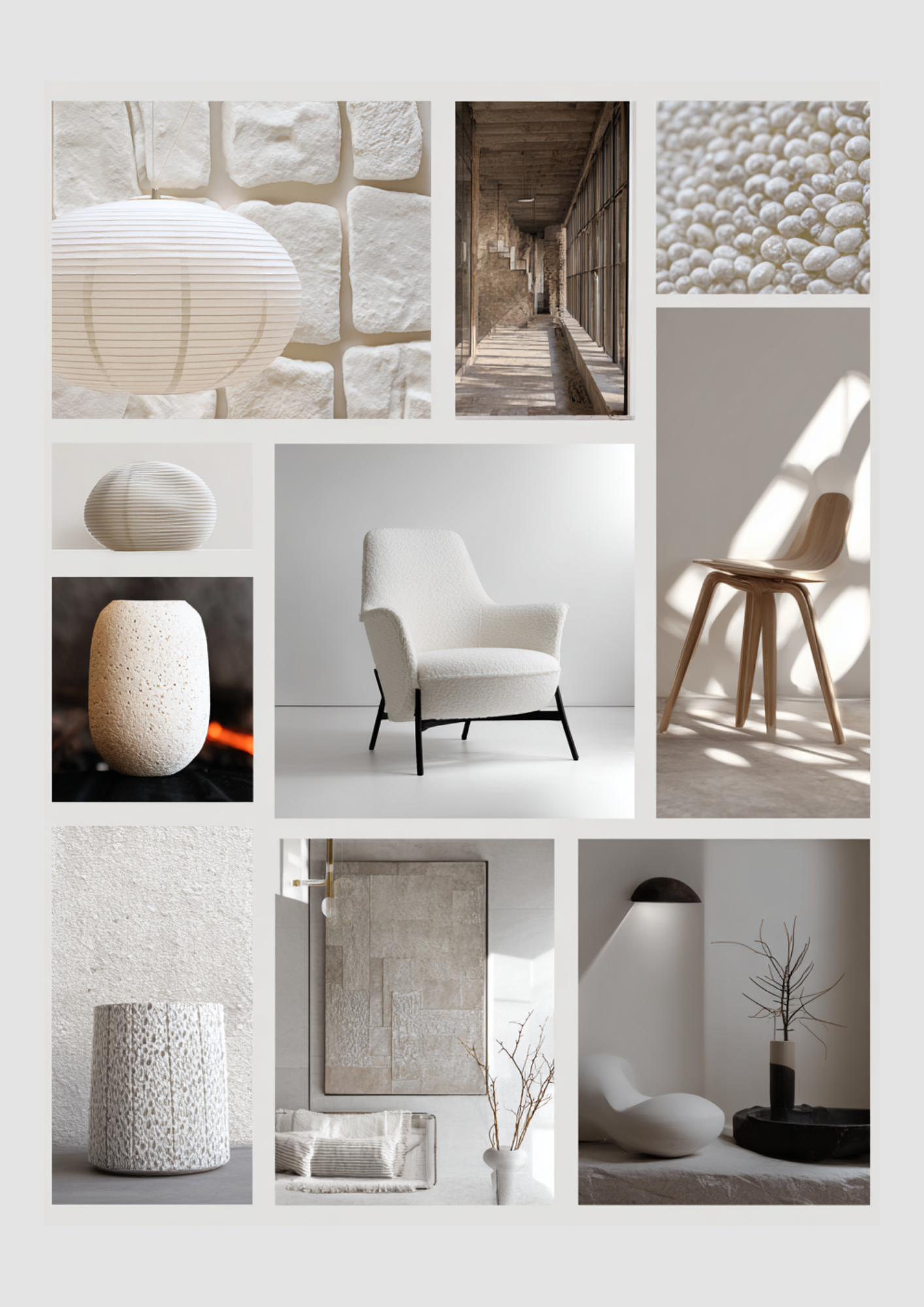
2. The Golden Rule: Texture is Non-Negotiable
The biggest mistake people make with white is keeping everything smooth. A flat white room feels like a hospital. To make it feel like a home, you must layer your textures.
Designer Tip: If the color palette is limited, the "feel" of the materials must be diverse. Think a chunky wool throw over a smooth linen sofa, paired with a reclaimed wood coffee table and a jute rug.
3. Sophisticated Color Pairings
White is the ultimate chameleon. Depending on what you pair it with, you can completely shift the energy of the room.
The Organic Modernist (White + Earth Tones)
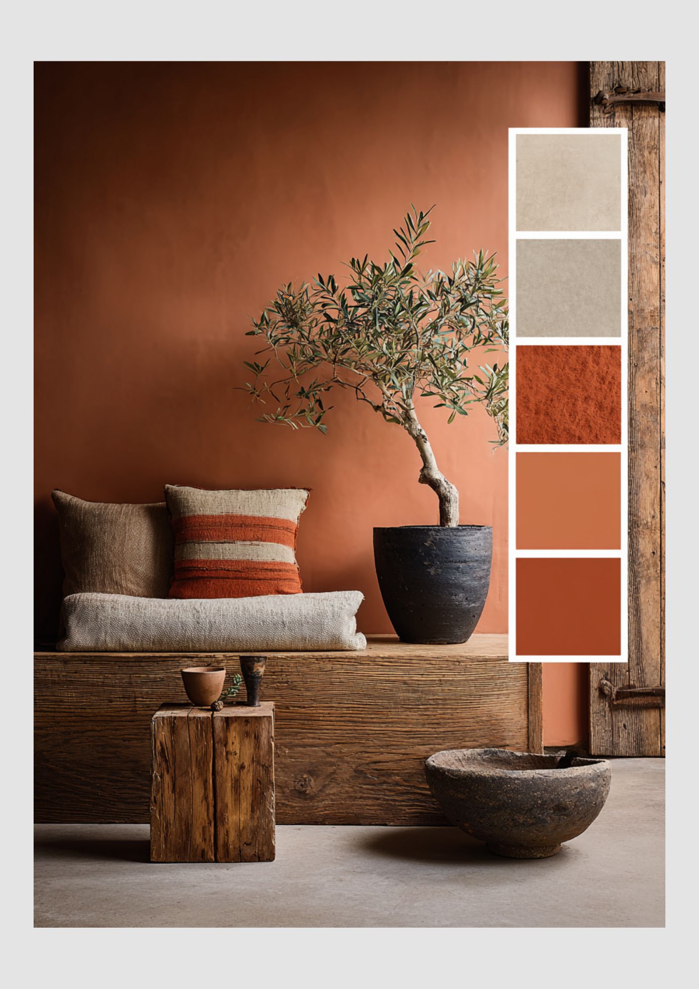
Combine crisp white walls with terracotta, sand, and olive green. This palette feels grounded and warm. It’s perfect for those who want a "boho-chic" or Mediterranean vibe.
The High-Contrast Minimalist (White + Black/Charcoal)
This is for the bold. Use white as your base and introduce matte black hardware, light fixtures, or window frames. It’s sharp, sophisticated, and incredibly architectural.
The Serene Scandi (White + Light Woods)
Pairing white with ash, oak, or pine creates that iconic Scandinavian warmth (Hygge). It’s soft, approachable, and works beautifully in kitchens and dining areas.
The Quiet Luxury (White + Champagne & Gold)
For a more "high-end" feel, mix different shades of white (cream, ivory, pearl) with brushed brass or gold accents. This creates a layered, monochromatic look that screams luxury without being loud.
4. Choosing the Right White
Before you head to the paint store, remember that there are thousands of "whites."
Cool Whites (Blue/Grey undertones): Best for modern spaces with lots of artificial light or south-facing rooms that get warm, yellow sunlight.
Warm Whites (Yellow/Red undertones): Best for north-facing rooms that can feel a bit "blue" or chilly. These add an instant glow.
Final Thought
A white interior isn't about hiding your personality; it's about giving your personality a stage to shine on. Your colorful books, your green plants, and your family photos will never look better than they do against a clean, white backdrop.
Bloomingloft Finishing touches
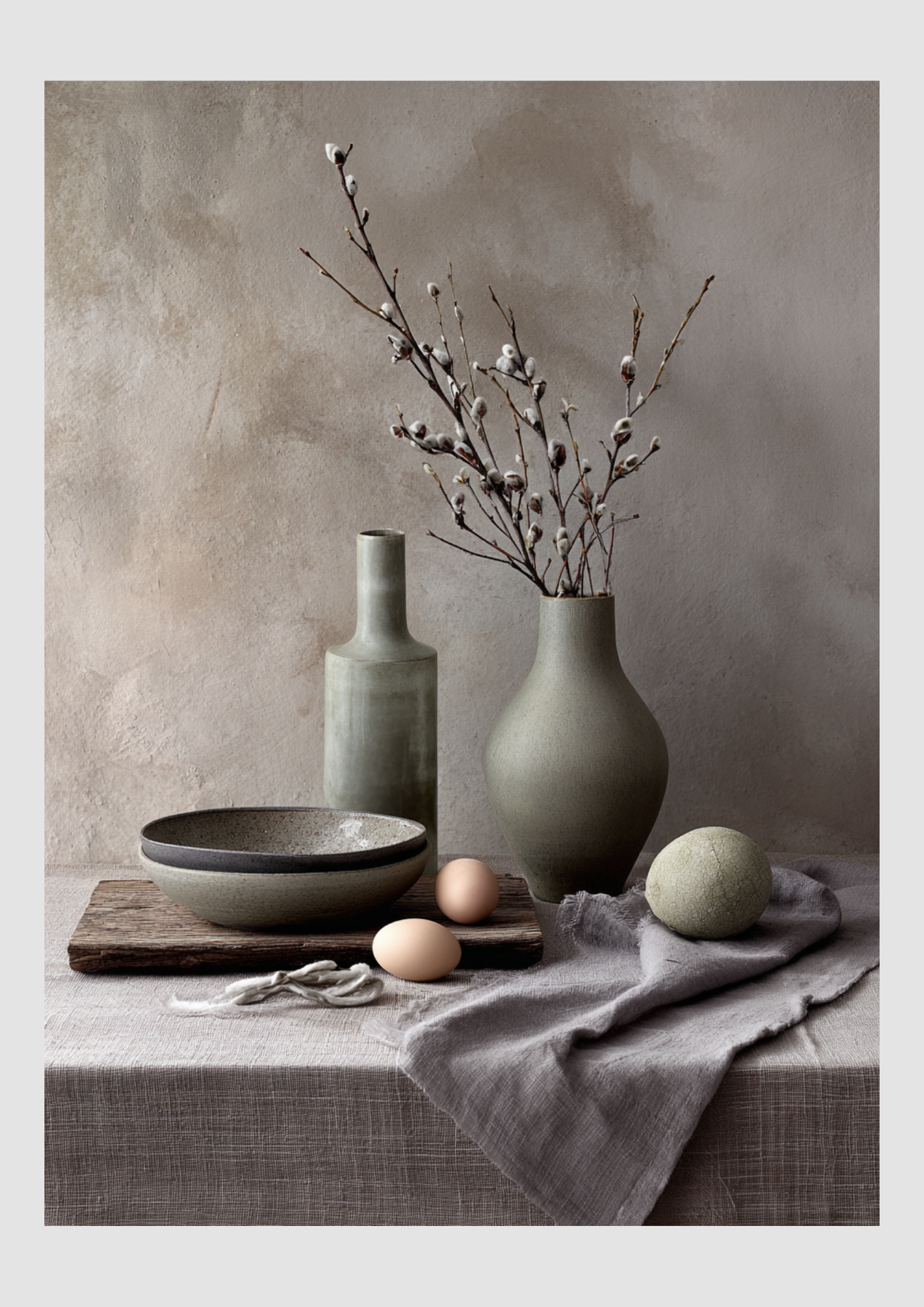
Ein Raum wird erst dann zu einem Zuhause, wenn er eine Seele hat. Viele denken beim Thema Interieur sofort an große Investitionen: das perfekte Sofa, ein massiver Esstisch oder das Designer-Regal. Doch wahre Stil-Experten wissen: Ein Zuhause dreht sich nicht nur um Möbel.
Die Magie der "Finishing Touches"
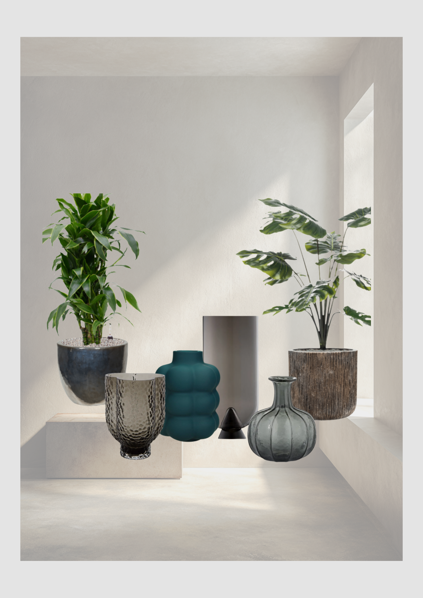
Es sind die Details, die den Unterschied zwischen einem Ausstellungsraum und einem lebendigen Loft machen. Bei Bloomingloft legen wir den Fokus auf die Elemente, die oft unterschätzt werden, aber die meiste Wirkung erzielen: Pflanzen und Vasen.
Dieser Beitrag enthält Affiliate-Links. Wenn Sie über diese Links etwas kaufen, erhalte ich eine kleine Provision (ohne zusätzliche Kosten für Sie)
Das Geheimnis des perfekten Ambientes
Ein Raum wird erst dann zu einem Zuhause, wenn er eine Seele hat. Viele denken beim Thema Interieur sofort an große Investitionen: das perfekte Sofa, ein massiver Esstisch oder das Designer-Regal. Doch wahre Stil-Experten wissen: Ein Zuhause dreht sich nicht nur um Möbel.
Die Magie der "Finishing Touches"
Es sind die Details, die den Unterschied zwischen einem Ausstellungsraum und einem lebendigen Loft machen. Bei Bloomingloft legen wir den Fokus auf die Elemente, die oft unterschätzt werden, aber die meiste Wirkung erzielen: Pflanzen und Vasen.

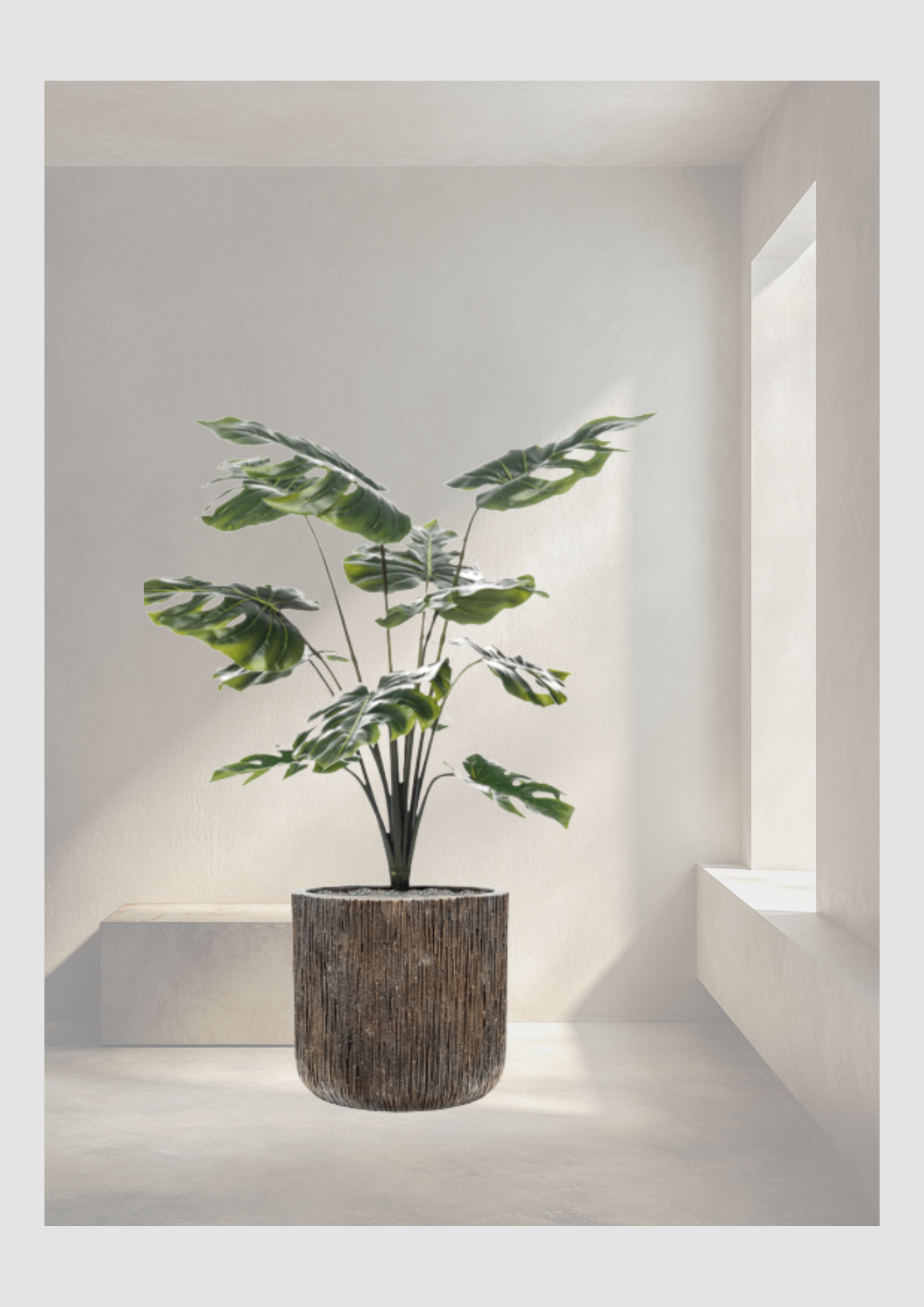
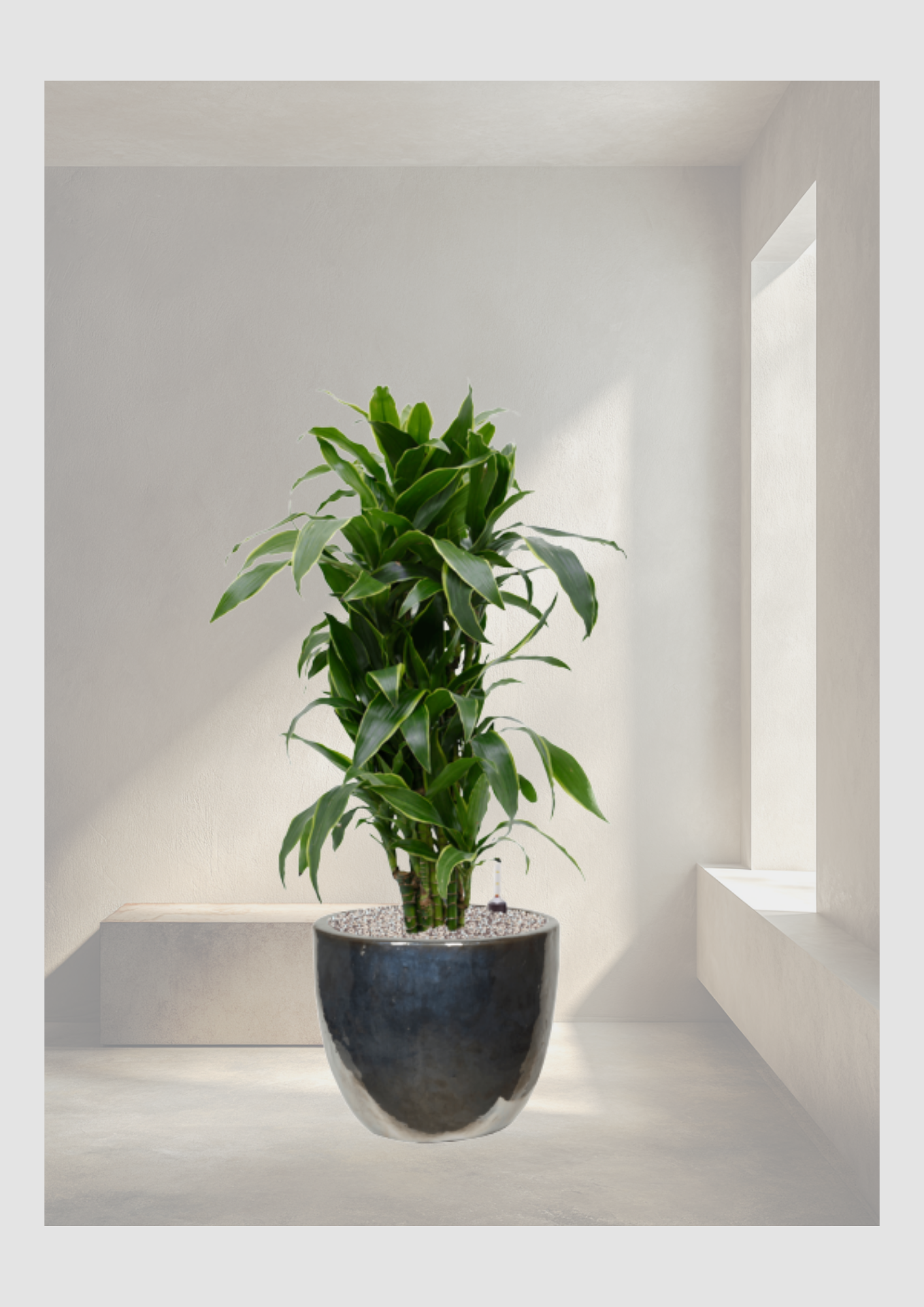
Grüne Lebendigkeit: Eine markante Pflanze, wie eine Monstera oder eine elegante Dracaena, bringt sofort Dynamik in minimalistische Ecken.
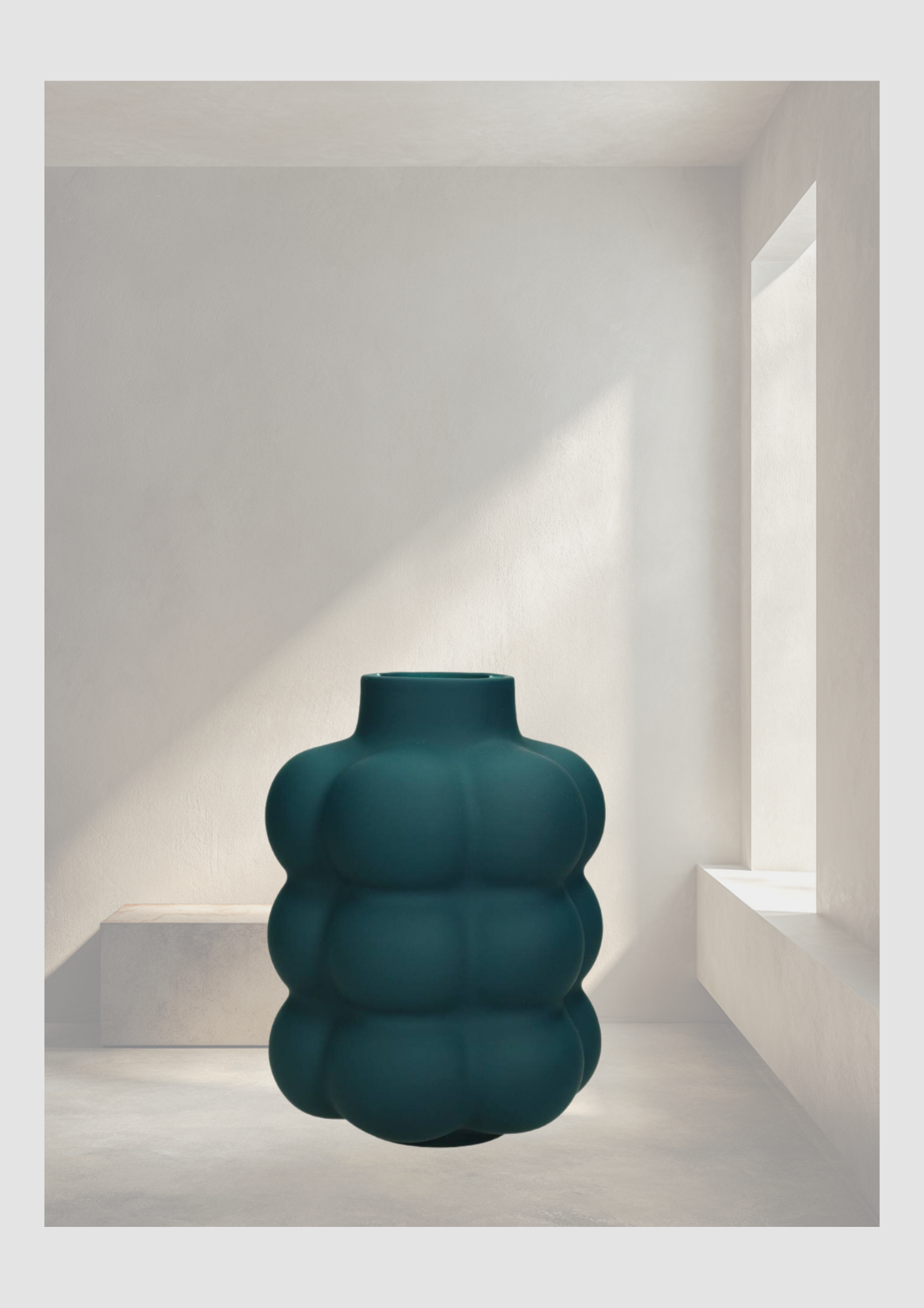
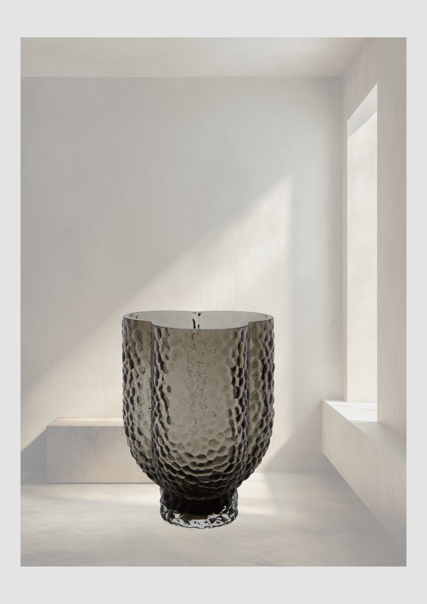
Charakterstarke Vasen: Ob strukturiertes Glas, mattes Petrol oder rauchiges Grau – eine Vase ist mehr als nur ein Gefäß. Sie ist ein Skulptur-Objekt, das auch ohne Inhalt wirkt.
Exklusive Farbakzente für das moderne Interieur
Unsere aktuelle Farbpalette beweist, dass gedeckte Töne keineswegs langweilig sind. Die Kombination aus Schiefergrau, warmem Taupe und tiefem Anthrazit bildet die perfekte Basis für ein modernes, zeitloses Design.
"Ein frisches Bouquet in einer handverlesenen Vase ist der wöchentliche Luxus, den sich jeder gönnen sollte."
Diese Farben lassen sich nahtlos in bestehende Konzepte integrieren und verleihen jedem Raum eine beruhigende, aber dennoch luxuriöse Ausstrahlung. Es ist das Zusammenspiel von rauen Texturen und organischer Natur, das den typischen Bloomingloft-Look ausmacht.
Hol dir den Look
Bist du bereit, deinem Wohnraum das gewisse Extra zu verleihen? Setze auf exklusive Akzente und finde die perfekte Balance zwischen Möbeln und Dekoration.
GLACIES: Wenn Natur auf Skulptur trifft
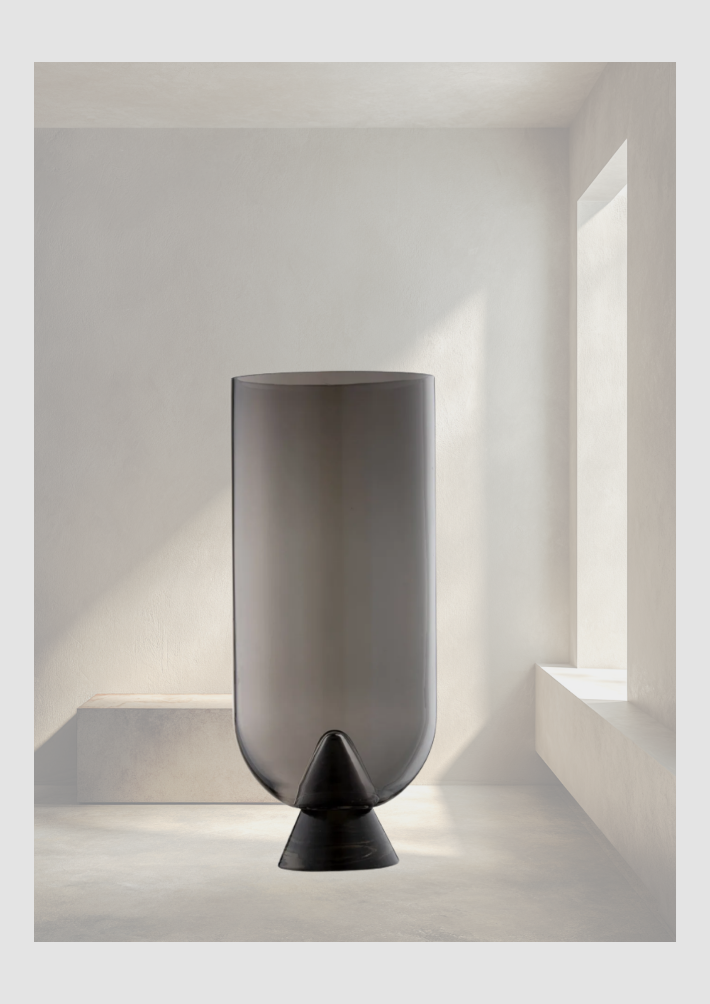
Stellen Sie sich die majestätische Silhouette eines Eisbergs vor, der ruhig aus der Meeresoberfläche emporragt – geheimnisvoll, kraftvoll und von zeitloser Schönheit. Genau diese Szenerie war die Inspiration für unsere neue GLACIES-Vasen-Kollektion.
Ein modernes Interieur definiert sich nicht nur über große Möbelstücke; es sind die Akzente, die dem Raum Charakter verleihen. Die einzigartige, kantige Form der GLACIES-Vase macht sie zu einem faszinierenden Design-Objekt in Ihrem Zuhause.
ARURA: Die Kunst der Unvollkommenheit
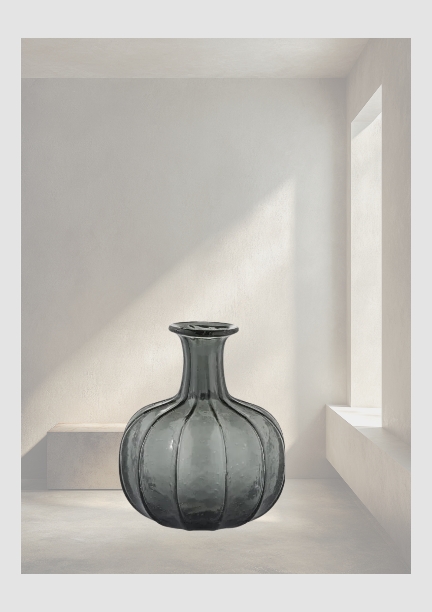
Wahre Exklusivität entsteht dort, wo Handwerkskunst auf exzentrisches Design trifft. Unsere ARURA-Vasen sind weit mehr als nur Dekorationsartikel – sie sind ein Statement für Individualität. Jedes Stück wird mundgeblasen, was jede Vase zu einem unvergleichlichen Unikat in Ihrem Zuhause macht.
Die sorgfältig zusammengestellte Kollektion von hochwertigen Kunstpflanzen ist pflegeleicht und bleibt das ganze Jahr über wunderschön grün. Und weil sie kein Licht brauchen, kommen sie in jedem Raum gut zurecht. Die Kunstpflanze wurde bis ins kleinste Detail ausgearbeitet und verfeinert. Dies stellt sicher, dass sie nicht von einer echten Pflanze unterschieden werden kann!
Aglaonema Freedman: Meisterhafte Floristik für Ihr Loft
Einzigartiges Wohndesign entsteht durch die Liebe zum Detail. Unsere Pflanzen-Arrangements sind weit mehr als bloße Dekoration – sie sind das Ergebnis echter Handwerkskunst. Jedes einzelne Arrangement wird von unseren erfahrenen Floristen individuell von Hand gefertigt, um höchste Exklusivität zu garantieren.
Petrol-Nuancen: Ein Statement in Keramik
Manchmal braucht ein Raum einen Farbtupfer, der Tiefe verleiht, ohne die Ruhe des Designs zu stören. Unsere Keramikvase in Petrol ist genau dieser Akzent. Sie bringt eine kühle Eleganz in Ihr Interieur und harmoniert perfekt mit Betonoptik, Anthrazit und sattem Pflanzengrün.
ARURA: Die Poesie des Glases
Echte Exzellenz zeigt sich im Detail. Unsere ARURA Design-Vasen sind eine Hommage an die traditionelle Glaskunst. Jedes Stück wird mit Hingabe mundgeblasen, wodurch keine Vase der anderen gleicht – ein exklusives Unikat, so individuell wie Ihr eigener Stil.

Wellness-look in Japanse stijl
In een wereld die nooit stilstaat, is ons huis de enige plek waar we echt kunnen opladen. Maar hoe tover je een gewone kamer om tot een persoonlijk heiligdom? Het antwoord vonden wij bij Kayori. Geïnspireerd door eeuwenoude Japanse wijsheden en de puurheid van de natuur, brengt dit merk een collectie die al je zintuigen prikkelt. Van de 10.000 jaar oude geheimen van de Yuzu-vrucht tot de zachte omhelzing van een handgeweven plaid: Kayori leert ons dat ware luxe zit in de kleine, bewuste momenten. Ga je mee op reis naar een huis vol balans en verfijning?
Dit bericht bevat affiliate links. Als u iets koopt via deze links, ontvang ik een kleine commissie (zonder extra kosten voor u).
In een wereld die nooit stilstaat, is ons huis de enige plek waar we echt kunnen opladen. Maar hoe tover je een gewone kamer om tot een persoonlijk heiligdom? Het antwoord vonden wij bij Kayori. Geïnspireerd door eeuwenoude Japanse wijsheden en de puurheid van de natuur, brengt dit merk een collectie die al je zintuigen prikkelt. Van de 10.000 jaar oude geheimen van de Yuzu-vrucht tot de zachte omhelzing van een handgeweven plaid: Kayori leert ons dat ware luxe zit in de kleine, bewuste momenten. Ga je mee op reis naar een huis vol balans en verfijning?
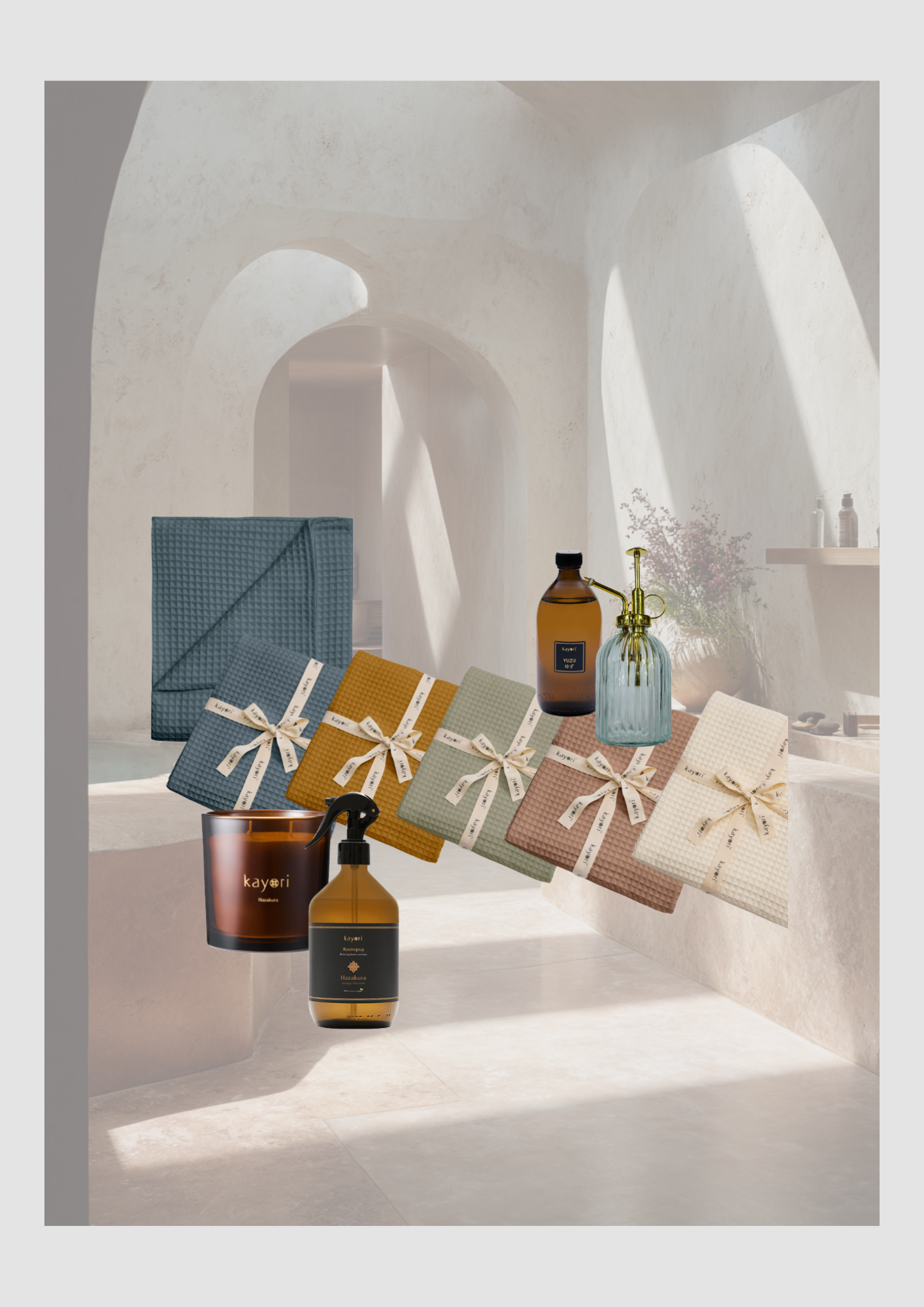
Shop de Kayori Wellness-Look
Heb je je laten inspireren door ons moodboard? Het creëren van een harmonieus interieur begint bij de juiste details. Of je nu valt voor de diepe, rustgevende tinten van onze geweven plaids of de verfijnde aroma's van onze roomsprays: elk item is zorgvuldig gekozen om jouw huis om te toveren tot een oase van rust.
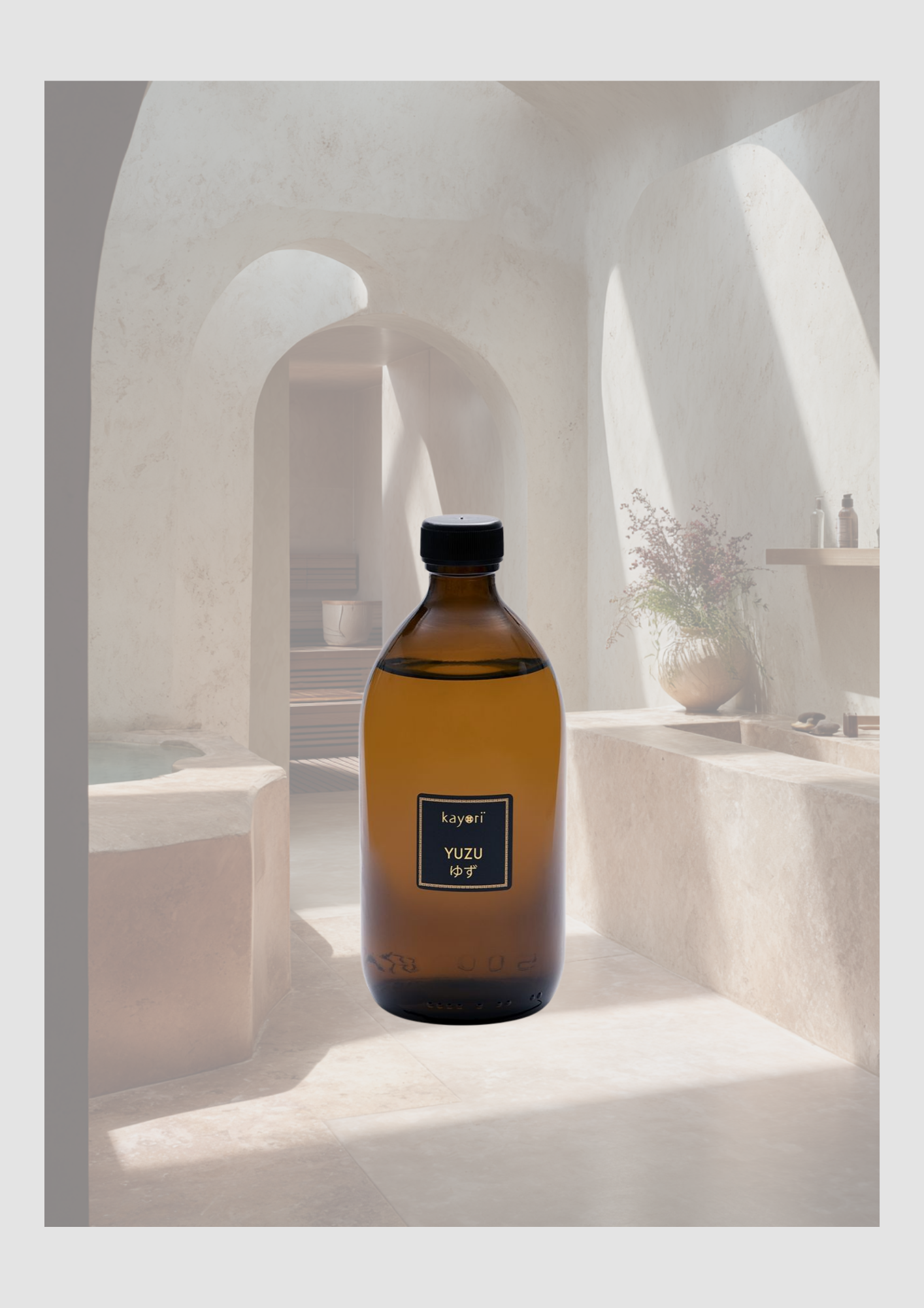
Yuzu
Ontspan als een keizer: De kracht van Yuzu in je badkamer
Wist je dat de Japanse citrusvrucht Yuzu (ook wel bekend als 'yuja') al meer dan 10.000 jaar wordt geprezen om haar bijzondere eigenschappen? Het is niet zomaar een vrucht; het is een eeuwenoud geheim voor een rustige geest.
De Yuzu-lijn van Kayori brengt deze Japanse traditie rechtstreeks naar jouw huis. De geur is een prachtige balans tussen fris citrus en warme bloemige tonen. Ideaal voor wie na een lange dag de stress van zich af wil schudden. Het is wetenschappelijk bewezen dat de geur van Yuzu:
Direct ontspannend werkt.
Helpt bij het verminderen van stress.
Een positieve invloed heeft op de bloedsomloop.
Kortom: een weldaad voor zowel je hart als je humeur. Gun jij jezelf dat momentje van pure Zen?
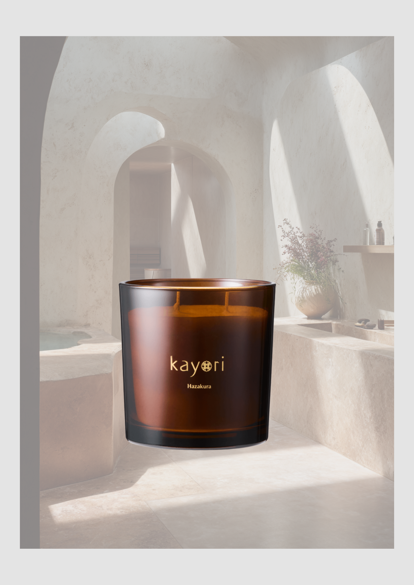
Hazakura - geurkaars
Stel je voor: het moment dat de kersenbloesems op hun mooist zijn en de eerste blaadjes langzaam naar de grond dwarrelen. Dat vergankelijke, serene moment is door Kayori gevangen in de Hazakura geurkaars.
Het is een geur die je interieur direct vult met een poederige warmte en zachte bloemige tonen. Geen overheersend parfum, maar een elegante, vrouwelijke omhelzing. Dankzij de royale inhoud van 450 gram en de dubbele lont geniet je maar liefst 50 branduren van een stabiele, schone vlam. Perfect voor die lange avonden waarop je even helemaal wilt ontsnappen aan de waan van de dag. Ben je nieuwsgierig naar deze geur, maar heb je toch de voorkeur voor een spray? Goed nieuws, want er is ook een roomspray van Hazakura beschikbaar!
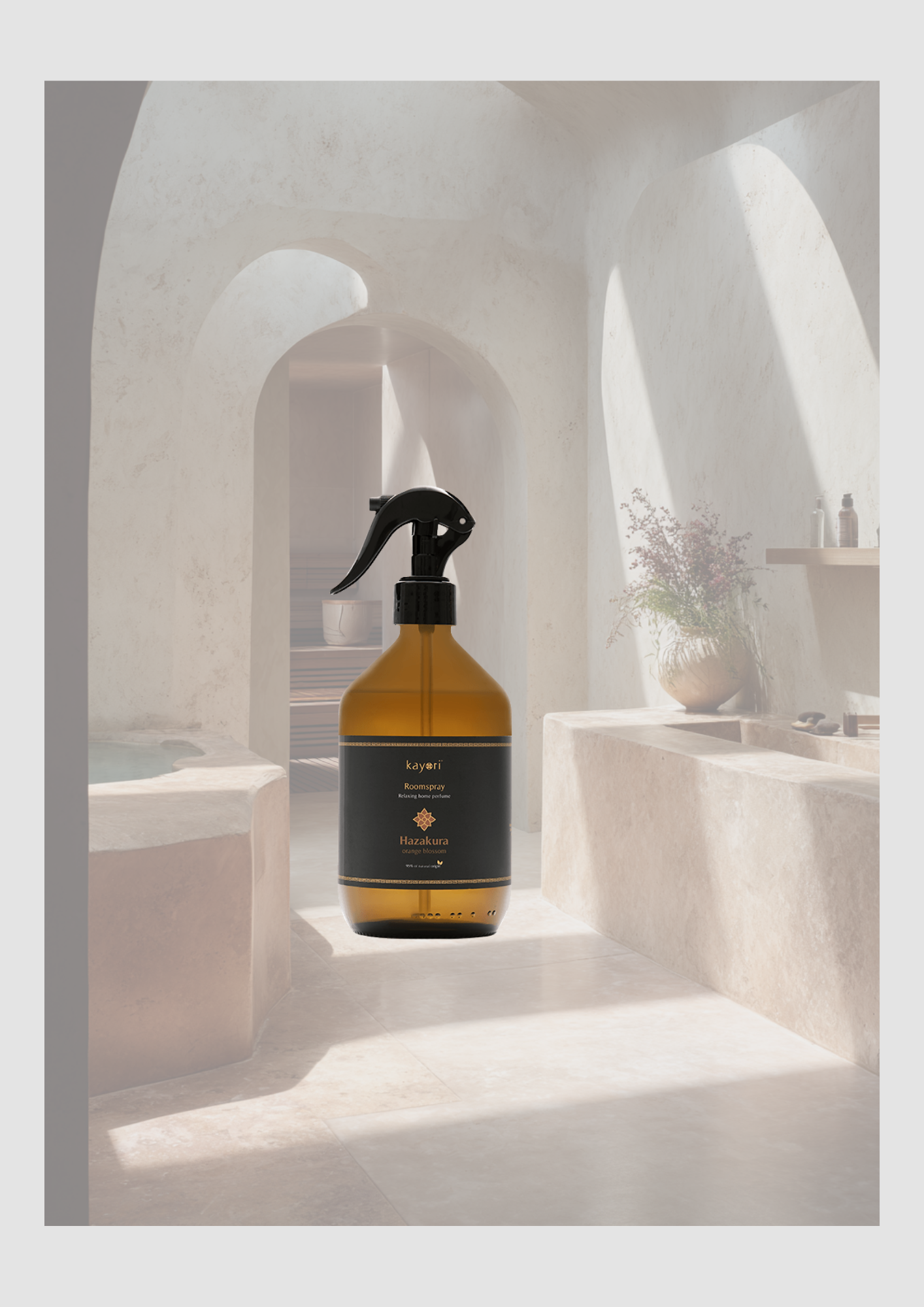
Niro Roomspray
Wist je dat geur ons krachtigste zintuig is? Het staat in directe verbinding met onze emoties. Een vleugje van een bepaalde geur kan je direct terugbrengen naar een warm moment, een verre reis of een gevoel van pure veiligheid. Jezelf omringen met een geur die je écht raakt, is daarom geen luxe, maar een vorm van zelfzorg.
De Kayori Niro Roomspray is ontworpen voor die momenten waarop je de sfeer in huis direct wilt transformeren. Of je nu je slaapkamer wilt omtoveren tot een rustgevend heiligdom of je woonkamer wilt vullen met een uitnodigende warmte: één spray is genoeg. Creëer elke dag opnieuw je eigen fijne plek.
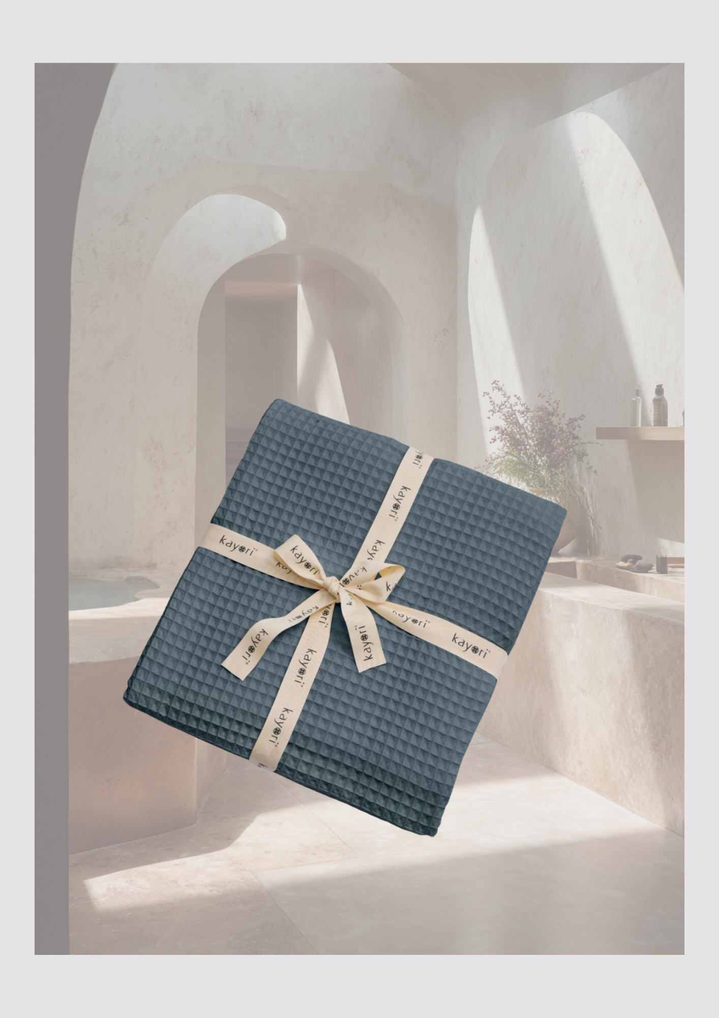
Plaid
Goya: Jouw trouwe metgezel voor elk seizoen
Er is niets fijner dan de tactiele beleving van een prachtig geweven plaid. Het Goya plaid van Kayori is met zijn subtiele 3D-structuur een sieraad voor je interieur, maar het is vooral een bron van comfort.
Dankzij de dikke, stevige weving is dit kleed heerlijk warm voor de frisse winteravonden op de bank, maar denk ook eens aan die lange zomeravonden in de tuin. Wanneer de zon ondergaat en het buiten net iets te fris wordt, sla je de Goya om je schouders om nog net even langer van de buitenlucht te genieten. Warmte, stijl en zachtheid in één.
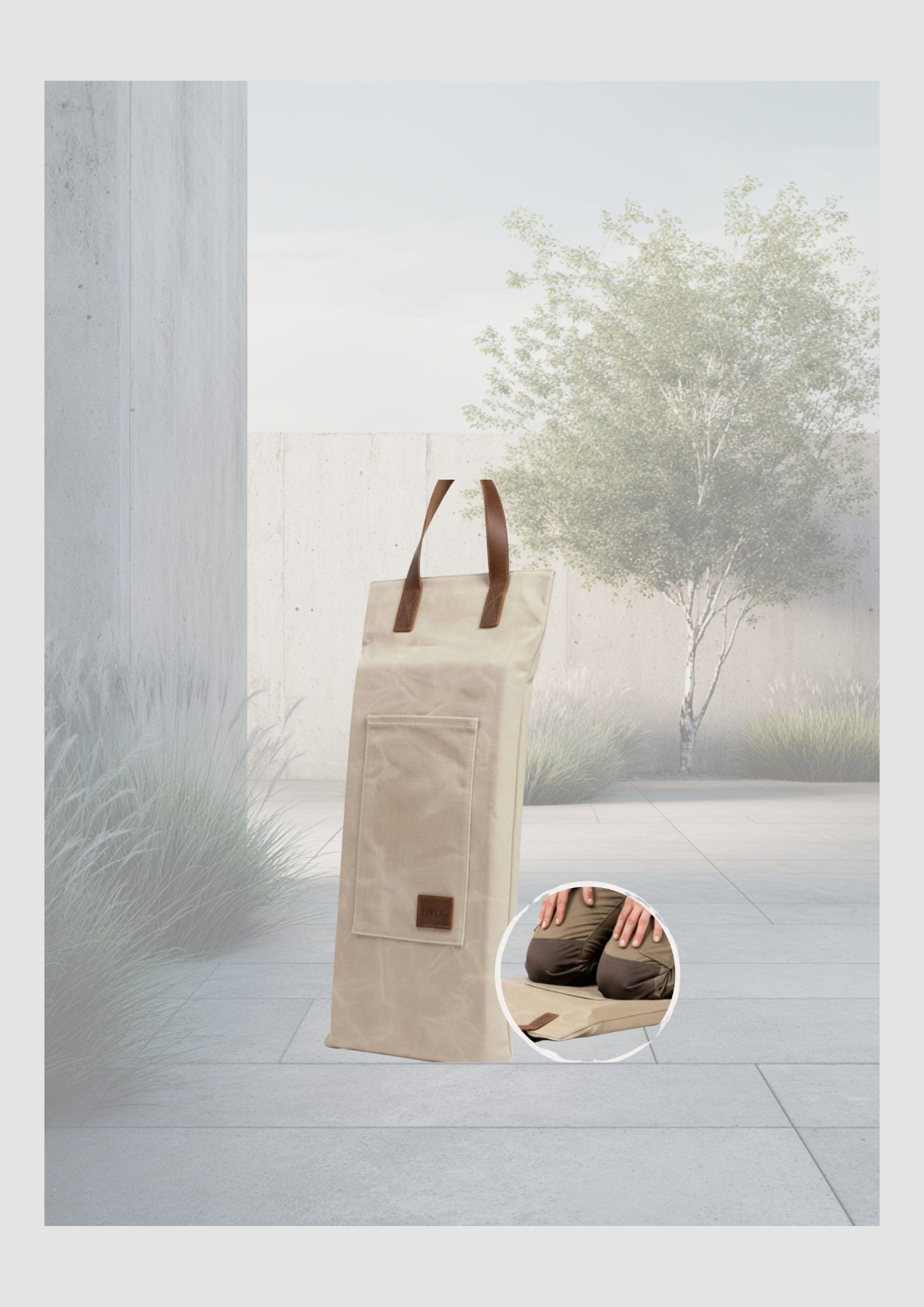
Skandinavisches Gartenglück
Träumen Sie von einem Außenbereich, der Ruhe ausstrahlt? Ein Ort, an dem Design und Natur im Einklang sind? Die neue Kollektion von Livlig53 beweist, dass Funktionalität und Schönheit Hand in Hand gehen. In diesem Blogpost nehmen wir Sie mit in eine Welt voller sanfter Salbeitöne, warmem Sand und zeitlosem skandinavischen Design.
Dieser Beitrag enthält Affiliate-Links. Wenn Sie über diese Links etwas kaufen, erhalte ich eine kleine Provision (ohne zusätzliche Kosten für Sie)
Wo harmonische Erdtöne auf minimalistische Ästhetik treffen
Träumen Sie von einem Außenbereich, der Ruhe ausstrahlt? Ein Ort, an dem Design und Natur im Einklang sind? Die neue Kollektion von Livlig53 beweist, dass Funktionalität und Schönheit Hand in Hand gehen. In diesem Blogpost nehmen wir Sie mit in eine Welt voller sanfter Salbeitöne, warmem Sand und zeitlosem skandinavischen Design.

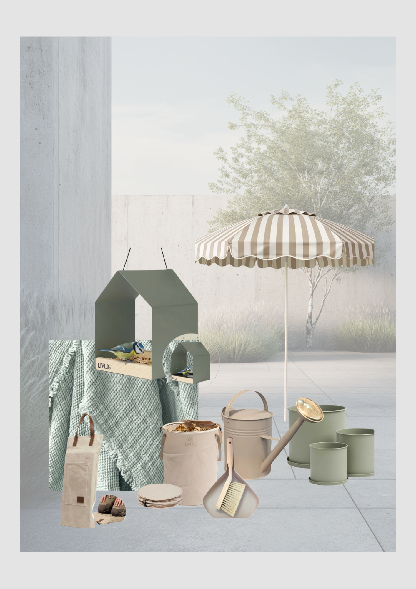
Meine Top 5 Favoriten von Livlig53
Um Ihren Garten oder Balkon in eine wahre Oase zu verwandeln, habe ich meine fünf absoluten Highlights zusammengestellt:
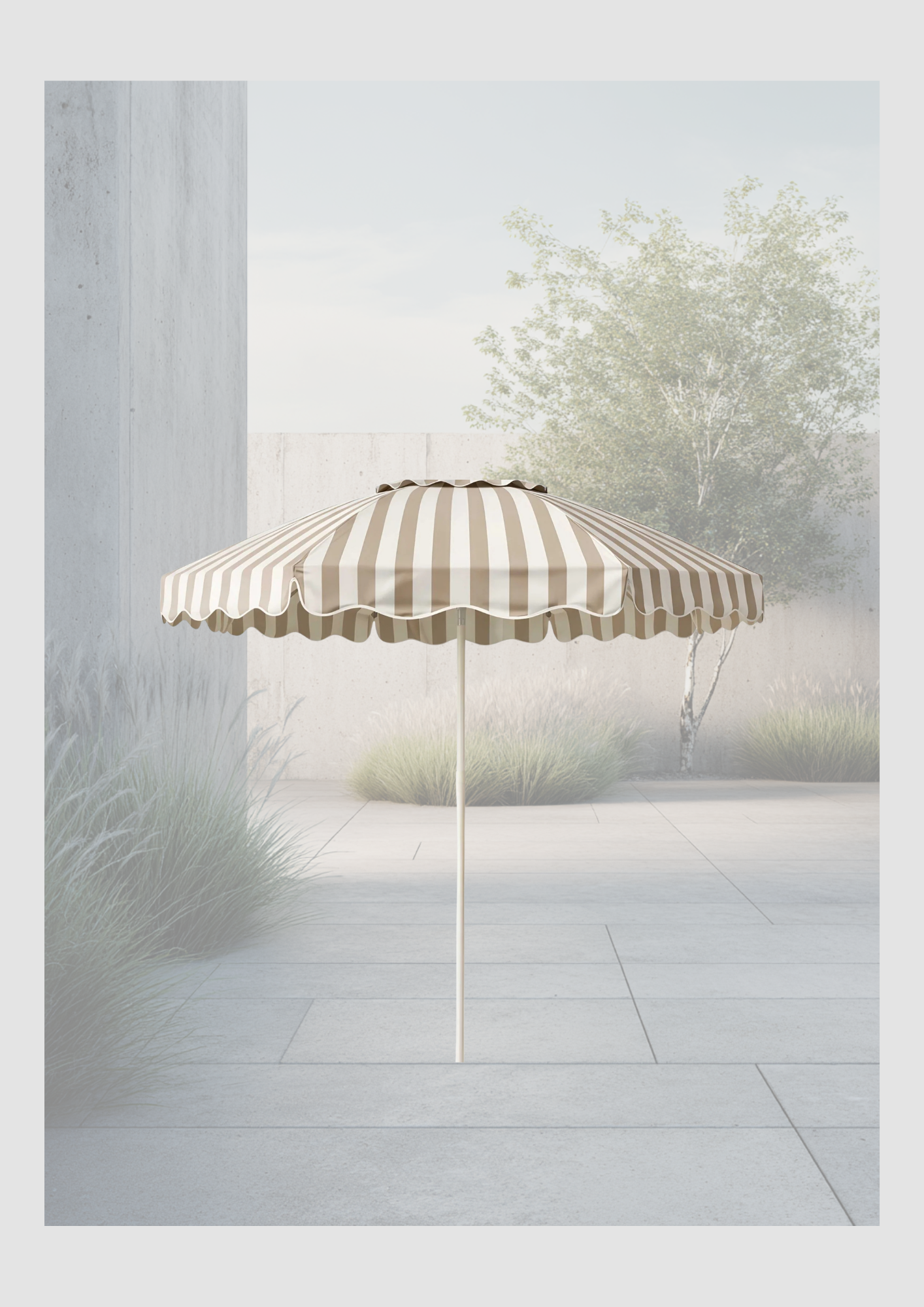
1. Der gestreifte Sonnenschirm: Ein Hauch von Nostalgie trifft auf moderne Eleganz. Die sanften Beigetöne sorgen für ein stilvolles Schattenspiel.
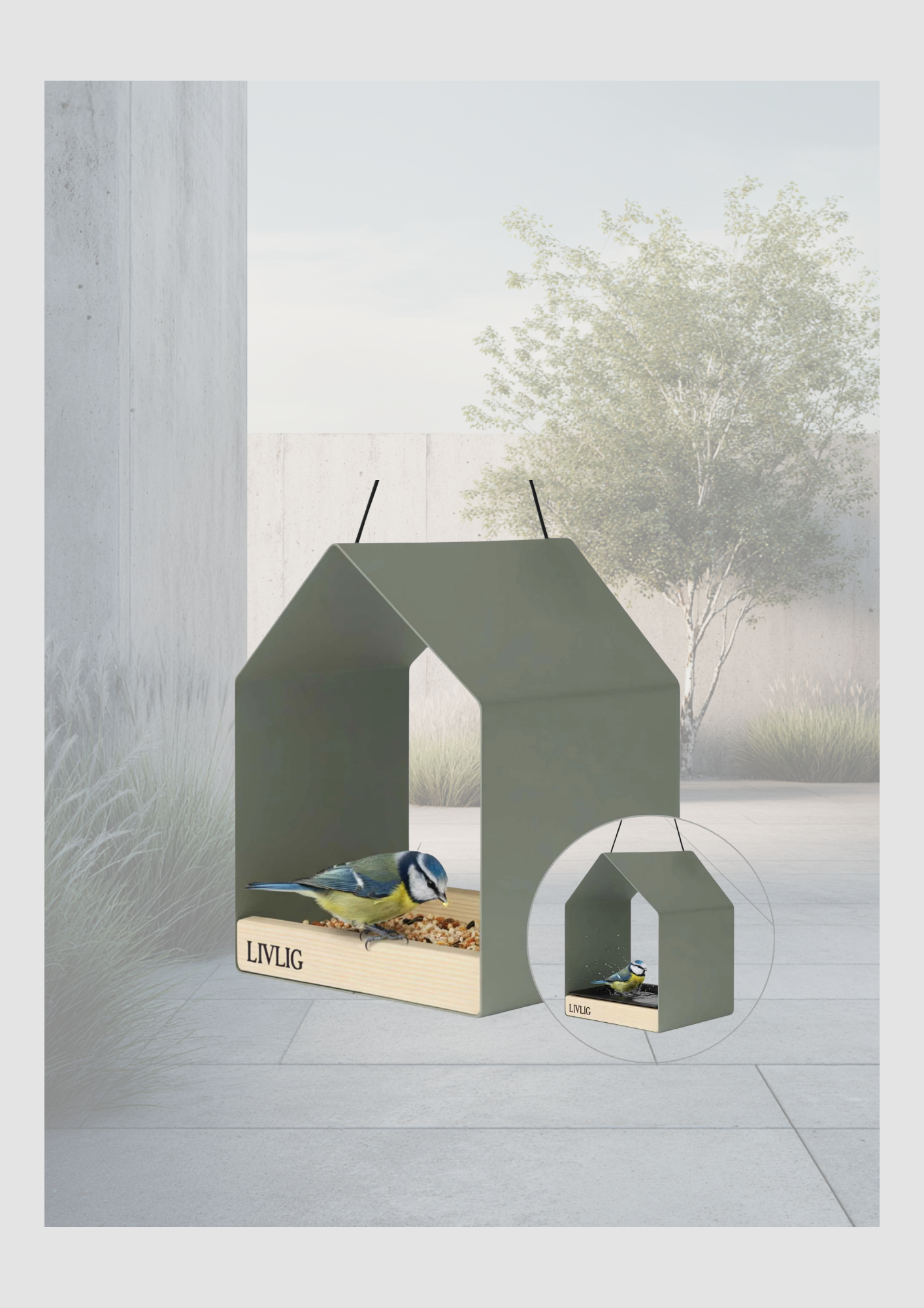
2. Das minimalistische Vogelhaus: Schlichtes Design in Saliengrün, das nicht nur den Vögeln gefällt, sondern auch ein echtes Statement-Piece an Ihrer Wand ist.
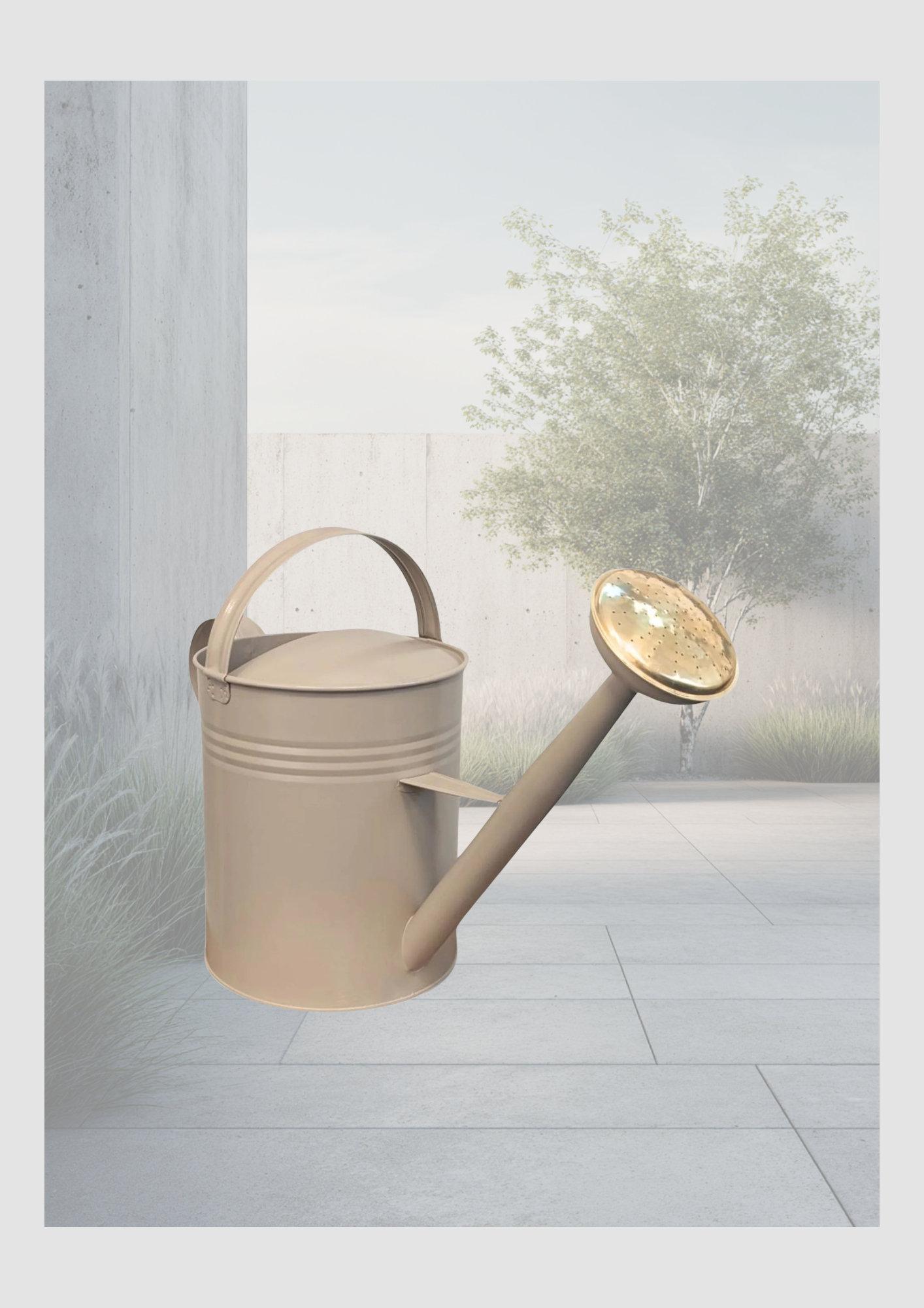
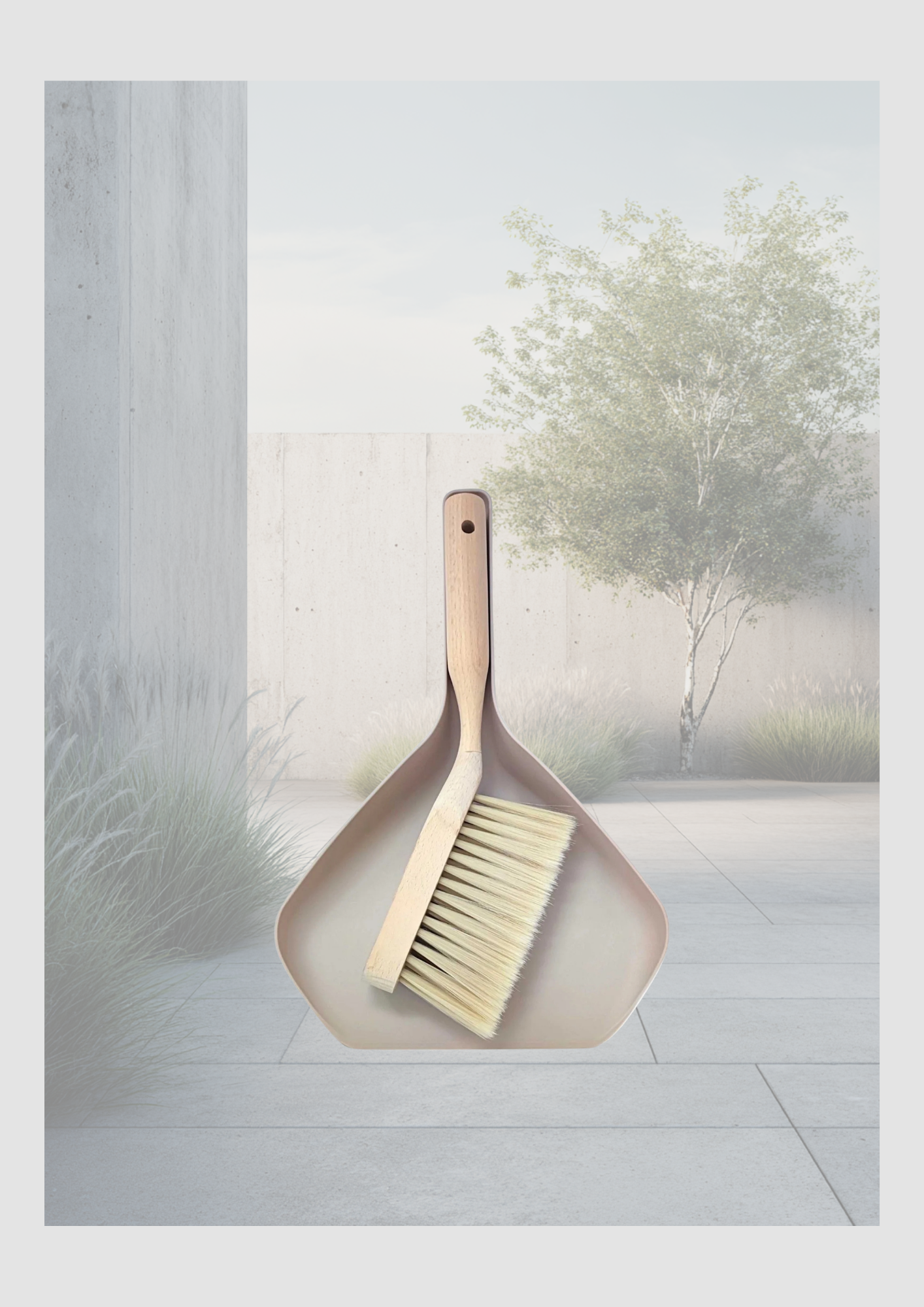
3. Die klassische Gießkanne: Ein praktisches Werkzeug in einer Farbe, die man nicht verstecken muss – perfekt abgestimmt auf das "Modern Organic" Thema.
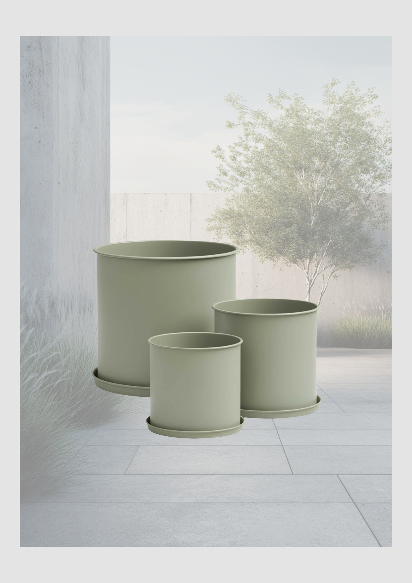
4. Das Pflanztopf-Set: Klare Linien und matte Oberflächen lassen Ihre Pflanzen erst richtig strahlen.
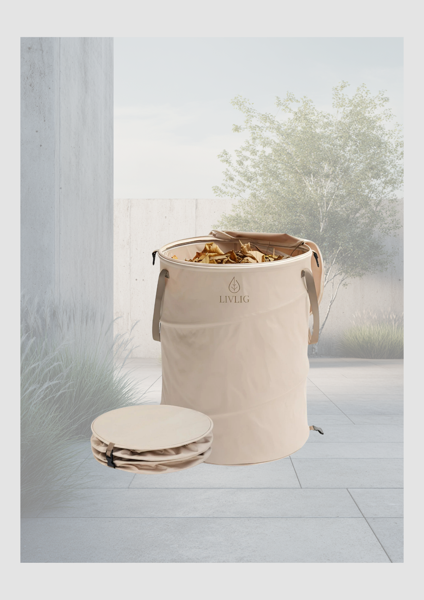
5. Der faltbare Gartenkorb: Beweis dafür, dass Ordnung halten auch ästhetisch sein kann. Platzsparend und dennoch ein Blickfang.
Warum wir diesen Look lieben
Dieser Stil basiert auf der Philosophie, dass weniger mehr ist. Durch die Kombination von harmonischen Erdtönen und minimalistischer Ästhetik schaffen wir eine Umgebung, die das Auge beruhigt. Es geht nicht nur um Dekoration, sondern um Lebensqualität im Freien.
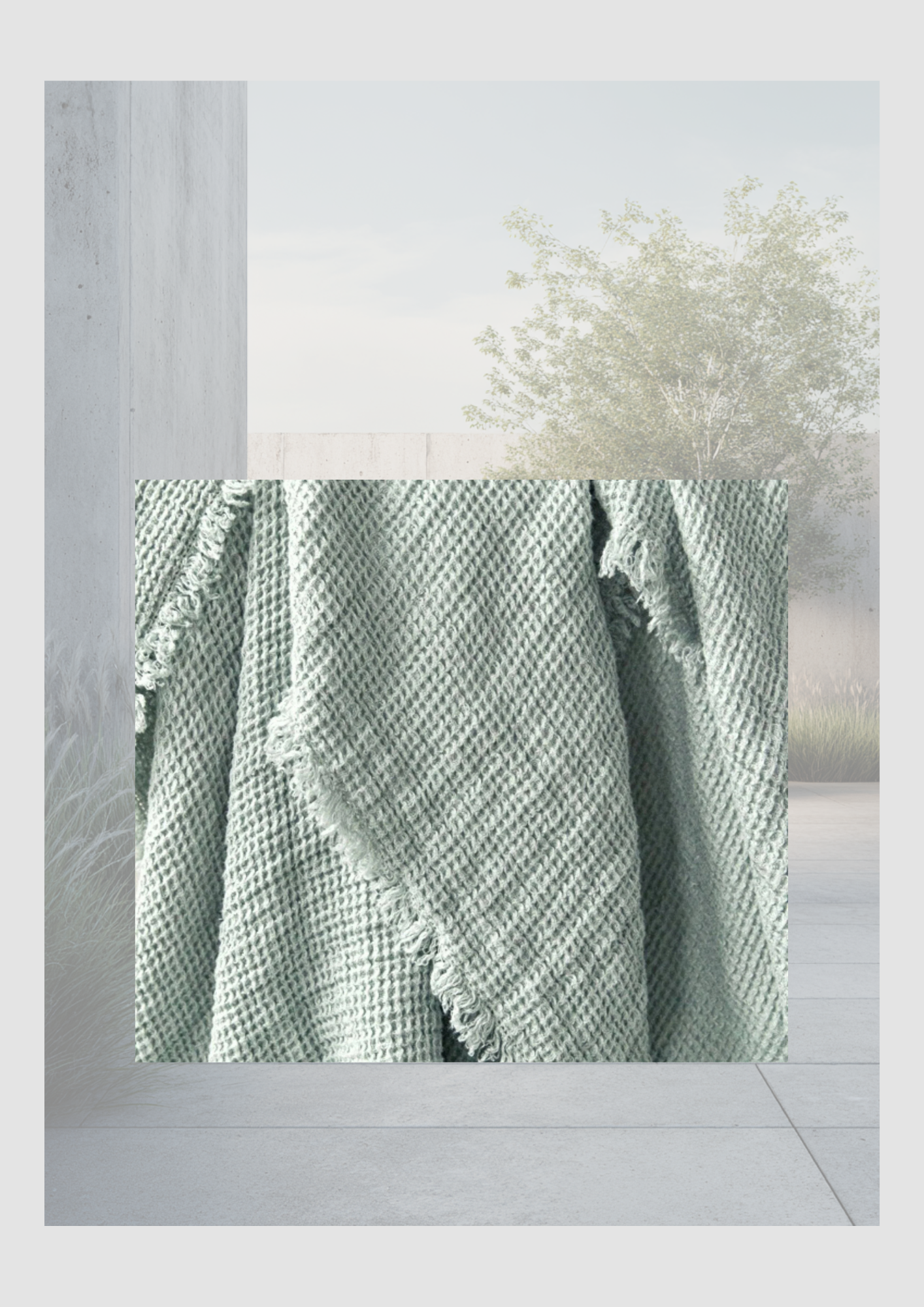
Tipp: Kombinieren Sie die harten Materialien wie Metall und Keramik mit weichen Textilien, wie einer grob gewebten Decke in Waffeloptik, um Tiefe und Gemütlichkeit (Hygge!) zu erzeugen.
Shop the Look
Hat Sie die Inspiration gepackt? Alle gezeigten Artikel finden Sie direkt über die untenstehenden Links. Verwandeln Sie Ihren Garten noch heute in Ihr persönliches skandinavisches Paradies!
Easter 2026: Minimalist Charm & Joyful Blooms
Spring 2026 is all about "Quiet Joy." We are moving away from cluttered mantels and choosing a refined, airy aesthetic that breathes life into our homes. Think of it as a blend of Scandinavian minimalism with a "sunny" twist.
Spring 2026 is all about "Quiet Joy." We are moving away from cluttered mantels and choosing a refined, airy aesthetic that breathes life into our homes. Think of it as a blend of Scandinavian minimalism with a "sunny" twist.
1. The 2026 Color Palette: "Nuanced Nature"
The trend for 2026 is the "Muddy Pastel." It’s no longer just baby pink; it’s a sophisticated Dusty Rose. Instead of basic yellow, we see Golden Glow and Butter Cream.
The Neutrals: Stone, oat, and mushroom form the base.
The Pops: Lavender mist, sky blue serenity, and a soft, zesty mint.
The Twist: Add one "grounding" color like terracotta or sage green to keep the pastels from looking too sugary.
2. "Happy" Florals: Less is More
In 2026, we don't do dense bouquets. We go for Sculptural Florals.
The Single-Stem Statement: Place one perfect Parrot Tulip or a branch of Cherry Blossom in a slim, ceramic vase. Negative space is your friend.
Vibrant Varieties: Choose flowers that naturally look "happy"—yellow Ranunculus, white Daffodils, or Lavender stocks.
Ikebana Influence: Use a kenzan (flower frog) in a shallow bowl for a minimalist, artistic floral arrangement that looks like a small piece of a spring meadow.

3. The Table Setting: Effortless Elegance
Forget the plastic eggs. Your 2026 Easter table should feel tactile and warm.
Linens: A crumpled linen runner in a neutral tone (sand or cream) provides an instant organic feel.
Ceramics: Matte-finished plates in "jelly mint" or soft white.
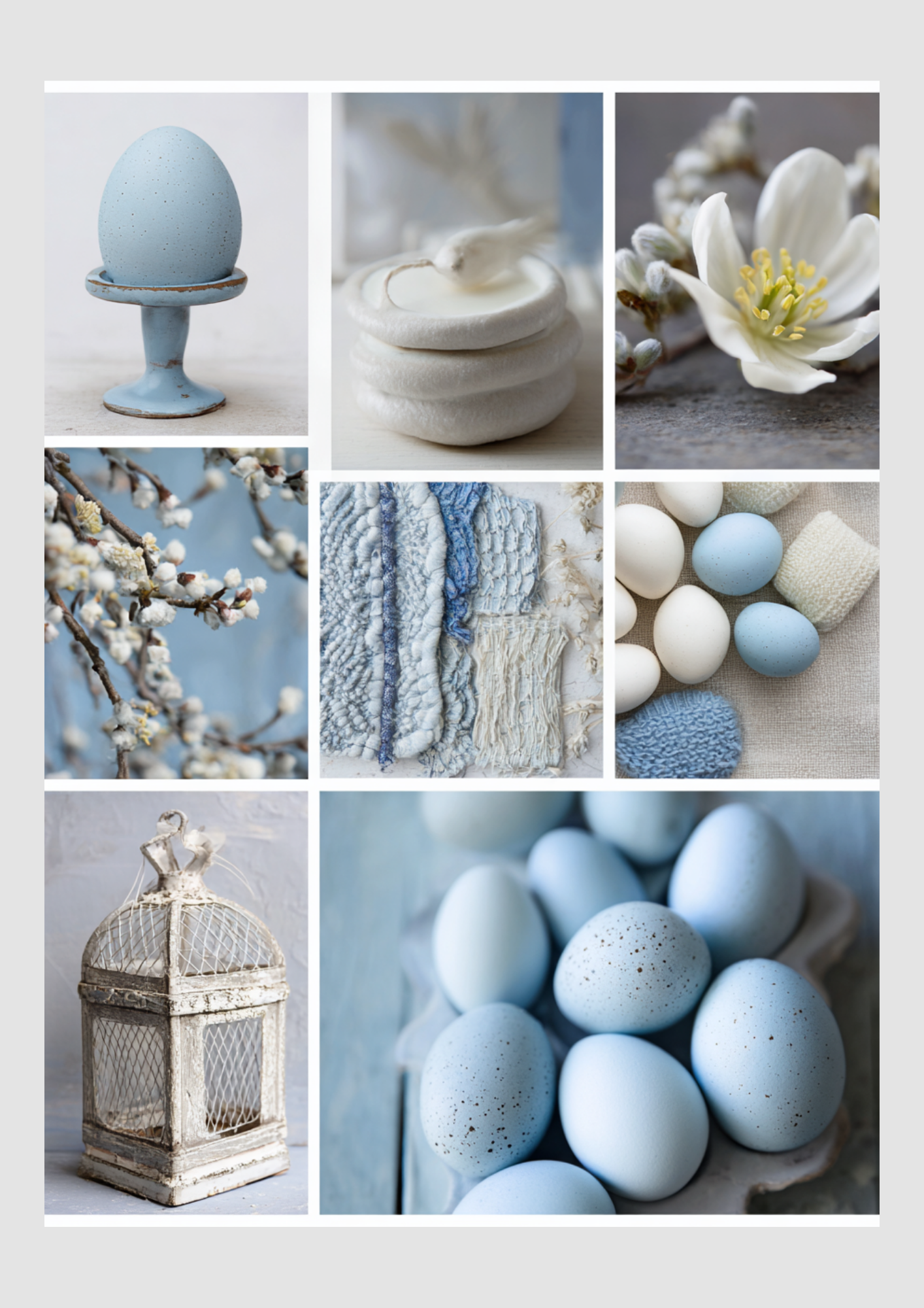
The Centerpiece: Instead of a big floral arrangement, place a few ceramic bunny figurines in neutral stone tones among small bud vases of varying heights.
Personal Touch: A single stem of dried grass or a fresh flower tucked into a napkin tied with a simple velvet ribbon in a pastel shade.
4. Minimalist Decorations: Trends for 2026
Paper Art: Hand-folded paper eggs and origami birds are huge this year. They are sustainable, lightweight, and add a geometric, modern touch.
Glass Cloches: A single, beautifully decorated egg or a nest of moss under a glass cloche creates a focal point without creating clutter.
Natural Textures: Use light woods, rattan, and unglazed ceramics to keep the atmosphere grounded and calm.
Trend Tip: 2026 is the year of "Asymmetry." Don't feel the need to place everything perfectly in the middle. Let your decor "flow" across the table or mantel like a growing garden.

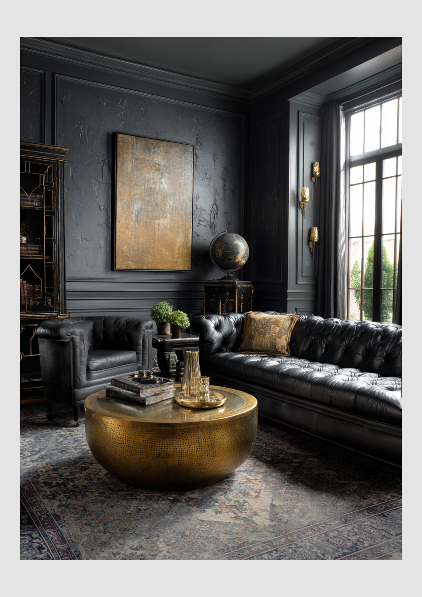
Modern Noir
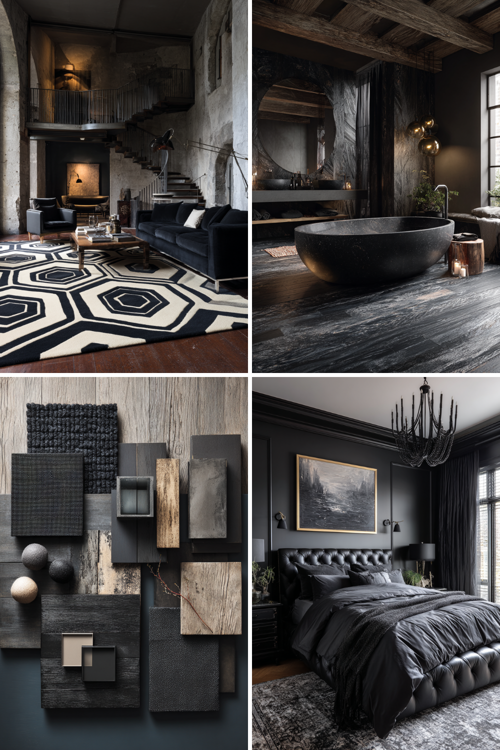
Why "Black and Moody" is the Ultimate Interior Power Move
For years, the interior world was obsessed with "bright and airy." But there is a new movement taking over our feeds: Modern Noir. If you’ve been hesitant to bring black or deep, moody tones into your home, this is your sign to embrace the dark side.
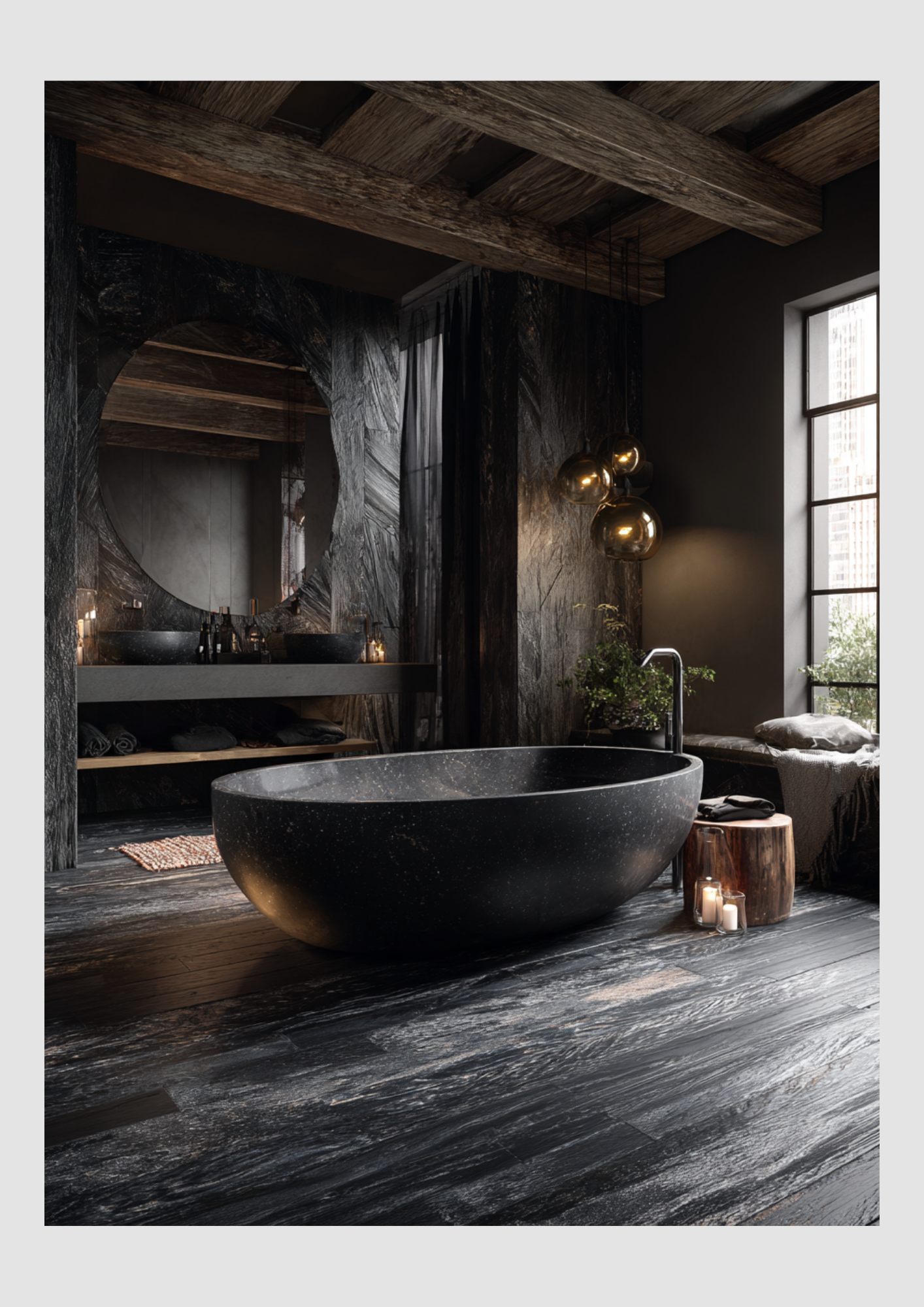
Why Moody Interiors Work
Contrary to popular belief, dark colors don't just make a room feel "smaller." When done right, they create a sense of infinite depth and intimacy. A "Noir" room feels like a warm hug—it's sophisticated, grounded, and incredibly calming after a long day.
By using deep tones, you allow your furniture and decor to truly pop, creating a gallery-like atmosphere in your own living room.
Perfect Color Pairings for Modern Noir
Black is the foundation, but the magic happens in the contrast. To keep your home from feeling like a cave, try these combinations:
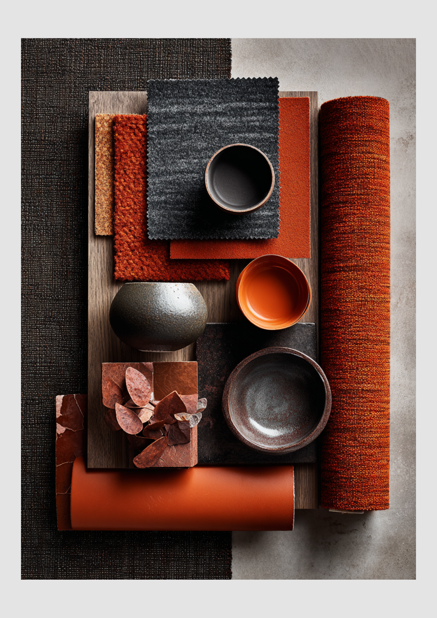
Terracotta & Burnt Orange: As seen in our latest mood boards, these "earthy" tones bring warmth and a Mediterranean soul to dark walls.
Champagne & Beige: This softens the edge of "Modern Noir," making it feel luxurious and approachable.
Sage Green: A deep charcoal wall paired with muted green plants or velvet pillows creates an "enchanted forest" vibe that is very on-trend.
Metallic Gold or Brass: Nothing says "Noir Luxury" like gold accents reflecting against a matte black backdrop.
Midnight blue: the eye cannot immediately discern where the black ends and the blue begins, giving the room a sense of infinite depth
Must-Have Items to Style Your Noir Space
To achieve this look, focus on textures. Since the color palette is dark, you need "tactile" variety to keep the eye moving:
Velvet Seating: A plush sofa in charcoal or deep rose (like our favorite vt wonen items) adds an instant layer of comfort.
Architectural Lighting: Think tripod floor lamps with linen shades. The soft glow against dark walls creates dramatic shadows.
Statement Art: Large-scale photography or abstract prints with white matting provide the necessary "breathing room" for your eyes.
Matte Ceramics: Vases in stone or clay textures add an organic feel to a modern setup.
Graphic Rugs: A cream or beige rug with a subtle black geometric pattern ties the whole room together.
Ready to Shop the Look?
Don't be afraid to experiment with one "moody" accent wall or a few dark statement pieces. It’s about balance, texture, and—most importantly—how the space makes you feel..

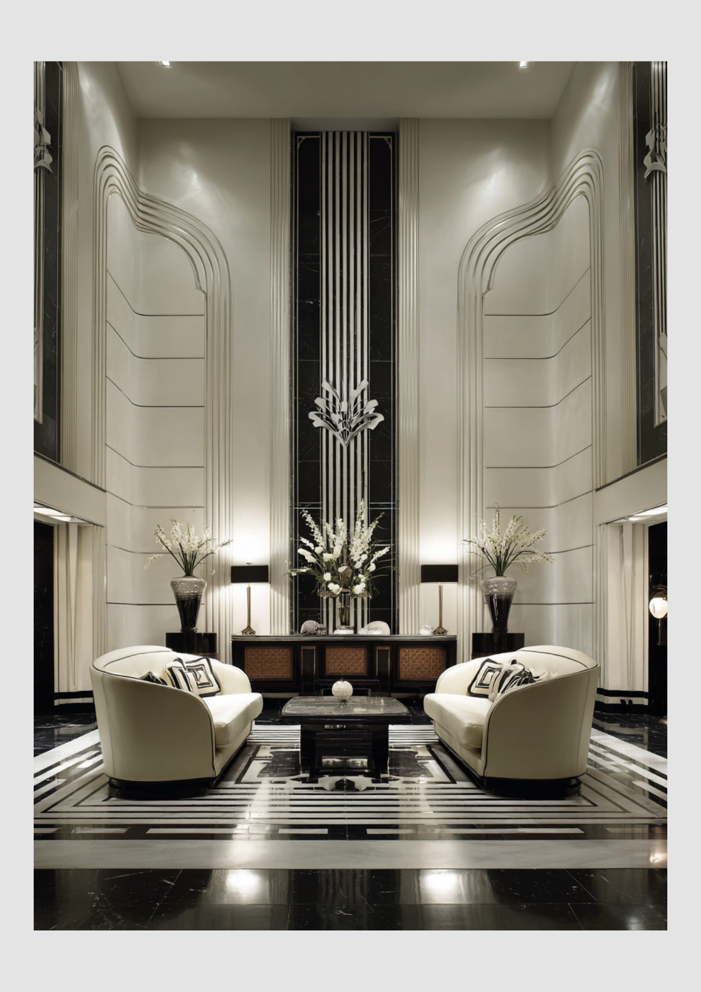
1920s-1930s Interior Design Trends
The period from 1920 to 1930 represents one of the most transformative eras in interior design. It was a decade of sharp contrasts: the birth of high-glamour Art Deco and the rise of industrial, functionalist Modernism (Bauhaus).
While the 1920s focused on optimism and luxury, the transition into the 1930s (the Great Depression era) saw styles become more streamlined and practical.
1. Art Deco: The Height of 1920s Glamour
Art Deco was the defining "look" of the Roaring Twenties. It celebrated the "Machine Age" with sleek surfaces and exotic materials.
Key Motifs: Sunbursts, zigzags (chevrons), fan shapes, and stepped silhouettes (inspired by the emerging New York skyscrapers).
Luxurious Materials: Designers used "exotic" woods like ebony and zebrawood, alongside chrome, glass, mirrors, and marble.
Color Palette: High-contrast combinations like black and gold, silver and chrome, or deep jewel tones (emerald, ruby, and sapphire) against cream or beige.
Furniture: Large-scale, symmetrical pieces with lacquered finishes and plush upholstery like velvet or silk.
2. Bauhaus & Modernism: Form Follows Function
While Art Deco was about decoration, the Bauhaus school in Germany (founded 1919) pushed for a radical "stripping away" of ornament.
Philosophy: Functionality was paramount. If a piece didn't serve a purpose, it shouldn't be there.
Materials: This era introduced the first widespread use of tubular steel (like the famous Wassily Chair), plywood, and reinforced concrete in home design.
Primary Colors: Unlike the jewel tones of Art Deco, Modernism favored the basics: Red, Blue, and Yellow, often set against white or gray walls.
Open Floor Plans: For the first time, architects and designers began moving away from "boxy" rooms toward open, airy living spaces.
3. The Transition to 1930s "Streamline Moderne"
As the world entered the 1930s and the Great Depression, the opulence of Art Deco softened into a more aerodynamic, "faster" look known as Streamline Moderne.
Curved Lines: Hard geometric angles were replaced by long horizontal lines and rounded "bullet" corners.
Nautical Influence: Interiors often looked like the inside of a luxury ocean liner or a sleek airplane.
Kitchen Innovation: This was the decade the kitchen became a design focus. We saw the rise of linoleum flooring (often in checkerboard), built-in "breakfast nooks," and the first colorful enameled appliances.
Minimalism for Economy: Due to the economic crash, homes became more sparsely furnished, emphasizing clean lines and durable materials like wood and steel over expensive silk and gold leaf.
Quick Comparison
1920s (High Art Deco)
Main: Vibe Opulent, Bold, Theatrical
Shapes: Sharp Zigzags, Triangles
Metals: Polished Brass, Gold Leaf
Colors: Deep Jewels, Black & Gold
Flooring: Parquet, Geometric Rugs
1930s (Streamline Moderne):
Main: Aerodynamic, Practical, Softened
Shapes: Long Horizontals, Curves
Metals: Chrome, Stainless Steel
Colors: Muted Neutrals, Pale Blues/Pinks
Flooring: Linoleum, Checkerboard Tile
Interior Colour 2026: Mocha mousse > Cloud dancer
In 2025, the interior design world has shifted away from "millennial gray" toward Mocha Mousse (Pantone 17-1230). This rich, velvety brown is defined by its "sophisticated neutrality"—it provides the grounding stability of an earth tone with the indulgence of a luxury aesthetic.
In 2026, the design world has embraced a "hard reset" with Cloud Dancer (Pantone 11-4201). After the rich, grounded warmth of 2025’s Mocha Mousse, Cloud Dancer arrives as a breath of fresh air—a billowy, balanced white that prioritizes mental clarity and serenity.
The Mood: Why Mocha Mousse in 2025?
Mocha Mousse isn’t just "brown"; it’s a sensory experience. It evokes the warmth of a morning latte and the comfort of cacao. Unlike the flat chocolate browns of the early 2000s, this 2025 version has soft beige and plum undertones, making it feel airy rather than heavy. It is designed to foster tranquility, well-being, and "refined coziness."
How to Style It by Room
1. The Living Room: The "Cocoon" Effect
Color Drenching: For a bold, high-end look, paint the walls, trim, and even the ceiling in Mocha Mousse. This "enveloping" technique creates an intimate sanctuary.
The Anchor Piece: If painting is too much, a plush mocha velvet sofa serves as a timeless focal point that pairs beautifully with lighter oak coffee tables.
2. The Kitchen: Sophisticated Warmth
Cabinetry: Move over, white kitchens. Mocha Mousse cabinets paired with gold or brass hardware create a "bakery-chic" vibe.
Backsplashes: Use handmade zellige tiles in this shade to add texture and catch the light, avoiding the sterile look of traditional subway tiles.
3. The Bedroom: The Ultimate Retreat
Textiles: Layer textures to keep the brown from looking flat. Combine linen bedding in Mocha Mousse with a chunky wool knit throw and silk accent pillows.
Lighting: Use warm-toned bulbs (2700K) to bring out the red and gold undertones in the paint, making the room glow at night.
Winning Color Combinations
Mocha Mousse is a "chameleon" that shifts depending on what you pair it with:
Palette Style: Natural/Grounded
Pairing Colors: Olive Green, Terracotta, Sage
Vibe: Organic, forest-like, and calm
Palette Style: Quiet Luxury
Pairing Colors: Creamy Beige, Soft White, Gold
Vibe: Minimalist, expensive, and airy
Palette Style: Modern Contrast
Pairing Colors: Powder Blue, Slate Gray, Charcoal
Vibe: Crisp, sophisticated, and cool-toned
Palette Style: Jewel Toned
Pairing Colors: Burgundy, Navy, Emerald
Vibe: Moody, dramatic, and opulent

Pro-Tips for 2025
Skip the Chrome: The cool, clinical look of chrome can clash with the warmth of Mocha Mousse. Stick to brass, bronze, or matte black fixtures.
Add "Living" Accents: Darker browns can sometimes feel stagnant. Bring the space to life with large-leaf greenery (like a Fiddle Leaf Fig) to provide a vibrant, natural contrast.
Start Small: If you're color-shy, introduce the trend through amber glassware, ceramic vases, or a statement area rug to anchor your existing neutral furniture.
Cloud Dancer
Here is your guide to styling 2026’s most influential "non-color."
The Mood: Why Cloud Dancer?
Cloud Dancer isn’t just white; it’s an emotional neutral. Described by Pantone as a "whisper of calm in a noisy world," it addresses the collective desire for simplification and a break from digital overstimulation.
Undertone:
It features a delicate balance of cool and warm, giving it a luminous, "airy" quality that avoids the clinical sterility of traditional optical whites.
The Vibe:
Minimalist, nostalgic, and deeply restorative.
2026 Design Applications
1. The "Visual Pause" in Living Spaces
In 2026, Cloud Dancer is used to create expansive visual silence.
Color Drenching: Designers are using it on walls, ceilings, and built-in shelving to make rooms feel larger and more light-filled.
Texture Over Tone: Because the color is subtle, the focus shifts to touch. Think bouclé sofas, hand-knotted wool rugs, and clay plaster walls all in this same shade. The variation in shadows provides the "color."
2. Human-Centric Offices & Kitchens
Workspaces: Used to reduce "cognitive fatigue," Cloud Dancer is the go-to for home offices to encourage deep focus.
Kitchens: Move away from high-contrast black-and-white. Pair Cloud Dancer cabinets with honed travertine or light ash wood for a "quiet luxury" aesthetic that feels lived-in and soft.
3. Sculptural Lighting
This shade is trending heavily in lighting design. Matte ceramic pendants and frosted glass fixtures in Cloud Dancer diffuse light softly, creating a glow that enhances the room’s serenity rather than creating harsh highlights.
2026 Official Palettes
Pantone has released several "Horizon" palettes for Cloud Dancer. Here are the most popular for interiors:
Palette: Powdered Pastels
Pairing Colors: Lemon Icing, Ice Melt, Pink Raindrops
Interior Style: Modern Whimsy: Soft, airy, and youthful.
Palette: Atmospheric
Pairing Colors: Alaskan Blue, Cosmic Sky, Aqua Gray
Interior Style: Coastal Minimalist: Moody, cool, and oceanic
Palette: Take a Break
Pairing Colors: Caramel, Iced Coffee, Tea (Green)
Interior Style: Japandi: Earthy, organic, and grounded
Palette: Light & Shadow
Pairing Colors: Baltic Sea, Hematite, Quiet Violet
Interior Style: High-End Contemporary: Dramatic and architectural
Essential Styling Tips
Layer the Whites: Don’t be afraid to mix Cloud Dancer with other off-whites like cream, oyster, or chalk. This prevents the room from looking flat.
Pair with Natural Materials: This color was designed to highlight craftsmanship. It looks best against raw oak, unpolished stone, and linen.
The Lighting Factor: * Warm Bulbs (2700K): Bring out the creaminess and make it feel cozy.
Cool/Natural Light: Reveals its architectural, "clean" side.
The Palette: Earth Meets Air
The magic of this duo lies in the balance of visual weight. Mocha Mousse provides the "roots" of the room, while Cloud Dancer provides the "sky."
Mocha Mousse (PANTONE 17-1230): A warm, mid-tone brown with a hint of peach/pink. It's the color of a perfect latte or high-end suede.
Cloud Dancer (PANTONE 11-4201): A creamy, non-sterile white that feels billowy and light. It’s softer than a standard gallery white, making it feel organic rather than clinical.
How to Layer Them in Your Home
1. The "70/30" Rule
To keep the room from feeling too heavy or too washed out, use Cloud Dancer as your canvas (70%) and Mocha Mousse as your anchor (30%).
The Walls: Paint your main living areas in Cloud Dancer. It reflects light beautifully and makes the space feel expansive.
The Furniture: Introduce a large statement piece, like a velvet sofa or a set of leather dining chairs, in Mocha Mousse. The contrast makes the furniture look like a piece of art against the soft white background.
2. Texture is Non-Negotiable
Since this is a neutral palette, the "flatness" of the colors needs to be broken up by tactile materials.
Pair Cloud Dancer with: Bouclé fabrics, sheer linen curtains, and white-washed oak.
Pair Mocha Mousse with: Walnut wood, brushed bronze hardware, and chunky wool knits.
3. The "Third Color" Bridge
To make the transition between these two years of trends feel seamless, add a small amount of a "bridge" color:
Sage Green: Adds a biophilic, natural touch.
Pale Terracotta: Plays into the warmth of the mocha.
Matte Black: Adds a modern, architectural edge to the soft palette.
Room-by-Room Breakdown
Living Room
Strategy: Cloud Dancer walls + Mocha Mousse area rug + brass accents.
Result: Sophisticated & Expansive
Bedroom
Strategy: Mocha Mousse bedding + Cloud Dancer sheer drapes + warm wood.
Result: Cozy & Sanctuary-like
Kitchen
Strategy: Cloud Dancer cabinetry + Mocha Mousse stone backsplashes.
Result: Modern & Appetizing

Spring is Loading in Interior Design
As the days grow longer and the first buds begin to peek through the frost, there’s a distinct shift in the air. We aren't just feeling it outside—we’re feeling it in our homes. Spring is officially loading, and it’s time to transition our interiors from the heavy, cozy layers of winter to something much more breathable and vibrant.
If you’re ready to shake off the "winter blues" and invite the season of renewal into your living space, here is how to get your home "Spring-ready."
Refresh Your Space
As the days grow longer and the first buds begin to peek through the frost, there’s a distinct shift in the air. We aren't just feeling it outside—we’re feeling it in our homes. Spring is officially loading, and it’s time to transition our interiors from the heavy, cozy layers of winter to something much more breathable and vibrant.
If you’re ready to shake off the "winter blues" and invite the season of renewal into your living space, here is how to get your home "Spring-ready."
1. The Palette Shift: From Moody to Airy
Winter is all about deep charcoals, forest greens, and navy. Spring, however, demands a lighter touch. You don't need to repaint your whole house to see a difference.
Pastel Accents: Introduce soft sages, butter yellows, and blush pinks through throw pillows and blankets.
Warm Neutrals: Swap out heavy grey tones for creamy whites and sandy beiges to reflect more natural light.
The "Pop" of Green: Incorporate "Digital Lavender" or "Neo-Mint"—the trendy shades making waves in 2024-2025.
2. Texture Transition
It’s time to pack away the chunky wool knits and faux furs. Spring interior design is all about breathability.
Out with the Old (Winter)
Velvet & Wool
Heavy Blackout Curtains
Dark Wood Accents
Faux Fur Throws
In with the New (Spring)
Linen & Cotton
Sheer, Flowy Drapes
Light Oak or Rattan
Lightweight Waffle Weave
3. Bring the Outside In (Biophilic Design)
The core of spring is growth. Biophilic design—the practice of connecting your indoor space to the natural world—is the most effective way to make your home feel "loaded" with spring energy.
The "Hero" Plant: Invest in a large Monstera or an Olive Tree to act as a living sculpture in your living room.
Seasonal Florals: Nothing says spring like a vase of fresh tulips, daffodils, or eucalyptus on the dining table.
Natural Materials: Use stone, clay, and untreated wood to ground your rooms in an earthy, organic feel.
4. Let the Light Lead
Now that the sun is finally sticking around past 5:00 PM, maximize it!
Mirror Magic: Place a large mirror opposite a window to bounce sunlight into the darker corners of the room.
Clear the Sills: Remove heavy objects from windowsills to allow as much unobstructed light as possible to filter in.
Pro Tip: "Spring Cleaning" isn't just a chore; it’s a design strategy. Decluttering your surfaces creates "visual breathing room," which is essential for that breezy spring aesthetic.
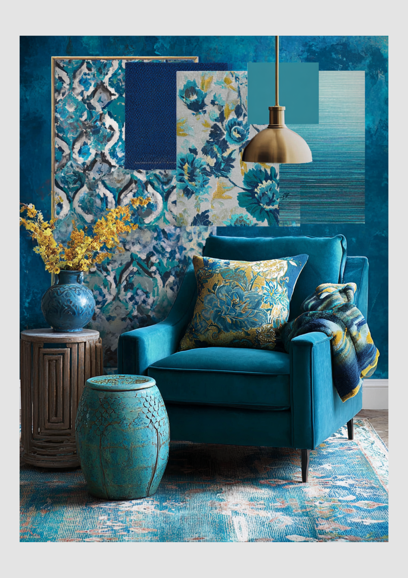
Electrify Your Space with Bold Blue and Transformative Teal
As the winter frost fades, a new energy is emerging in the world of interior design. This year, we aren’t just looking for "soft and subtle"—we’re looking for impact. Spring 2025 is all about the "loading" phase: the transition from quiet hibernation to high-definition vibrancy.
While pastels will always have their place, the real stars of the season are Electric Blue and Transformative Teal. These aren't just colors; they are moods. One provides a jolt of modern energy, while the other offers a sophisticated, grounding depth.
Here is how to master this high-contrast duo for your spring refresh.
The Color Profile: Why These Two?
Electric Blue: This is the "high-speed internet" of colors. It’s a saturated, high-energy hue that mimics the brightness of a clear spring sky. It’s meant to stimulate creativity and wake up a tired room.
Transformative Teal: Named a "Color of the Year" for its versatility, this shade sits perfectly between blue and green. It represents renewal and balance, acting as the sophisticated anchor to the more "wild" electric blue.
1. The "Pop & Anchor" Strategy
To prevent your home from feeling like an aquarium, use the 60-30-10 rule. Use a neutral (like crisp white or warm sand) for 60% of the room, Transformative Teal for 30% (furniture or rug), and Electric Blue for that final 10% punch.
In the Living Room: A deep teal velvet sofa creates a luxurious, grounded focal point. Scatter a few electric blue geometric pillows on top to give the eye a place to "land."
In the Dining Area: Try teal upholstered chairs paired with electric blue glass vases or table runners.
2. Spring Textures: Gloss vs. Matte
Spring light is unique—it’s bright but often sharp. Play with how these colors react to the sun:
Glossy Accents: Use electric blue in high-shine finishes—think ceramic lamps, lacquered trays, or glass bowls. The gloss catches the spring sun and makes the color feel "electric."
Matte Foundations: Keep your teals matte or "toothy." Linen teal curtains or a flat-weave teal rug provide a soft, organic backdrop that keeps the room feeling "homey" rather than "clinical."
3. Complementary Pairings
Bold blues and teals thrive when they have a "friend" on the opposite side of the color wheel.
The Warm Contrast: Add touches of Terracotta or Burnt Orange. These earthy tones ground the coolness of the blues and make the "Spring" vibe feel more like a garden in bloom.
The Metallic Edge: Skip the silver this year. Warm Gold or Champagne Bronze hardware makes teal look expensive and transforms electric blue into something regal.
Quick Swap Checklist: 5 Minutes to Spring
Throw blanket:
Swap Heavy Charcoal Wool with Lightweight Teal Cotton Knit
Wall art:
Swap Dark Landscapes with Electric Blue Abstract Prints
Tabletop:
Swap Pinecones/Dried Twigs with Blue Hydrangeas or Teal Glassware
Floor:
Swap Thick Shag Rug with Jute Rug with Teal Borders
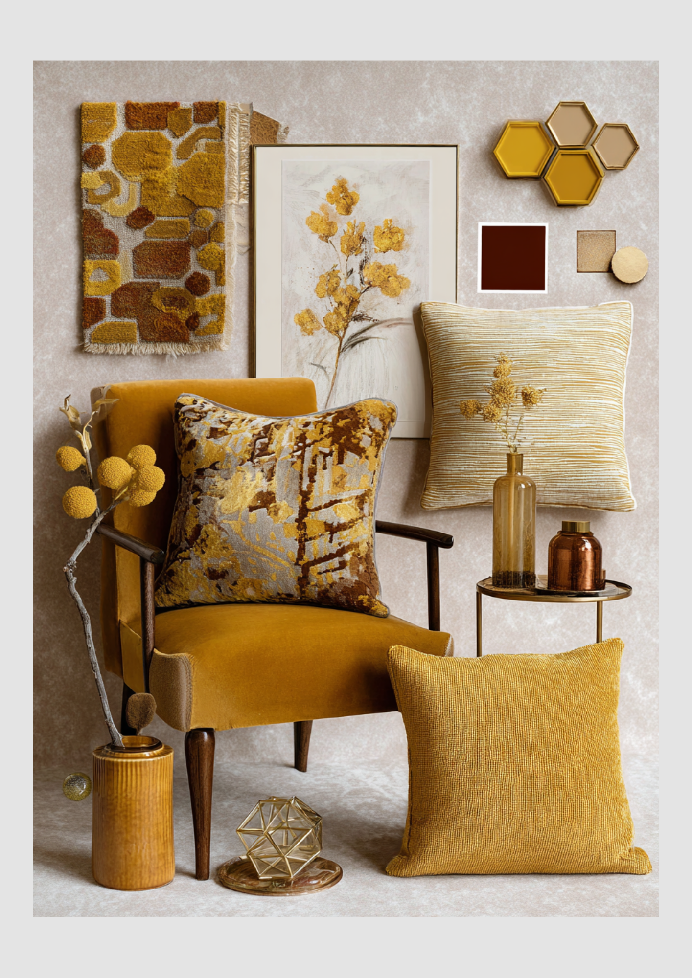
Golden Hour Indoors: Spring Loading with Rich Ochre and Honey Hues
While spring is often associated with cool pastels, there is a warmer, more sophisticated side to the season of renewal. This year, we are seeing a move toward "Sun-Drenched Interiors"—a trend that swaps icy whites for the glow of honey yellows, deep ochres, and radiant golds.
If you love a home that feels like a warm embrace, here is how to load your interior with these cozy, high-end spring accents.
The Palette: Liquid Sunshine
Spring 2025 is leaning into "Butter Yellow" as a base, but for a truly "loading" look, we are layering it with deeper, richer tones to create dimension.
Honey Yellow: The "sweet spot" between bright lemon and dark mustard. It feels fresh for spring but carries a cozy weight.
Rich Ochre: An earthy, grounded yellow that connects your indoor space to the natural world outside.
Gleaming Gold: Not just for the holidays! In spring, gold acts as a reflector, catching the increasing natural light and bouncing it around the room.
1. The Velvet Touch
Velvet is often relegated to winter, but in honey and ochre tones, it becomes the ultimate spring luxury. The key is in the weight and the pairing.
The Statement Piece: A honey-yellow velvet armchair or ottoman acts as a "sunlight anchor" in a room with neutral walls.
Spring Layering: Pair your rich velvet pillows with breathable linen or lightweight cotton throws. This contrast keeps the velvet from feeling too "heavy" for the rising temperatures.
Light-Reflecting Texture: Velvet has a natural sheen that changes as the spring sun moves throughout the day, making your decor feel alive and "loading" in real-time.
2. Golden Accents & Warm Metals
To make your yellows feel "expensive" rather than "nursery-like," you need the right hardware.
Champagne Gold: Swap out matte black or silver for brushed gold or brass. A gold-framed mirror or a set of brass candlesticks instantly elevates ochre textiles.
Ochre Ceramics: Use "terracotta-adjacent" ochre vases. The matte, earthy texture of clay balances the shimmer of gold and the plushness of velvet.
3. Styling the "Sun-Drenched" Look
The Sofa
Layer 2 Ochre Velvet cushions with 1 Cream Linen pillow for a balanced, airy look.
The Windows
Use sheer curtains in a very pale "Butter" hue to tint the incoming sunlight with warmth.
The Table
A gold-toned tray with honey-colored glass tumblers and fresh white daisies.
The Walls
Gold-leaf frames or botanical prints featuring yellow wildflowers.
The "Gothic Spring" Reveal: Saturated Deep Blues, Forest Greens, and Burgundy
Spring doesn’t always have to be a cloud of pastels. This season, a new aesthetic is "loading" in the design world: The Saturated Spring. It’s a rebellion against the typical washed-out palette, favoring the deep, moody colors of a forest floor at dawn or the ink-blue sky before a spring rain.
By layering Deep Blues, Forest Greens, and Rich Burgundies, you can create a home that feels like a lush, high-definition sanctuary. Here is how to style these "heavy" colors to feel fresh for the warmer months.
1. The Anchors: Forest Green & Inky Blue
In 2025, we are seeing a shift toward "Bio-Saturated" design. Instead of sage, we are going for Forest Green (like Benjamin Moore’s Rosepine) to mimic the dense foliage of a spring awakening.
Color Drenching: For a bold move, paint your walls, trim, and ceiling in a single shade of deep navy or forest green. This creates a "cocoon" effect that, surprisingly, makes a room feel more expansive and sophisticated.
The "Cool" Foundation: Use deep blue as your neutral. A midnight blue rug or sofa acts as a calm, cool base that allows the other colors to pop without feeling chaotic.
2. The Contrast: Transformative Burgundy
Burgundy is the unexpected hero of Spring 2025. It moves away from "winter wine" and toward "vibrant botanical" when paired correctly.
Botanical Pairings: Think of the deep red in a tulip or the heart of a peony. Pair burgundy velvet cushions with live greenery—the bright, lime-green of new plant growth creates a "high-voltage" contrast against the dark red.
Lighter Transitions: To keep burgundy from feeling too autumnal, pair it with Chalky Lilac or Blush Pink. This softens the edge and firmly roots the color in the spring season.
3. Texture & Light: The Secret to Depth
Saturated colors can absorb light, so the "Spring" version of this look relies on luster and reflection.
Silk & Satin
Reflects light off deep blues, making them look like water.
Polished Brass
Provides a "jewelry" effect against forest green walls.
Glass & Crystal
Clear accessories prevent saturated rooms from feeling "heavy."
Light Woods
A blonde oak table provides a "visual break" from a burgundy rug.
Country chic
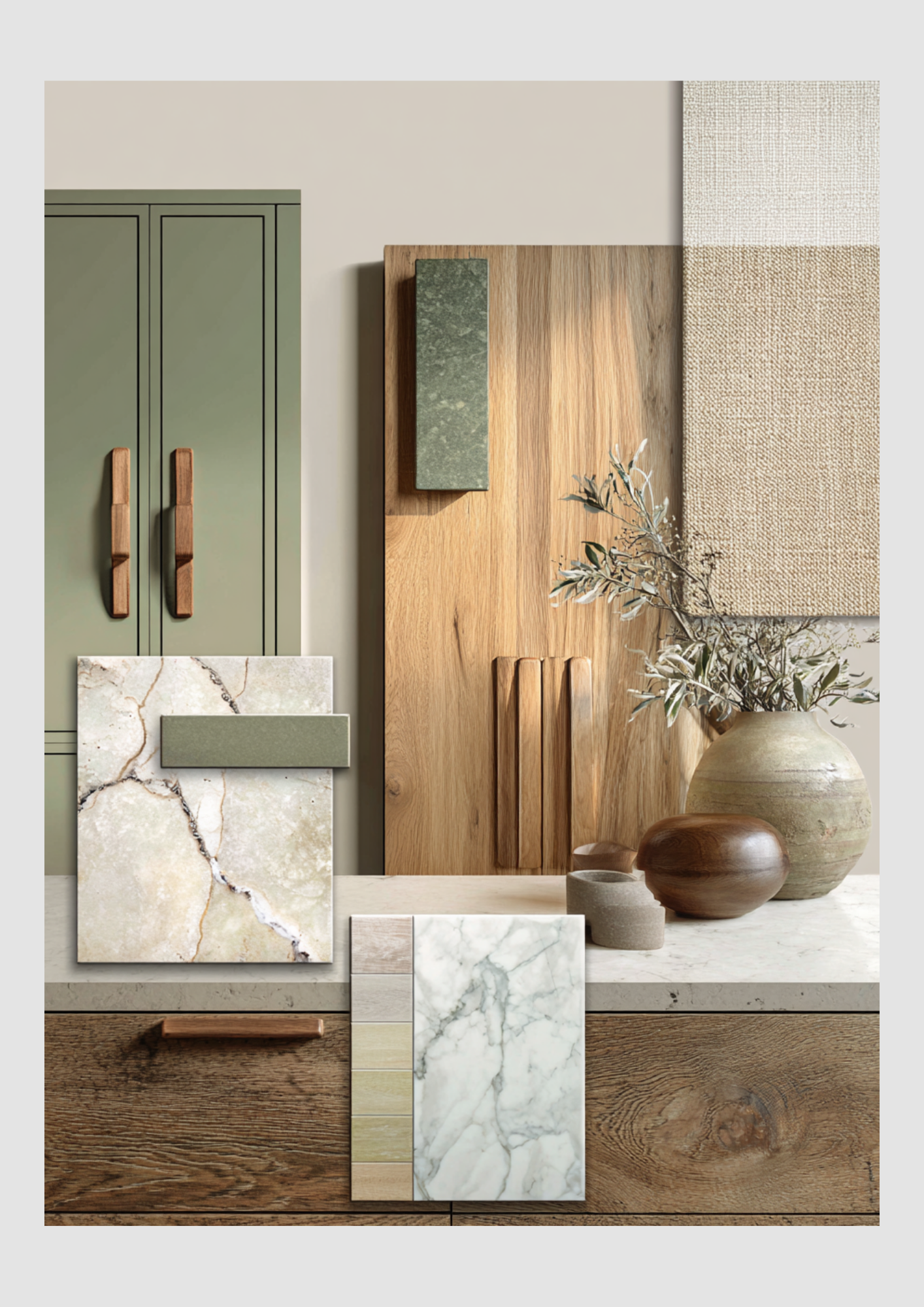
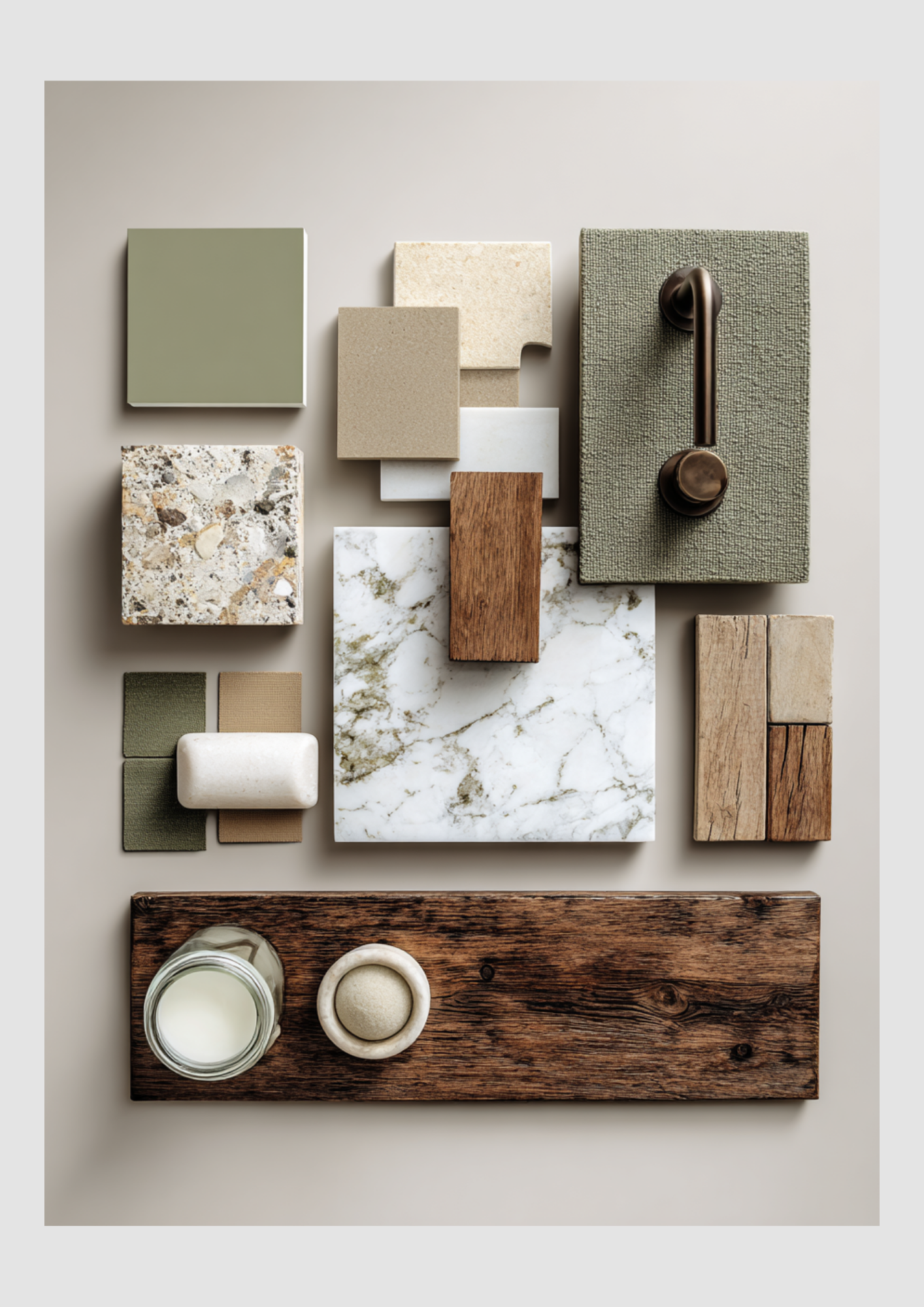
Looking to infuse your home with a sense of calm, natural elegance, and cozy country charm? We've distilled the perfect palette using sage green, rich woods, creamy neutrals, and luxurious marble to transform your kitchen, bedroom, living room, and bathroom into tranquil retreats.
This design style leans heavily on texture and organic materials, creating spaces that feel both grounded and refined.
A Mood Board Guide to Naturally Elegant Home Design
Looking to infuse your home with a sense of calm, natural elegance, and cozy country charm? We've distilled the perfect palette using sage green, rich woods, creamy neutrals, and luxurious marble to transform your kitchen, bedroom, living room, and bathroom into tranquil retreats.
This design style leans heavily on texture and organic materials, creating spaces that feel both grounded and refined.
The Heart of the Home: Country Kitchen Inspiration
Inspired by the mood board, the country kitchen embraces color and texture for a timeless look.
Key Elements:
Sage Green Cabinetry: Using this muted green on cabinet fronts offers a beautiful, unexpected pop of color that still feels neutral and earthy. It's a soft, welcoming alternative to classic white or gray.
Rich Wood Accents: Integrate warm oak or walnut for drawer fronts and handles to ground the design. The contrast between the dark wood and the pale green is striking.
Luxurious Countertops: Veined marble provides a sophisticated contrast to the rustic wood. Look for warm-toned marbling (beige, gold, or brown veins) to keep the feel inviting, rather than cold.
Natural Textures: Incorporate linen or burlap textures through window treatments or simple cloth accessories for an authentic, handcrafted feel.
Design Tip: Don't forget functional décor! A simple ceramic vase with olive branches brings the outdoors in, tying the whole look together.
A Sanctuary of Serenity: Country Bathroom Design
The bathroom mood board highlights the blend of rustic hardware and polished materials for a spa-like experience.
Key Elements:
Earthy Color Palette: A soft, neutral beige wall color serves as the backdrop, allowing the sage and wood tones to shine.
Mixed Materials: Combine the soft, matte sage green with a speckled, earthy tile (perhaps for the floor or a shower accent) and a creamy, polished marble for the vanity countertop.
Warm Wood Shelving: Use a slab of thick, rustic wood for open shelving to hold linens and bath essentials. This adds an immediate sense of country warmth.
Vintage Hardware: Choose hardware in an aged brass or bronze finish for pulls and fixtures. This simple detail elevates the space and reinforces the country aesthetic.
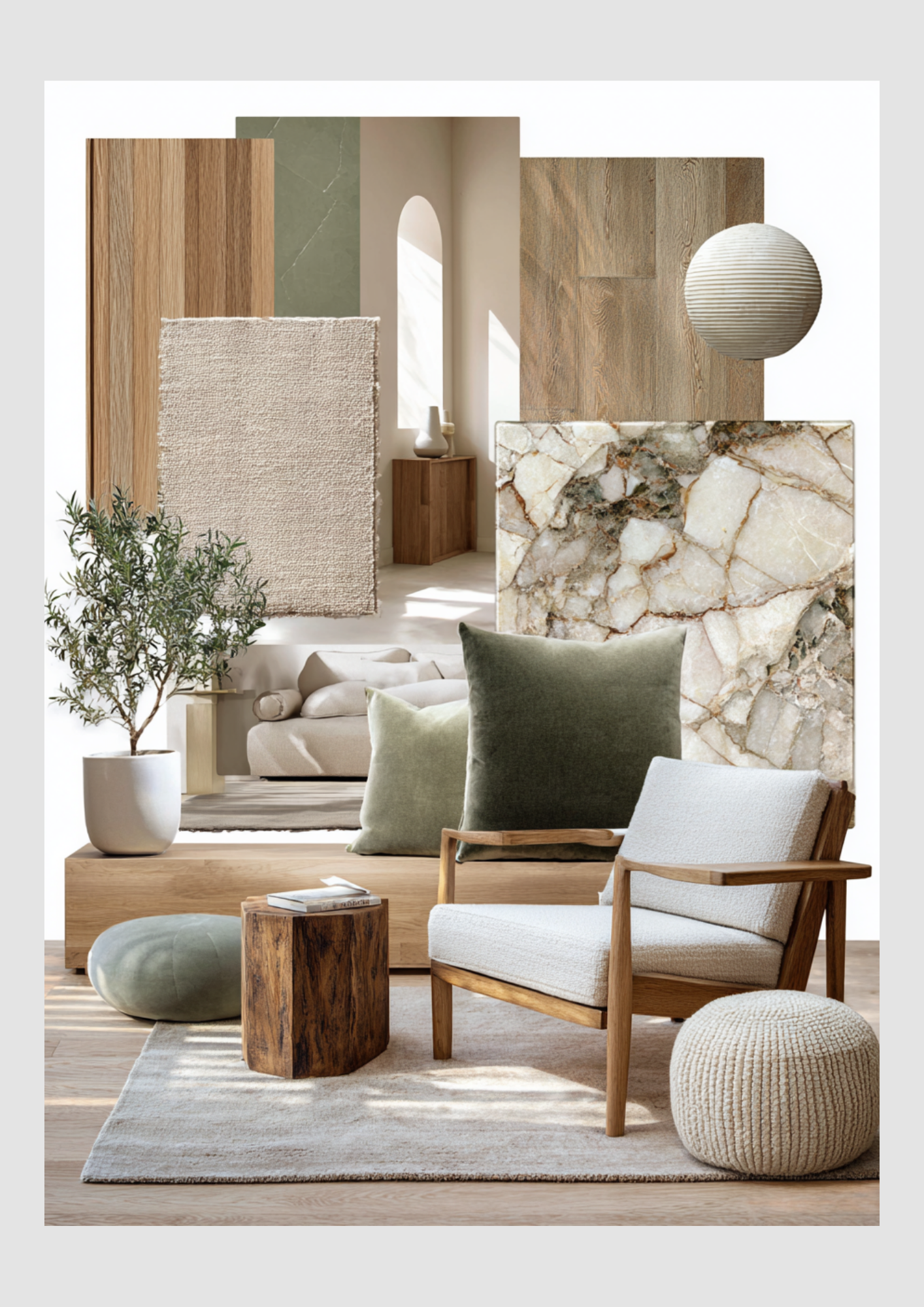
Relaxed and Refined: Country Living Room Style
The living room is all about comfort and layering natural textures while maintaining an airy, light-filled space.
Key Elements:
Layered Neutrals: Start with a base of cream or beige for larger pieces like the sofa and rugs. The rug texture should be tactile, like a chunky wool or jute.
Oversized Green Accents: Introduce sage green through large, plush velvet or textured pillows to add depth and a touch of luxury.
Minimalist Wood Furniture: Select clean-lined, modern wooden armchairs and natural stump side tables. The wood adds warmth without making the room feel heavy.
Bring in Nature: Accessorize with real or preserved olive or rosemary plants. They enhance the green palette and add life to the room.
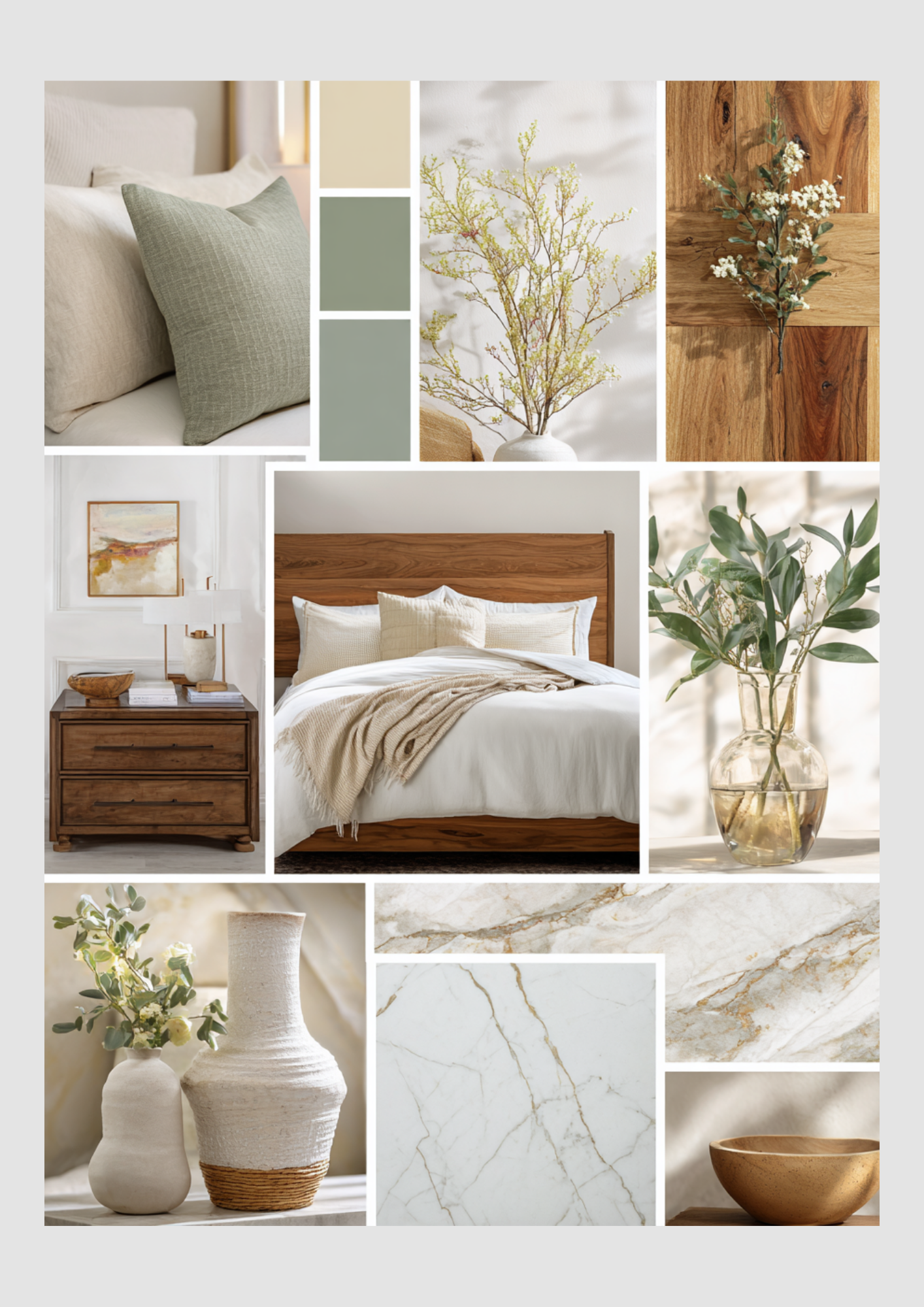
Sweet Dreams: Country Bedroom Retreat
The bedroom mood board focuses on creating a cozy, restful haven using softness and subtle color.
Key Elements:
Warm Wood Bed Frame: A classic wooden headboard is the anchor, lending a timeless, sturdy feel.
Crisp, Creamy Bedding: Keep the primary bedding white or cream, then layer on soft textured throws and light sage-colored pillows. The focus is on tactile comfort.
Organic Wall Art: Choose artwork with abstract landscapes or soft, muted colors (like pale oranges and blues) that complement the natural tones.
Decorative Marble Accents: Instead of using large slabs, incorporate marble on smaller surfaces, such as a nightstand top or a decorative tray, to add a touch of subtle sheen and elegance.
By consistently applying this palette of beige, sage green, and natural wood, and mixing materials like marble, linen, and aged metal, you can achieve a cohesive, beautifully textured, and sophisticated country style throughout your entire home.

The holidays are coming
As the year draws to a close, I want to take a moment to thank you for the past year. Thank you for your support, your trust, and for following along. I am thrilled to let you know that I will be ready for you again (both online and in person) in 2026!
To show my appreciation, I have a special present for you to download!
As the year draws to a close, I want to take a moment to thank you for the past year. Thank you for your support, your trust, and for following along. I am thrilled to let you know that I will be ready for you again (both online and in person) in 2026!
To show my appreciation, I have a special present for you to download! You can find it right here:
I've been keeping busy in the meantime; I've already started a new educational course focusing on Home Staging. And I am already fully focused on the new year as well!
Starting in January, I will gradually begin to shift focus towards the spring. The trends for the upcoming season are shaping up to be truly interesting and unique, so we need to get ahead of the curve!
For my art prints, many new themes are already in the pipeline. And I truly cannot wait to start developing these! There are some fun surprises in store, but as you've come to expect, the themes will always have a connection to real estate and/or interior/exterior design. Another great reason to keep an eye on the website and subscribe to my newsletter if you haven't already!
My calendar for early 2026 is also starting to fill up nicely with inspiring assignments. What's exciting is the variety! I'll be doing real estate photography, but also assignments for interior design, and even a large, beautiful project for a new construction development! I am incredibly excited for it all.
But first, the holidays, of course!
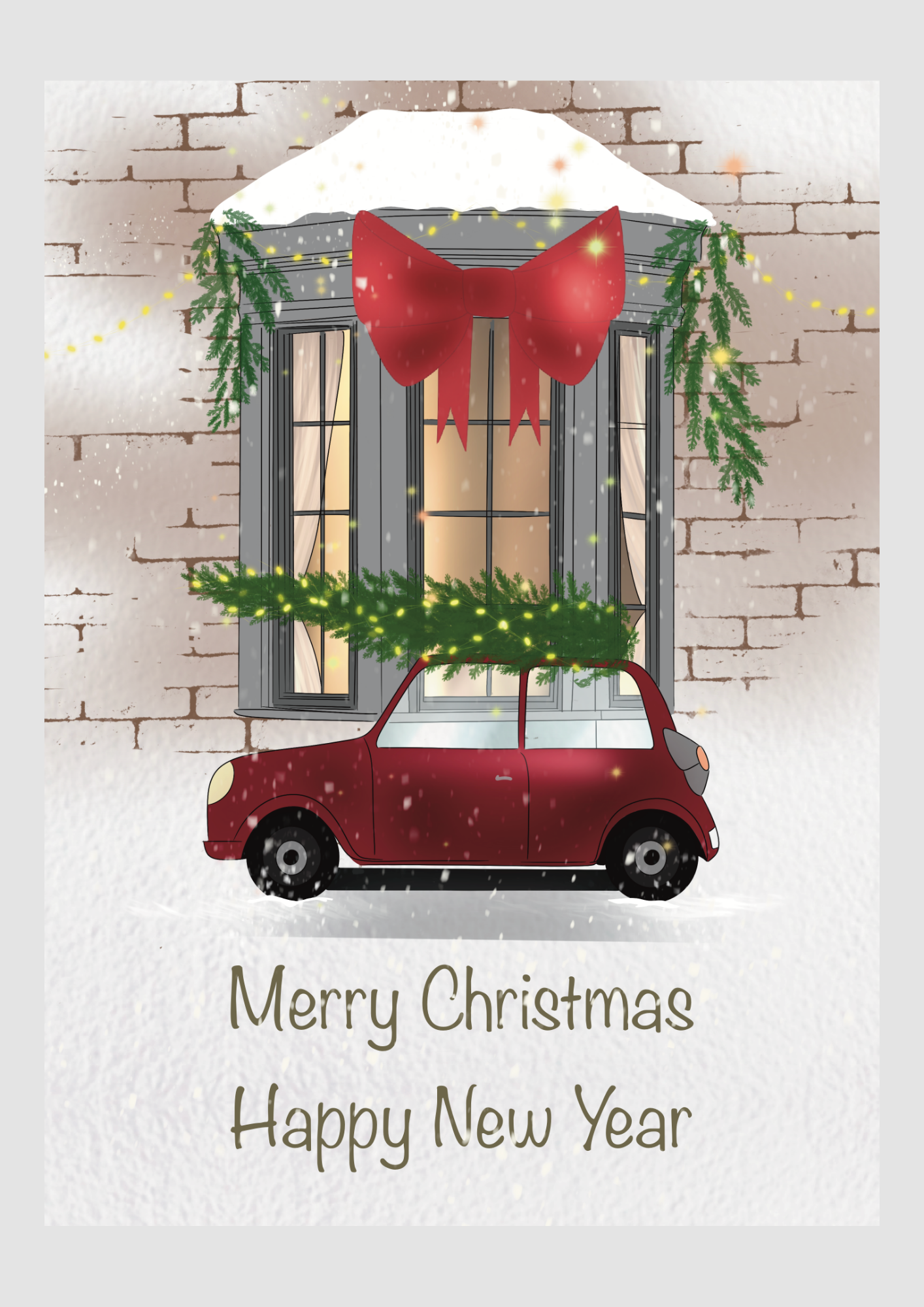
Wishing you a truly beautiful Christmas and New Year celebration, and a very healthy 2026!

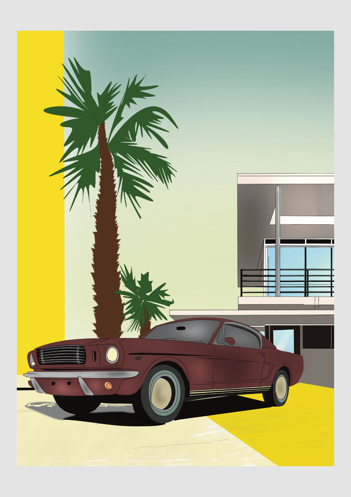
Drive into Luxury
Our New Real Estate & Automotive Art Print Collection – Inspired by Your Favorite Netflix Series
Welcome to our latest collection, where the allure of stunning real estate meets the elegance of classic automobiles! If you're anything like us, you've been captivated by the opulent homes and lavish lifestyles showcased in hit Netflix series like Selling Sunset, Selling Tampa, Owning Manhattan, and Buying Beverly Hills. The grand architecture, the breathtaking interiors, and of course, the gleaming luxury cars parked out front – they all paint a picture of a dream life.

We've channeled that inspiration into our exclusive new series of four art prints, designed to bring a touch of that high-end glamour into your home or office. Each piece in this collection celebrates the sophisticated synergy between magnificent properties and iconic vehicles, echoing the aspirational aesthetics seen on screen.

Imagine the sleek lines of a vintage car perfectly complementing a grand mansion, or a stylish ride adding a dash of character to an urban brownstone. Our artists have meticulously crafted these scenes to evoke the same sense of aspiration and beauty that draws us to these shows.

Whether you're a real estate enthusiast, a car lover, or simply appreciate fine art that tells a story of modern luxury, this collection is for you. Explore all four prints and find the perfect piece to elevate your space and fuel your dreams!

The Secret Ingredient to a Great Meal? Happiness!
We all know the feeling: you walk into a restaurant, the aroma hits you, the chatter of excited voices fills the air, and suddenly, your mood lifts. But what truly makes a dining experience memorable? Is it just the food, or is there a more elusive ingredient at play? I believe it's happiness!
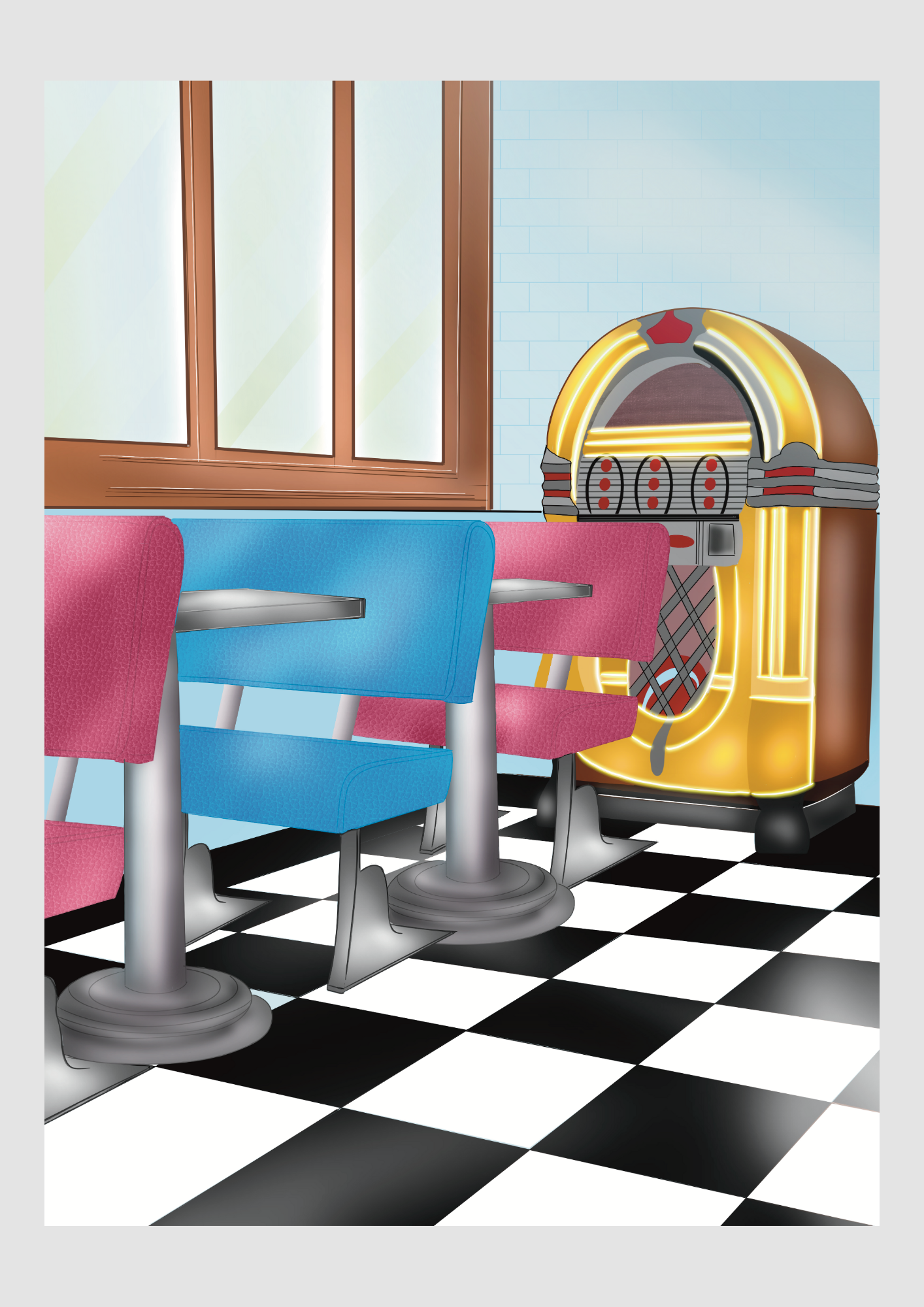
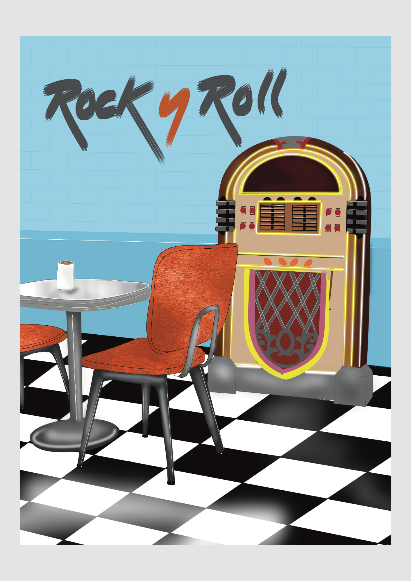
You know those classic, authentic American diners, don't you? The ones decked out in vibrant colors, featuring plush, comfortable booths and a jukebox placed centrally for everyone to enjoy? That whole vibe has genuinely inspired me to develop a new series of designs for interior posters!
We all know the feeling: you walk into a restaurant, the aroma hits you, the chatter of excited voices fills the air, and suddenly, your mood lifts. But what truly makes a dining experience memorable? Is it just the food, or is there a more elusive ingredient at play? I believe it's happiness!
You know those classic, authentic American diners, don't you? The ones decked out in vibrant colors, featuring plush, comfortable booths and a jukebox placed centrally for everyone to enjoy? That whole vibe has genuinely inspired me to develop a new series of designs for interior posters!
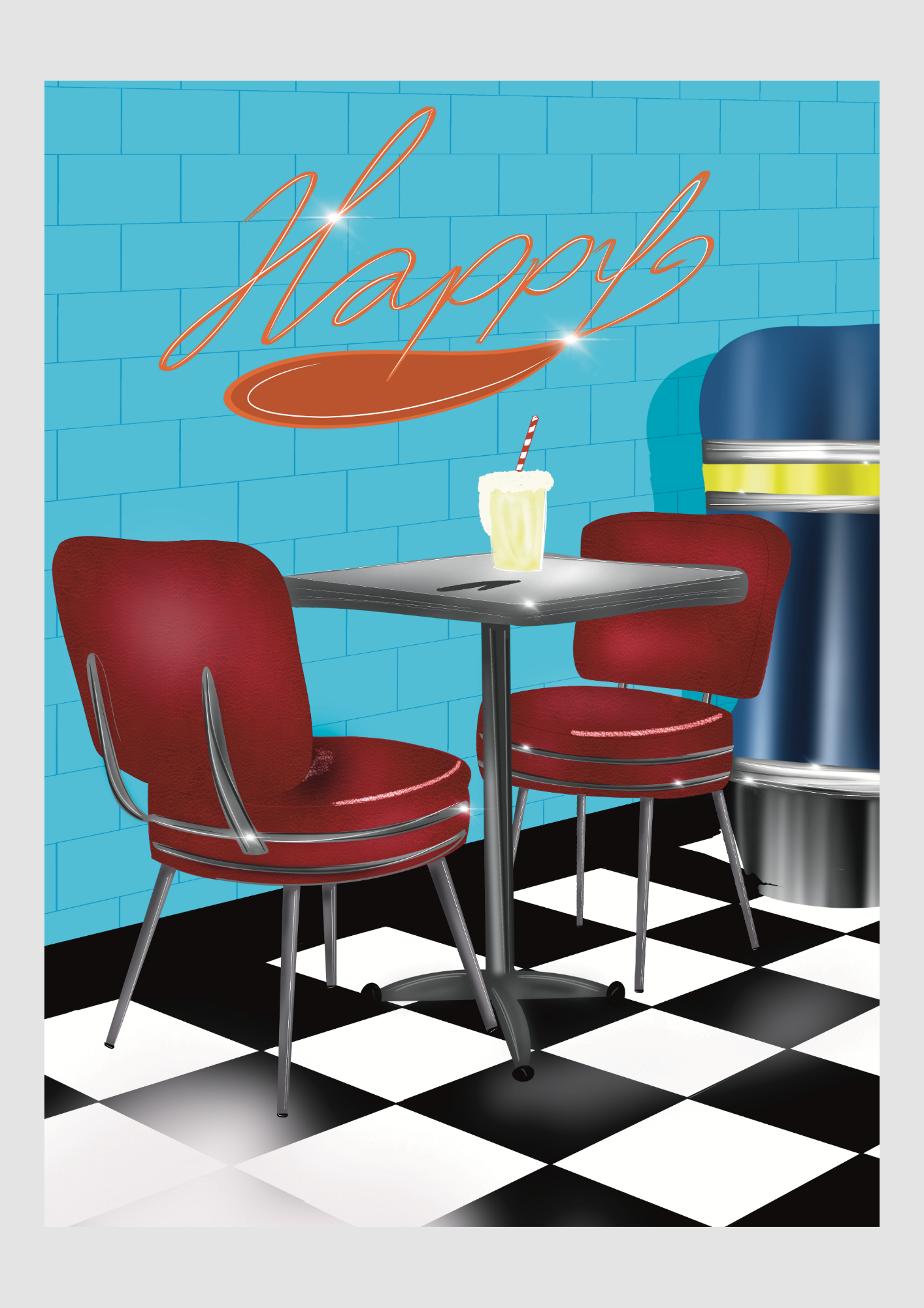
In many of these restaurants, they're passionate about creating an atmosphere where joy is served alongside every dish. When diners are happy, everything tastes better, conversations flow more easily, and memories are truly made.
So, what goes into cultivating this joyful dining experience?
A Warm Welcome:
It starts the moment you step through the doors. A genuine smile, a friendly greeting, and a readiness to make you feel right at home are paramount. The feeling that you're visiting old friends.
Comfort and Ambiance:
The interiors are designed to be an extension of that warmth. Comfortable seating, inviting lighting, and a thoughtfully curated decor set the stage for relaxation and enjoyment. A pleasant environment enhances the entire meal.
Food Made with Love:
Of course, the food is central! The chefs pour their heart and soul into every plate, using fresh, high-quality ingredients to create dishes that delight the palate. When food is prepared with care, you can taste the difference.
Attentive, Joyful Service:
The team isn't just serving food; they're serving experiences. They're knowledgeable about the menu, attentive to your needs, and genuinely enjoy making your visit special. Their happiness is contagious!
The Buzz of Good Times:
There's nothing quite like the sound of happy chatter, laughter, and clinking glasses. A restaurant filled with people enjoying themselves, celebrating milestones, or simply savoring a delicious meal in good company.

So, the term 'Happy Diner' is more than just a name! Soak up the ambiance and order the posters in my webshop.

Your 2025 Christmas Decor Trends & Styling Guide!
Christmas is just around the corner! And as an interior designer, my head is absolutely buzzing with delightful ideas. I'd love to share them with you to spark inspiration for your holiday decorations this year.
Depending on your taste, you can choose from a range of different styles. Here are the most striking trends and general styling concepts for bringing Christmas cheer into your home's interior:

Christmas Trends 2025: Style & Color
This year offers diverse aesthetics, ranging from the truly glamorous to the beautifully rustic.

1. Palazzo Chic / All That Jazz (Glamorous & Luxe)
Colors: Rich and deep, such as gold, aubergine, burgundy, deep black, mother-of-pearl, and vintage rose.
Materials: Velvet, silk, glass, metal, crystal, and marble. Think Baroque-style baubles, ornate candlesticks, and decorations reminiscent of the roaring Twenties. It's time to indulge in opulence!

2. Cosy Time (Restful & Natural)
Colors: Soft and earthy: off-white, rosemary green, matcha green, peach, and brandy tones.
Materials: Wood, wool, cotton, felt, jute, and plush. Focus on soft candlelight, chunky knit throws, and handmade decorations for a snug, Scandinavian-inspired look.

3. Winter Garden / Amber Forest (Natural & Classic)
Colors: Traditional red, fir green, and gold, complemented by sage green, light blue, and copper.
Decor: Bring the outdoors in! Use leaf motifs, fruits, mushrooms, and branches. Sage green combines beautifully with light wood tones, creating an elegant, classic nature theme.
4. Snow Moon (Cool & Modern)
Colors: Icy blue, silver, white, and grey.
Atmosphere: A serene, minimalist beauty achieved with plenty of shine, reflection, and materials like glass, acrylic, and mother-of-pearl. It’s the perfect look for a sleek, contemporary space.
General Styling Tips
Lighting is Essential!
Use string lights (micro-LED chains are perfect!) not just in the tree, but everywhere:
Jars or Vases: Fill them with lights, moss, or tinsel.
Windowsill: Place light chains, illuminated figures, miniature Christmas houses, and Poinsettia stars here.
DIY Stars/Wreaths: Adorn your homemade decorations with a delicate string of lights.
Tip: Consider LED candles for the perfect ambiance without any fire safety risks.
Create a Focal Point
Choose one element that will draw the most attention, such as:
A richly set Christmas dinner table.
A large, impressive wreath above the mantelpiece or on the wall.
An imposing vase filled with winter branches and ornaments.
Let the rest of your styling subtly complement this central piece.
Work with Texture and Contrast
Combine shiny materials (metallic, glitter, glass) with matte textures (felt, ceramic, linen) for more depth and visual tension in your decorations.
Scent Completes the Vibe
Finish the atmosphere with scented candles or diffusers featuring winter aromas like pine, cinnamon, or orange. Fresh eucalyptus or pine branches also provide a wonderful, natural fragrance.
Play with Height
Vary the height in your displays by using candles in different sizes or by combining tall vases with low bowls filled with baubles.
Which of these styles or ideas appeals to you the most? Let me know, and I can give you more specific tips!

How to Create Depth and Drama in Your Holiday Decor
The secret to truly dynamic and visually engaging Christmas decor isn't just about selecting beautiful items—it's about how those items interact. By masterfully applying texture and contrast, you can transform a nice display into a stunning, layered masterpiece.
Here are detailed tips on how to effectively use texture and contrast in your holiday styling:
1. Contrast in Materials: The Touch Factor
Always combine different finishes to create visual tension. Think of it as a conversation between materials: soft meets hard, and rough meets smooth.
On the Sofa:
Fleece, wool, chunky knit throws, linen cushions. (Velvet reflects light subtly and can bridge both.) Velvet cushions with a sheen, pillows with metallic embroidery or beads.
In the Tree:
Wooden ornaments, paper stars, matte glass baubles, felt figures.
Glossy/metallic baubles, miniature mirrors, crystal garlands.
Table Setting:
Linen table runners, matte ceramic bowls, moss, cotton napkins.
Glass candlesticks, gold cutlery, polished silver accents, crystal glassware.
General Decor:
Pine branches, pinecones, raw wood, twine, burlap (jute).
Glass, mirrored surfaces, brass, copper, aluminum.
Example: Drape a coarsely knitted (matte, soft) throw over the back of your sofa and combine it with a few cushions made of glossy velvet or featuring metallic embroidery. This simple pairing instantly elevates the sensory experience of the space.
2. Contrast in Color and Tone: The Visual Pop
Even if you prefer a minimalist style, you can create contrast by playing with the intensity and temperature of your colors.
Warm vs. Cool:
Combine the warm, deep red of winter berries with the cool, icy blue of silver glitter. Or pair warm gold tones with cool, deep moss green.
Dark vs. Light:
Use dark, matte green baubles next to mother-of-pearl white or translucent ornaments. A dark wooden table beautifully anchors a light, white runner, making the tabletop pop.
3. Contrast in Scale and Shape: Dynamic Displays
Playing with the size and form of your decor adds dynamism and interest to any arrangement.
Large vs. Small:
Pair a large, dominant focal point (an XL wreath or an immense vase) with a grouping of three or five smaller, delicate items (like tiny glass candles or bird ornaments). The oversized element draws the eye, while the small pieces add charm and detail.
Round vs. Angular:
Combine the soft, round shape of traditional baubles with the sharp, geometric lines of modern, metal stars or cube-shaped candles. This juxtaposition keeps the look fresh and contemporary.
4. Texture in Lighting: Light is a Material
Don't forget that light itself is a texture! The way light is dispersed or reflected creates its own layer of contrast.
Sharp vs. Diffuse:
Combine the sharp, bright reflection of a mirror or highly polished surface with the soft, diffuse glow coming from a frosted glass lantern or a lamp with a fabric shade.
Light Source Sheen:
Consider the light temperature. LED candles or warm-white string lights provide a softer, gentler glow, while cold, bluish lights offer an icy contrast, perfect for a Snow Moon theme.

Color palette
Now that we know how to use texture and contrast, let’s talk about what colors to use! Choosing a cohesive color palette is the foundation of brilliant holiday styling. It sets the mood and guides your material choices.
Below you’ll find the most popular Christmas color palettes for this year (2025), combined with suggestions for complementary textures and contrasts to make your look truly professional.
Palette 1: Modern & Serene (Cosy Time / Nordic Noel)
This palette is inspired by nature, tranquility, and the ever-popular Scandinavian style. It’s all about softness and light, creating a restorative space.
Cream / Warm White:
Wool throws, teddy cushions, linen table runners, matte ceramics.
Mother-of-pearl baubles, glossy white enamel, white lighting.
Peaceful, light, airy.
Sage / Moss Green:
Dried eucalyptus, felt, moss, soft (faux) pine branches.
Antique bronze ornaments, copper bowls, ribbed glass.
Natural, earthy, refined.
Wood Tones / Brandy:
Untreated wood, rattan, jute, wicker, cinnamon sticks.
Warm gold, amber-colored glass, brass candlesticks.
Warm, cozy, rustic.
Contrast Tip: The inherent softness and texture of a cream-colored wool throw contrasts perfectly with the cool, reflective shine of a copper bowl filled with matte pinecones.
Palette 2: Luxury & Glamour (Palazzo Chic / All That Jazz)
This palette is all about richness, depth, and a touch of drama. It’s festive, decadent, and meant to make a statement.
Burgundy / Aubergine:
Velvet, silk ribbons, silky wallpaper.
Glossy burgundy baubles, dark red crystals, polished mahogany wood.
Elegant, deep, regal.
Deep Green (Emerald):
Velvety green cushions, thick pine boughs, green stained-glass ornaments.
Bronze, gold (especially antique gold), dark mirrored glass.
Statement, classic, opulent.
Mother-of-Pearl / Gold :
Woven metallic thread, fine glitter, shiny satin.
High-gloss gold candlesticks, mirror elements, glass bead garlands.
Festive, bright, luxurious.
Contrast Tip: Combine a matte dark blue (or deep green) velvet cushion with a detail featuring shiny gold braid (texture). The matte and glossy finishes create a chic, highly layered effect.
Palette 3: Cool & Modern (Snow Moon)
Ideal for a sleek, fresh, and ultra-wintery interior. This palette relies on crispness and the play between reflection and shadow.
Icy Blue / Lavender:
Faux fur, soft teddy fabric, felt.
Iridescent (rainbow sheen) glass, cool silver, clear acrylic.
Fresh, modern, serene.
White / Light Grey:
Flocked (snowy) branches, chunky knits, white feathers.
High-gloss white lacquer, transparent glass, silver glitter.
Pure, wintery, minimalist.
Silver:
Brushed metal, silver tinsel (lametta).
Smooth, high-shine silver baubles, cut glass.
Dazzling, sleek, icy.
Contrast Tip: The soft, fluffy texture of a white faux fur rug or boa contrasts dramatically with the sleek, polished shape of a modern silver lantern.
Which palette speaks to you the most for further planning of your decorations, textures, and contrasts? Let me know, and we can start bringing that vision to life!

The Eclectic Christmas Challenge: How to Mix All Three Palettes for Rich, Layered Decor
So, you love the cozy warmth of Nordic Noel, the deep drama of Palazzo Chic, and the crisp modern feel of Snow Moon? Excellent! The ultimate challenge is combining elements from all three palettes. This results in an eclectic, yet incredibly rich and layered Christmas atmosphere—provided you find the right balance.
The secret is to choose one of the three palettes as your foundation and use the other two for targeted accents and dynamic contrasts. This creates a cohesive look that still offers delightful surprises.
Here is an example of how you can bring all three styles together, with a keen focus on texture and contrast:
The Grand Christmas Palette: Eclectic Harmony
We will use Palette 1 (Nordic Noel) as the base for its essential warmth, and then strategically add glamour (Palette 2) and freshness (Palette 3).
Base (P1: Nordic)
Warm White / Wood
Chunky knit, wool, linen, raw wood.
Area rug, throws, basic cushions, tree skirt/basket. (The foundational warmth)
Base (P1: Nordic)
Moss & Sage Green
Dried branches, moss, matte ceramics.
Wreaths, planters, dinnerware.
Glimmer (P2: Glamour)
Burgundy / Gold
Glossy velvet, satin, polished brass.
Accent cushions, ribbons in the tree, candlesticks. (The statement piece)
Freshness (P3: Modern)
Silver / Icy Blue
Clear glass, bright silver, smooth acrylic.
Delicate glassware, small ornaments, vase filler. (The crisp accent)
Application: Three Texture-Contrast Tips
This is where the magic happens—blending the materials from different worlds:
1. The Living Room Contrast: Soft vs. Hard (P1 + P2)
Start with the soft, neutral base (P1): Lay down a thick wool (rough texture) rug and drape a chunky knit (matte texture) throw over the sofa.
Add the glamorous contrast (P2): Introduce a couple of velvet (soft, reflective texture) cushions in deep burgundy or emerald green.
Place the third element: Set a polished brass (hard, reflective, P2) candlestick on a rough, wooden (matte, P1) side table. Result: A cozy space with sudden, luxurious focal points.
2. The Christmas Tree Contrast: Matte vs. Shine (P1 + P3)
Choose a majority of matte baubles (P1) in neutral tones (warm white, sage green) or ornaments made from paper/wood (P1). This grounds the tree.
Use smaller accents from the other palettes for contrast:
Depth (P2): Hang a few large, glossy dark red baubles for a dramatic statement.
Freshness (P3): Add icy, translucent ornaments or a silver bead garland to highlight the darker P2 colors and add sparkle.
3. The Table Contrast: Natural vs. Sleek (P1 + P3)
Create a natural base (P1): Use a linen table runner or a rough wooden platter filled with moss and pinecones.
Add the sleek, icy contrast (P3): Use tall, slender silver cutlery and clear, smooth glass wine glasses.
The combination of the rough P1 textures with the smooth P3 glassware creates a highly sophisticated and dynamic table setting.
Now, would you like to plan a specific space, such as the dining table or the entryway, using these three blended palettes?