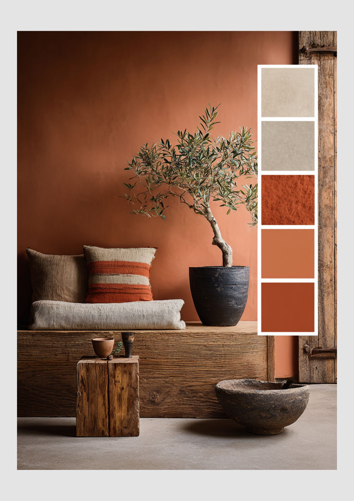
Spring is Loading in Interior Design
Refresh Your Space
As the days grow longer and the first buds begin to peek through the frost, there’s a distinct shift in the air. We aren't just feeling it outside—we’re feeling it in our homes. Spring is officially loading, and it’s time to transition our interiors from the heavy, cozy layers of winter to something much more breathable and vibrant.
If you’re ready to shake off the "winter blues" and invite the season of renewal into your living space, here is how to get your home "Spring-ready."
1. The Palette Shift: From Moody to Airy
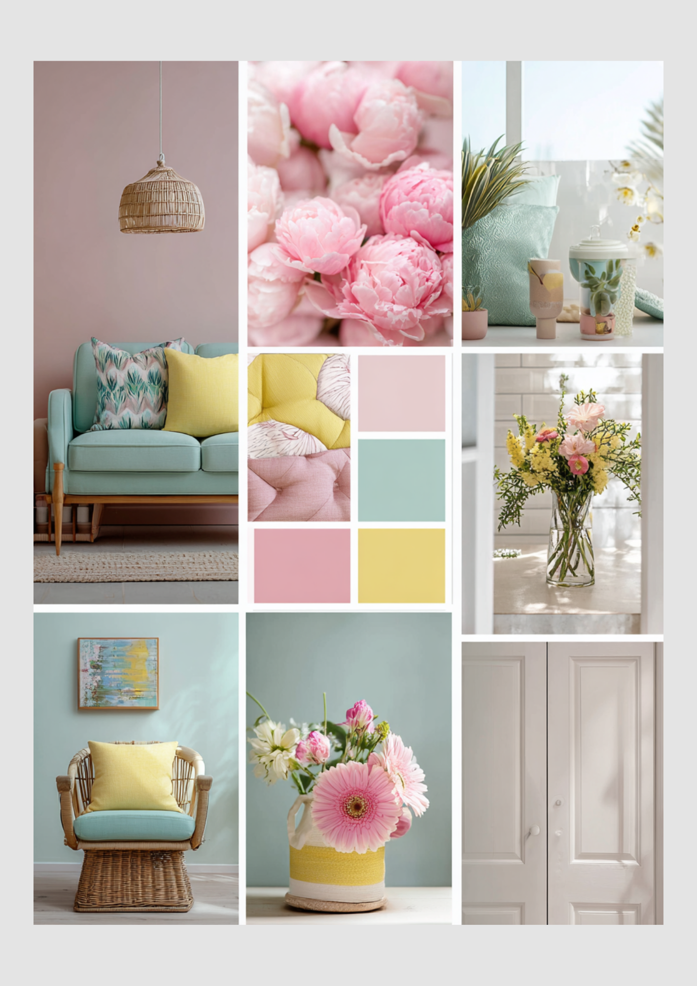
Winter is all about deep charcoals, forest greens, and navy. Spring, however, demands a lighter touch. You don't need to repaint your whole house to see a difference.
Pastel Accents: Introduce soft sages, butter yellows, and blush pinks through throw pillows and blankets.
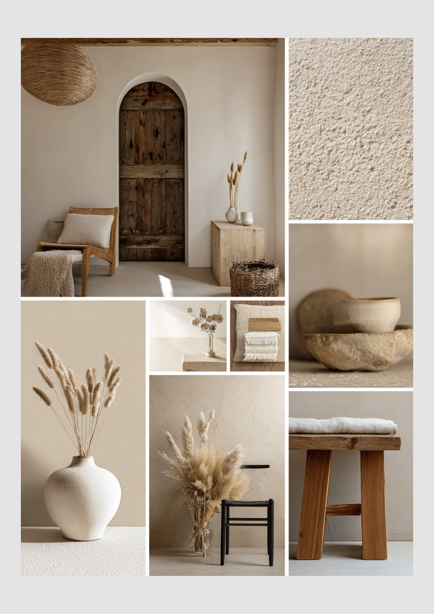
Warm Neutrals: Swap out heavy grey tones for creamy whites and sandy beiges to reflect more natural light.
The "Pop" of Green: Incorporate "Digital Lavender" or "Neo-Mint"—the trendy shades making waves in 2024-2025.
2. Texture Transition
It’s time to pack away the chunky wool knits and faux furs. Spring interior design is all about breathability.
Out with the Old (Winter)
Velvet & Wool
Heavy Blackout Curtains
Dark Wood Accents
Faux Fur Throws
In with the New (Spring)
Linen & Cotton
Sheer, Flowy Drapes
Light Oak or Rattan
Lightweight Waffle Weave
3. Bring the Outside In (Biophilic Design)
The core of spring is growth. Biophilic design—the practice of connecting your indoor space to the natural world—is the most effective way to make your home feel "loaded" with spring energy.
The "Hero" Plant: Invest in a large Monstera or an Olive Tree to act as a living sculpture in your living room.
Seasonal Florals: Nothing says spring like a vase of fresh tulips, daffodils, or eucalyptus on the dining table.
Natural Materials: Use stone, clay, and untreated wood to ground your rooms in an earthy, organic feel.
4. Let the Light Lead
Now that the sun is finally sticking around past 5:00 PM, maximize it!
Mirror Magic: Place a large mirror opposite a window to bounce sunlight into the darker corners of the room.
Clear the Sills: Remove heavy objects from windowsills to allow as much unobstructed light as possible to filter in.
Pro Tip: "Spring Cleaning" isn't just a chore; it’s a design strategy. Decluttering your surfaces creates "visual breathing room," which is essential for that breezy spring aesthetic.
Electrify Your Space with Bold Blue and Transformative Teal
As the winter frost fades, a new energy is emerging in the world of interior design. This year, we aren’t just looking for "soft and subtle"—we’re looking for impact. Spring 2025 is all about the "loading" phase: the transition from quiet hibernation to high-definition vibrancy.
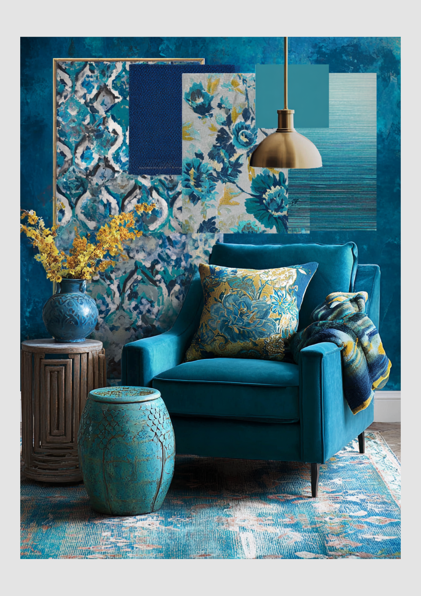
While pastels will always have their place, the real stars of the season are Electric Blue and Transformative Teal. These aren't just colors; they are moods. One provides a jolt of modern energy, while the other offers a sophisticated, grounding depth.
Here is how to master this high-contrast duo for your spring refresh.
The Color Profile: Why These Two?
Electric Blue: This is the "high-speed internet" of colors. It’s a saturated, high-energy hue that mimics the brightness of a clear spring sky. It’s meant to stimulate creativity and wake up a tired room.
Transformative Teal: Named a "Color of the Year" for its versatility, this shade sits perfectly between blue and green. It represents renewal and balance, acting as the sophisticated anchor to the more "wild" electric blue.
1. The "Pop & Anchor" Strategy
To prevent your home from feeling like an aquarium, use the 60-30-10 rule. Use a neutral (like crisp white or warm sand) for 60% of the room, Transformative Teal for 30% (furniture or rug), and Electric Blue for that final 10% punch.
In the Living Room: A deep teal velvet sofa creates a luxurious, grounded focal point. Scatter a few electric blue geometric pillows on top to give the eye a place to "land."
In the Dining Area: Try teal upholstered chairs paired with electric blue glass vases or table runners.
2. Spring Textures: Gloss vs. Matte
Spring light is unique—it’s bright but often sharp. Play with how these colors react to the sun:
Glossy Accents: Use electric blue in high-shine finishes—think ceramic lamps, lacquered trays, or glass bowls. The gloss catches the spring sun and makes the color feel "electric."
Matte Foundations: Keep your teals matte or "toothy." Linen teal curtains or a flat-weave teal rug provide a soft, organic backdrop that keeps the room feeling "homey" rather than "clinical."
3. Complementary Pairings
Bold blues and teals thrive when they have a "friend" on the opposite side of the color wheel.
The Warm Contrast: Add touches of Terracotta or Burnt Orange. These earthy tones ground the coolness of the blues and make the "Spring" vibe feel more like a garden in bloom.
The Metallic Edge: Skip the silver this year. Warm Gold or Champagne Bronze hardware makes teal look expensive and transforms electric blue into something regal.
Quick Swap Checklist: 5 Minutes to Spring
Throw blanket:
Swap Heavy Charcoal Wool with Lightweight Teal Cotton Knit
Wall art:
Swap Dark Landscapes with Electric Blue Abstract Prints
Tabletop:
Swap Pinecones/Dried Twigs with Blue Hydrangeas or Teal Glassware
Floor:
Swap Thick Shag Rug with Jute Rug with Teal Borders
Golden Hour Indoors: Spring Loading with Rich Ochre and Honey Hues
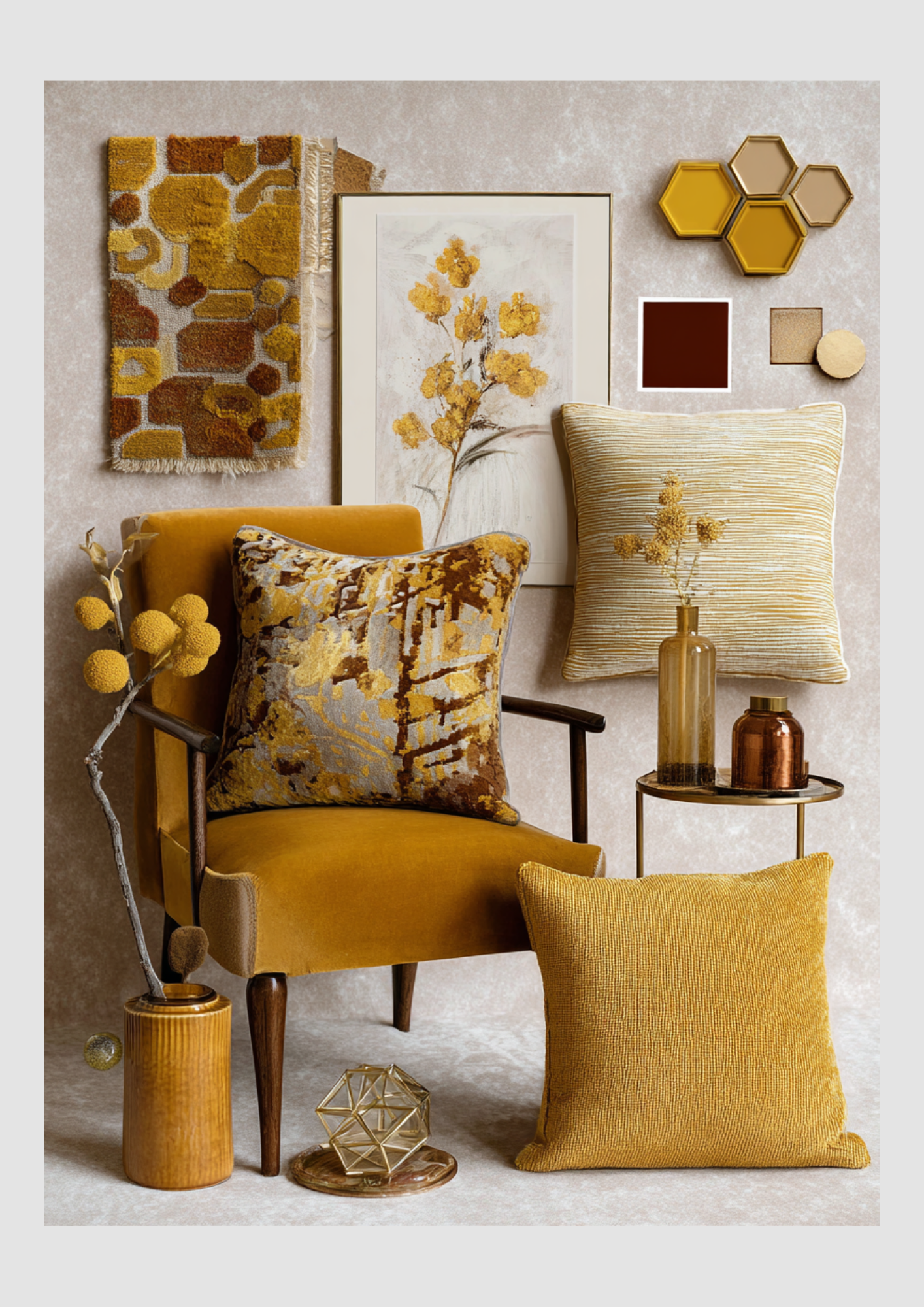
While spring is often associated with cool pastels, there is a warmer, more sophisticated side to the season of renewal. This year, we are seeing a move toward "Sun-Drenched Interiors"—a trend that swaps icy whites for the glow of honey yellows, deep ochres, and radiant golds.
If you love a home that feels like a warm embrace, here is how to load your interior with these cozy, high-end spring accents.
The Palette: Liquid Sunshine
Spring 2025 is leaning into "Butter Yellow" as a base, but for a truly "loading" look, we are layering it with deeper, richer tones to create dimension.
Honey Yellow: The "sweet spot" between bright lemon and dark mustard. It feels fresh for spring but carries a cozy weight.
Rich Ochre: An earthy, grounded yellow that connects your indoor space to the natural world outside.
Gleaming Gold: Not just for the holidays! In spring, gold acts as a reflector, catching the increasing natural light and bouncing it around the room.
1. The Velvet Touch
Velvet is often relegated to winter, but in honey and ochre tones, it becomes the ultimate spring luxury. The key is in the weight and the pairing.
The Statement Piece: A honey-yellow velvet armchair or ottoman acts as a "sunlight anchor" in a room with neutral walls.
Spring Layering: Pair your rich velvet pillows with breathable linen or lightweight cotton throws. This contrast keeps the velvet from feeling too "heavy" for the rising temperatures.
Light-Reflecting Texture: Velvet has a natural sheen that changes as the spring sun moves throughout the day, making your decor feel alive and "loading" in real-time.
2. Golden Accents & Warm Metals
To make your yellows feel "expensive" rather than "nursery-like," you need the right hardware.
Champagne Gold: Swap out matte black or silver for brushed gold or brass. A gold-framed mirror or a set of brass candlesticks instantly elevates ochre textiles.
Ochre Ceramics: Use "terracotta-adjacent" ochre vases. The matte, earthy texture of clay balances the shimmer of gold and the plushness of velvet.
3. Styling the "Sun-Drenched" Look
The Sofa
Layer 2 Ochre Velvet cushions with 1 Cream Linen pillow for a balanced, airy look.
The Windows
Use sheer curtains in a very pale "Butter" hue to tint the incoming sunlight with warmth.
The Table
A gold-toned tray with honey-colored glass tumblers and fresh white daisies.
The Walls
Gold-leaf frames or botanical prints featuring yellow wildflowers.
The "Gothic Spring" Reveal: Saturated Deep Blues, Forest Greens, and Burgundy
Spring doesn’t always have to be a cloud of pastels. This season, a new aesthetic is "loading" in the design world: The Saturated Spring. It’s a rebellion against the typical washed-out palette, favoring the deep, moody colors of a forest floor at dawn or the ink-blue sky before a spring rain.
By layering Deep Blues, Forest Greens, and Rich Burgundies, you can create a home that feels like a lush, high-definition sanctuary. Here is how to style these "heavy" colors to feel fresh for the warmer months.
1. The Anchors: Forest Green & Inky Blue
In 2025, we are seeing a shift toward "Bio-Saturated" design. Instead of sage, we are going for Forest Green (like Benjamin Moore’s Rosepine) to mimic the dense foliage of a spring awakening.
Color Drenching: For a bold move, paint your walls, trim, and ceiling in a single shade of deep navy or forest green. This creates a "cocoon" effect that, surprisingly, makes a room feel more expansive and sophisticated.
The "Cool" Foundation: Use deep blue as your neutral. A midnight blue rug or sofa acts as a calm, cool base that allows the other colors to pop without feeling chaotic.
2. The Contrast: Transformative Burgundy
Burgundy is the unexpected hero of Spring 2025. It moves away from "winter wine" and toward "vibrant botanical" when paired correctly.
Botanical Pairings: Think of the deep red in a tulip or the heart of a peony. Pair burgundy velvet cushions with live greenery—the bright, lime-green of new plant growth creates a "high-voltage" contrast against the dark red.
Lighter Transitions: To keep burgundy from feeling too autumnal, pair it with Chalky Lilac or Blush Pink. This softens the edge and firmly roots the color in the spring season.
3. Texture & Light: The Secret to Depth
Saturated colors can absorb light, so the "Spring" version of this look relies on luster and reflection.
Silk & Satin
Reflects light off deep blues, making them look like water.
Polished Brass
Provides a "jewelry" effect against forest green walls.
Glass & Crystal
Clear accessories prevent saturated rooms from feeling "heavy."
Light Woods
A blonde oak table provides a "visual break" from a burgundy rug.
