Interior Colour 2026: Mocha mousse > Cloud dancer
In 2025, the interior design world has shifted away from "millennial gray" toward Mocha Mousse (Pantone 17-1230). This rich, velvety brown is defined by its "sophisticated neutrality"—it provides the grounding stability of an earth tone with the indulgence of a luxury aesthetic.
In 2026, the design world has embraced a "hard reset" with Cloud Dancer (Pantone 11-4201). After the rich, grounded warmth of 2025’s Mocha Mousse, Cloud Dancer arrives as a breath of fresh air—a billowy, balanced white that prioritizes mental clarity and serenity.
The Mood: Why Mocha Mousse in 2025?
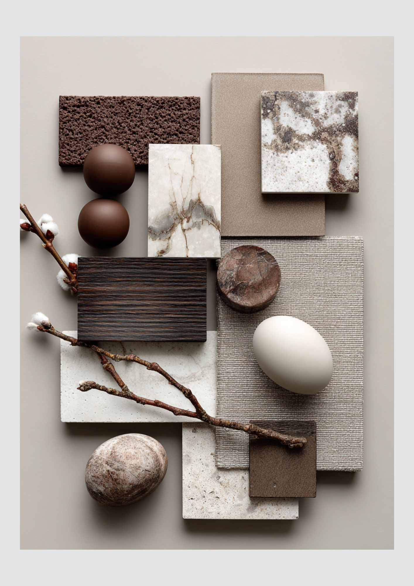
Mocha Mousse isn’t just "brown"; it’s a sensory experience. It evokes the warmth of a morning latte and the comfort of cacao. Unlike the flat chocolate browns of the early 2000s, this 2025 version has soft beige and plum undertones, making it feel airy rather than heavy. It is designed to foster tranquility, well-being, and "refined coziness."
How to Style It by Room
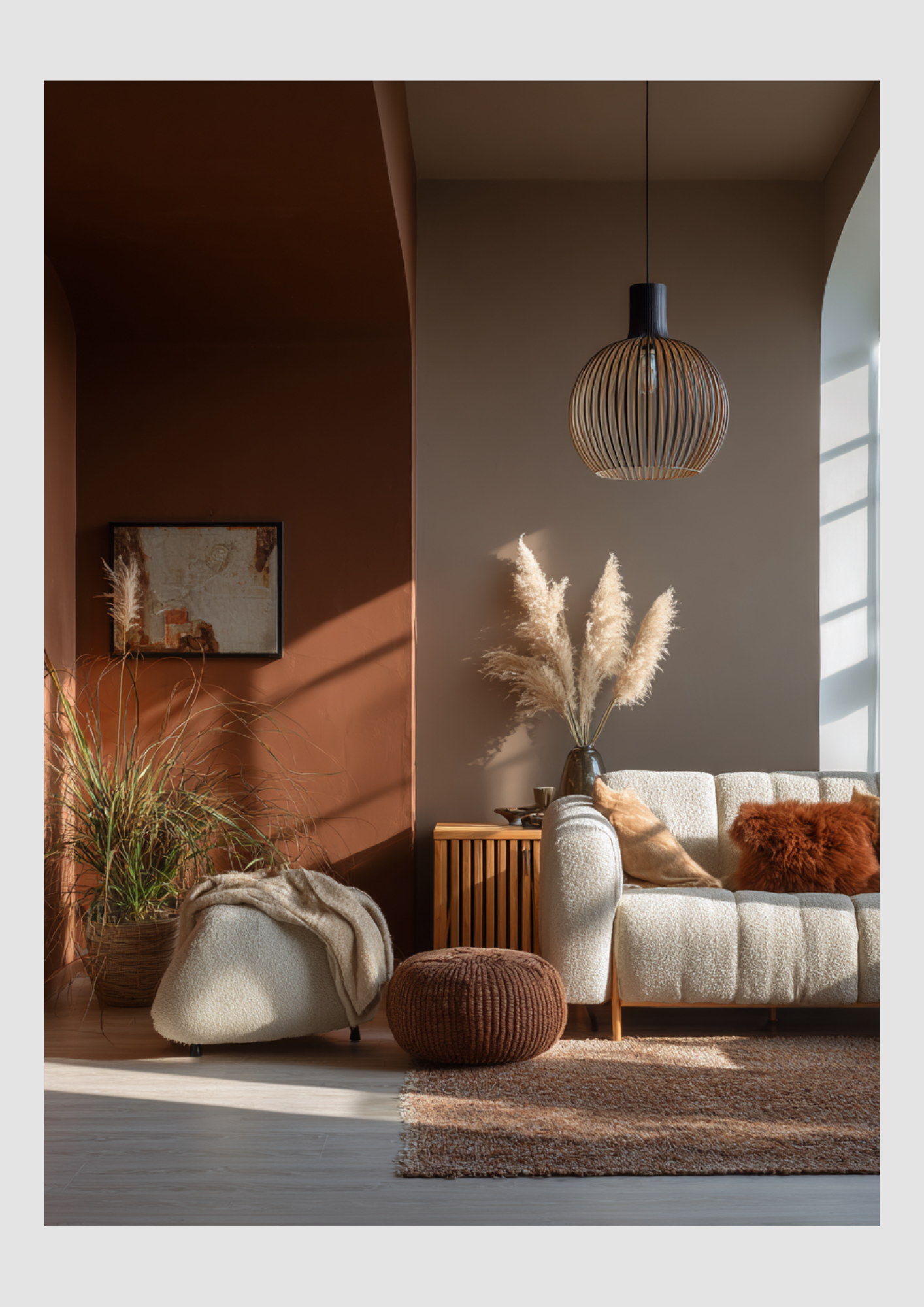
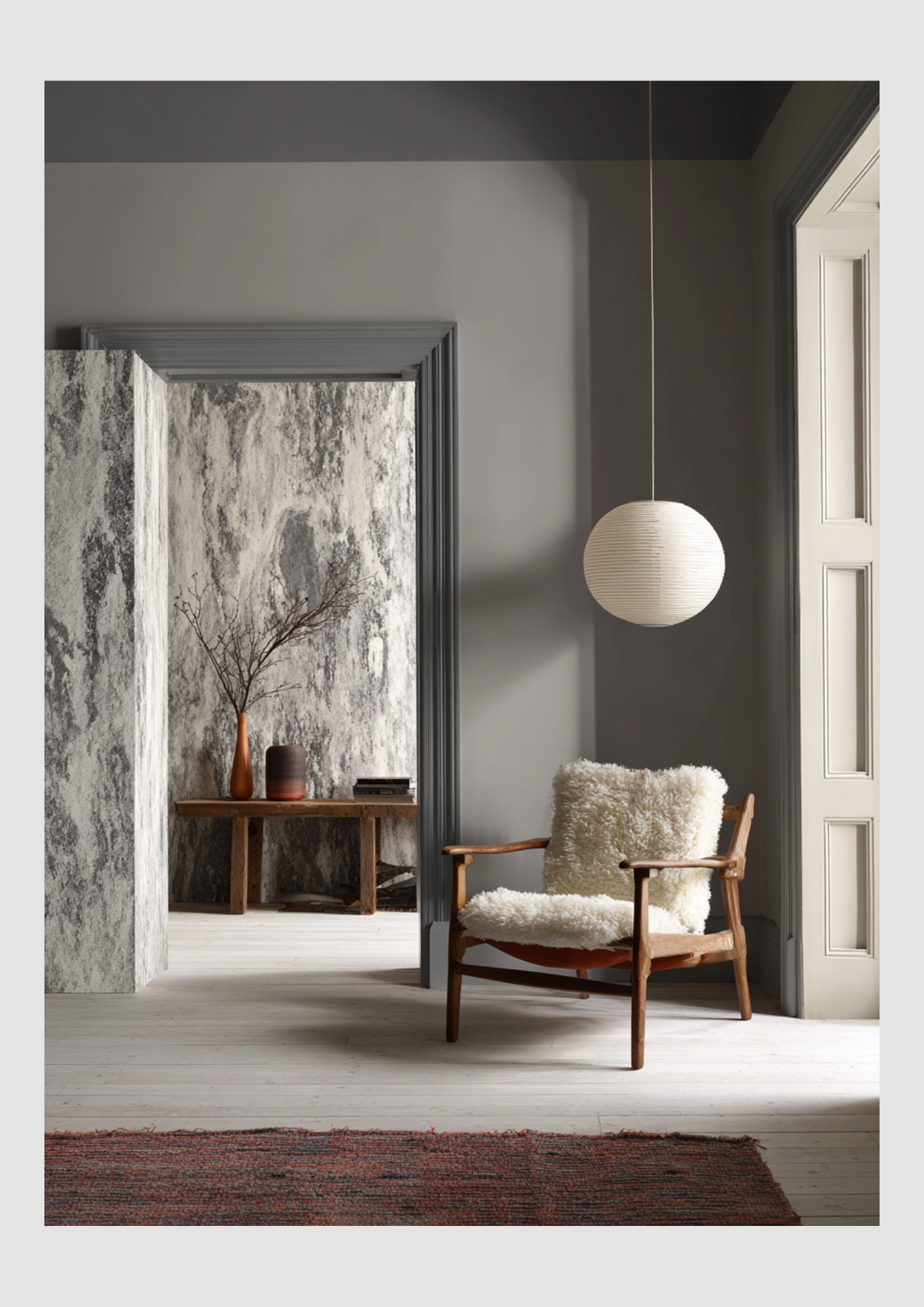
1. The Living Room: The "Cocoon" Effect
Color Drenching: For a bold, high-end look, paint the walls, trim, and even the ceiling in Mocha Mousse. This "enveloping" technique creates an intimate sanctuary.
The Anchor Piece: If painting is too much, a plush mocha velvet sofa serves as a timeless focal point that pairs beautifully with lighter oak coffee tables.
2. The Kitchen: Sophisticated Warmth
Cabinetry: Move over, white kitchens. Mocha Mousse cabinets paired with gold or brass hardware create a "bakery-chic" vibe.
Backsplashes: Use handmade zellige tiles in this shade to add texture and catch the light, avoiding the sterile look of traditional subway tiles.
3. The Bedroom: The Ultimate Retreat
Textiles: Layer textures to keep the brown from looking flat. Combine linen bedding in Mocha Mousse with a chunky wool knit throw and silk accent pillows.
Lighting: Use warm-toned bulbs (2700K) to bring out the red and gold undertones in the paint, making the room glow at night.
Winning Color Combinations
Mocha Mousse is a "chameleon" that shifts depending on what you pair it with:
Palette Style: Natural/Grounded
Pairing Colors: Olive Green, Terracotta, Sage
Vibe: Organic, forest-like, and calm
Palette Style: Quiet Luxury
Pairing Colors: Creamy Beige, Soft White, Gold
Vibe: Minimalist, expensive, and airy
Palette Style: Modern Contrast
Pairing Colors: Powder Blue, Slate Gray, Charcoal
Vibe: Crisp, sophisticated, and cool-toned
Palette Style: Jewel Toned
Pairing Colors: Burgundy, Navy, Emerald
Vibe: Moody, dramatic, and opulent
Pro-Tips for 2025
Skip the Chrome: The cool, clinical look of chrome can clash with the warmth of Mocha Mousse. Stick to brass, bronze, or matte black fixtures.
Add "Living" Accents: Darker browns can sometimes feel stagnant. Bring the space to life with large-leaf greenery (like a Fiddle Leaf Fig) to provide a vibrant, natural contrast.
Start Small: If you're color-shy, introduce the trend through amber glassware, ceramic vases, or a statement area rug to anchor your existing neutral furniture.
Cloud Dancer
Here is your guide to styling 2026’s most influential "non-color."
The Mood: Why Cloud Dancer?
Cloud Dancer isn’t just white; it’s an emotional neutral. Described by Pantone as a "whisper of calm in a noisy world," it addresses the collective desire for simplification and a break from digital overstimulation.
Undertone:
It features a delicate balance of cool and warm, giving it a luminous, "airy" quality that avoids the clinical sterility of traditional optical whites.
The Vibe:
Minimalist, nostalgic, and deeply restorative.
2026 Design Applications
1. The "Visual Pause" in Living Spaces
In 2026, Cloud Dancer is used to create expansive visual silence.
Color Drenching: Designers are using it on walls, ceilings, and built-in shelving to make rooms feel larger and more light-filled.
Texture Over Tone: Because the color is subtle, the focus shifts to touch. Think bouclé sofas, hand-knotted wool rugs, and clay plaster walls all in this same shade. The variation in shadows provides the "color."
2. Human-Centric Offices & Kitchens
Workspaces: Used to reduce "cognitive fatigue," Cloud Dancer is the go-to for home offices to encourage deep focus.
Kitchens: Move away from high-contrast black-and-white. Pair Cloud Dancer cabinets with honed travertine or light ash wood for a "quiet luxury" aesthetic that feels lived-in and soft.
3. Sculptural Lighting
This shade is trending heavily in lighting design. Matte ceramic pendants and frosted glass fixtures in Cloud Dancer diffuse light softly, creating a glow that enhances the room’s serenity rather than creating harsh highlights.
2026 Official Palettes
Pantone has released several "Horizon" palettes for Cloud Dancer. Here are the most popular for interiors:
Palette: Powdered Pastels
Pairing Colors: Lemon Icing, Ice Melt, Pink Raindrops
Interior Style: Modern Whimsy: Soft, airy, and youthful.
Palette: Atmospheric
Pairing Colors: Alaskan Blue, Cosmic Sky, Aqua Gray
Interior Style: Coastal Minimalist: Moody, cool, and oceanic
Palette: Take a Break
Pairing Colors: Caramel, Iced Coffee, Tea (Green)
Interior Style: Japandi: Earthy, organic, and grounded
Palette: Light & Shadow
Pairing Colors: Baltic Sea, Hematite, Quiet Violet
Interior Style: High-End Contemporary: Dramatic and architectural
Essential Styling Tips
Layer the Whites: Don’t be afraid to mix Cloud Dancer with other off-whites like cream, oyster, or chalk. This prevents the room from looking flat.
Pair with Natural Materials: This color was designed to highlight craftsmanship. It looks best against raw oak, unpolished stone, and linen.
The Lighting Factor: * Warm Bulbs (2700K): Bring out the creaminess and make it feel cozy.
Cool/Natural Light: Reveals its architectural, "clean" side.
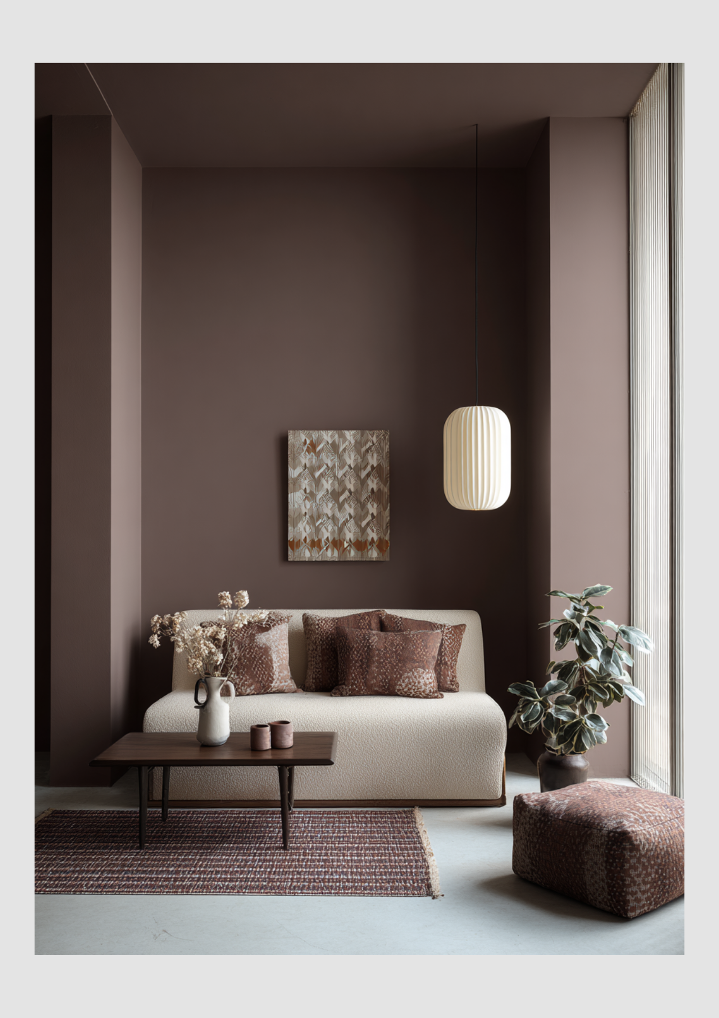
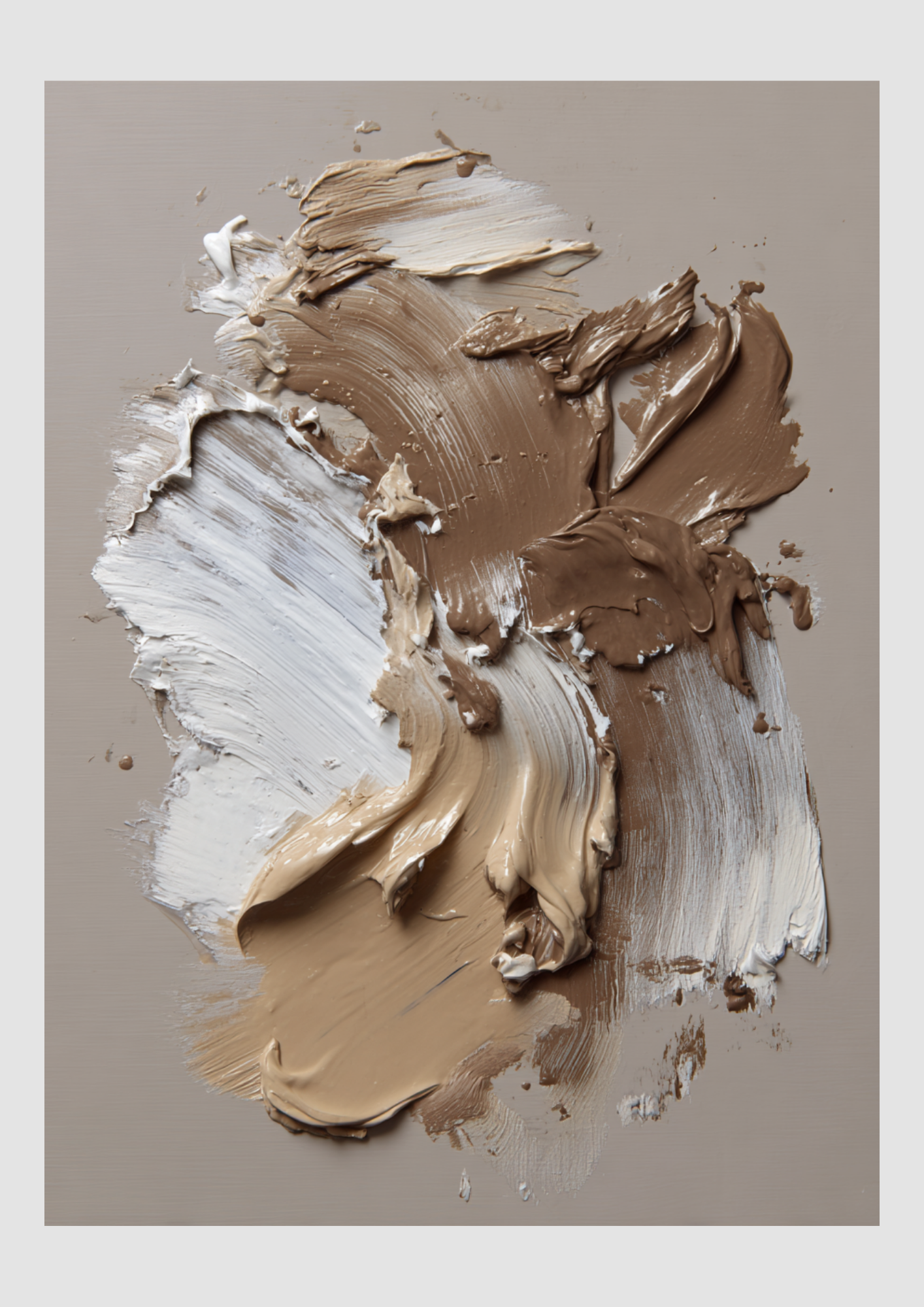
The Palette: Earth Meets Air
The magic of this duo lies in the balance of visual weight. Mocha Mousse provides the "roots" of the room, while Cloud Dancer provides the "sky."
Mocha Mousse (PANTONE 17-1230): A warm, mid-tone brown with a hint of peach/pink. It's the color of a perfect latte or high-end suede.
Cloud Dancer (PANTONE 11-4201): A creamy, non-sterile white that feels billowy and light. It’s softer than a standard gallery white, making it feel organic rather than clinical.
How to Layer Them in Your Home
1. The "70/30" Rule
To keep the room from feeling too heavy or too washed out, use Cloud Dancer as your canvas (70%) and Mocha Mousse as your anchor (30%).
The Walls: Paint your main living areas in Cloud Dancer. It reflects light beautifully and makes the space feel expansive.
The Furniture: Introduce a large statement piece, like a velvet sofa or a set of leather dining chairs, in Mocha Mousse. The contrast makes the furniture look like a piece of art against the soft white background.
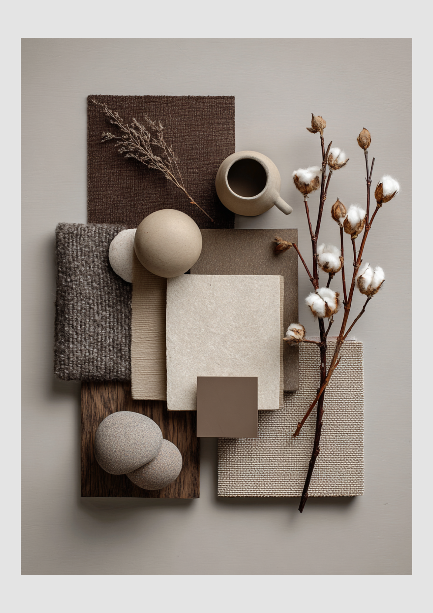
2. Texture is Non-Negotiable
Since this is a neutral palette, the "flatness" of the colors needs to be broken up by tactile materials.
Pair Cloud Dancer with: Bouclé fabrics, sheer linen curtains, and white-washed oak.
Pair Mocha Mousse with: Walnut wood, brushed bronze hardware, and chunky wool knits.
3. The "Third Color" Bridge
To make the transition between these two years of trends feel seamless, add a small amount of a "bridge" color:
Sage Green: Adds a biophilic, natural touch.
Pale Terracotta: Plays into the warmth of the mocha.
Matte Black: Adds a modern, architectural edge to the soft palette.
Room-by-Room Breakdown
Living Room
Strategy: Cloud Dancer walls + Mocha Mousse area rug + brass accents.
Result: Sophisticated & Expansive
Bedroom
Strategy: Mocha Mousse bedding + Cloud Dancer sheer drapes + warm wood.
Result: Cozy & Sanctuary-like
Kitchen
Strategy: Cloud Dancer cabinetry + Mocha Mousse stone backsplashes.
Result: Modern & Appetizing
