Beyond the Blank Canvas
Why White Interiors are the Ultimate Design Power Move
When you think of a white interior, do you see a sterile gallery or a serene sanctuary? In the world of interior design, white is the most misunderstood "color" in the palette. It isn’t the absence of design; it is a deliberate choice that prioritizes light, space, and timeless elegance.
Whether you are renovating a canal house or styling a modern apartment, here is why white is your best friend and how to make it work for your home.
1. The Psychology: Why White Works
White has a profound impact on how we feel within our four walls. It represents clarity, freshness, and simplicity.
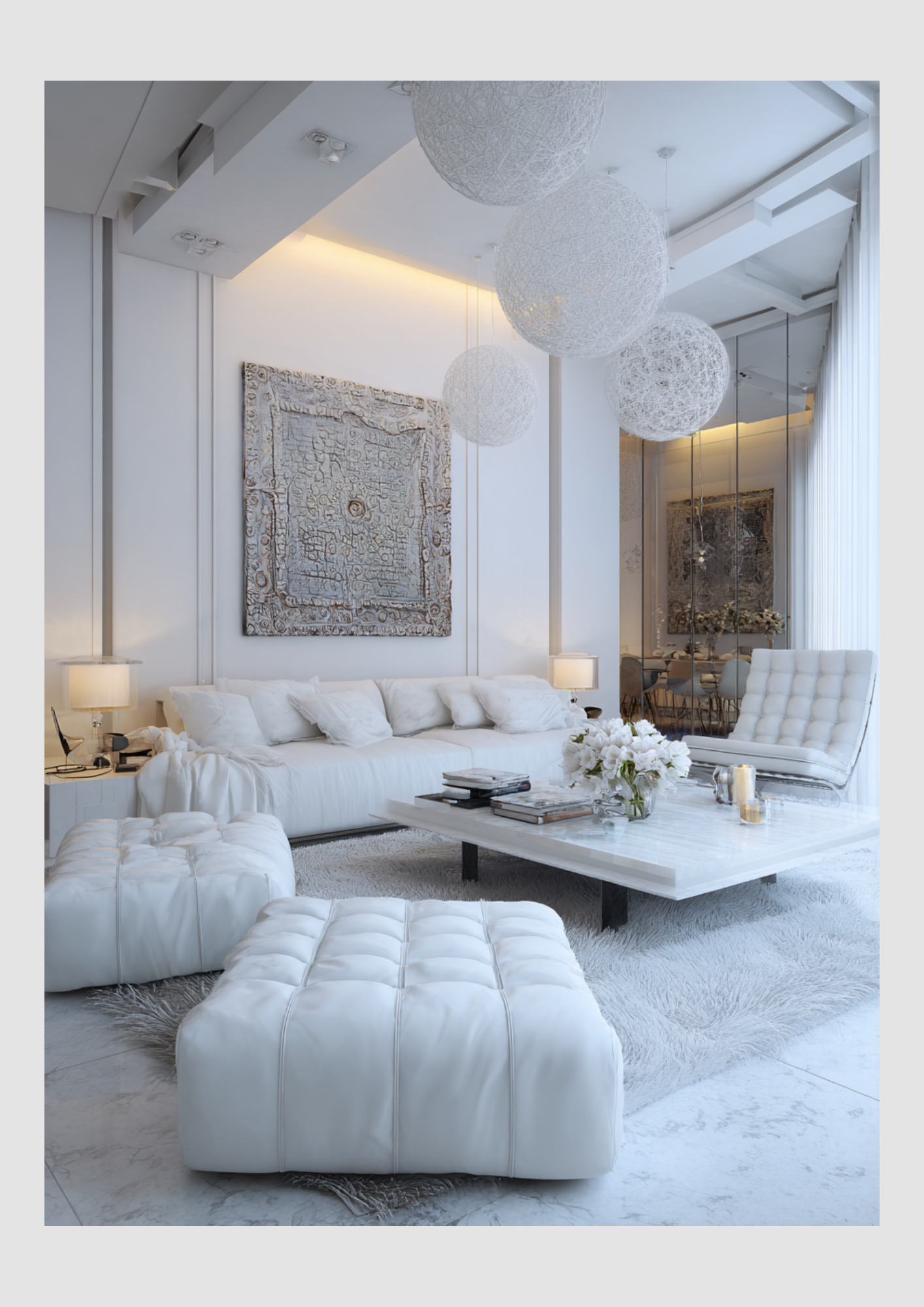
The Illusion of Space: White walls push boundaries away. By reflecting the maximum amount of light, white "tricks" the eye into seeing more square footage than there actually is.
A Mental Reset: In an era of sensory overload, white provides a "visual silence" that lowers stress levels and allows your mind to rest.
The Ageless Aesthetic: While "Millennial Pink" or "Forest Green" might trend for a season, white never goes out of style. It’s an investment in longevity.
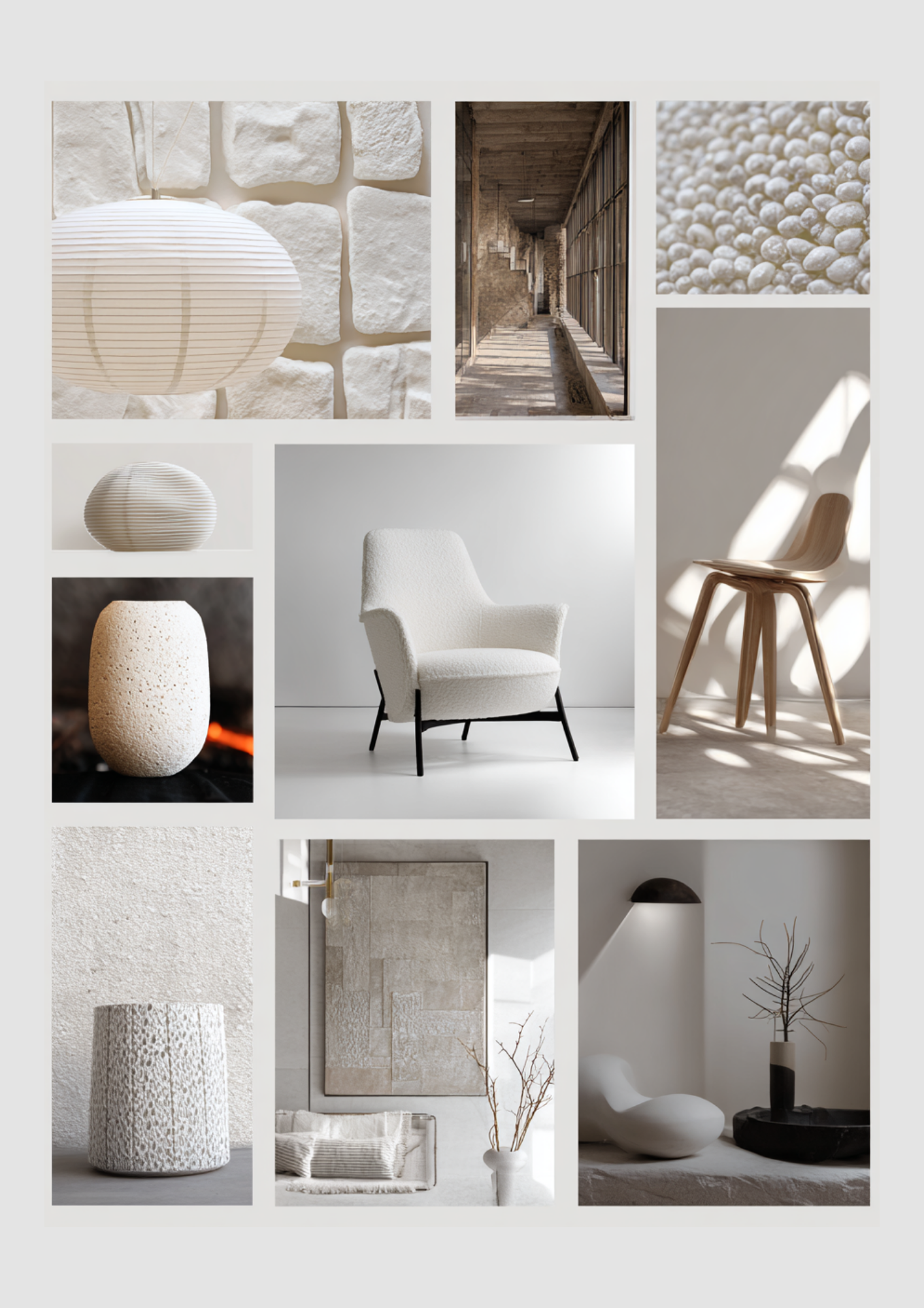
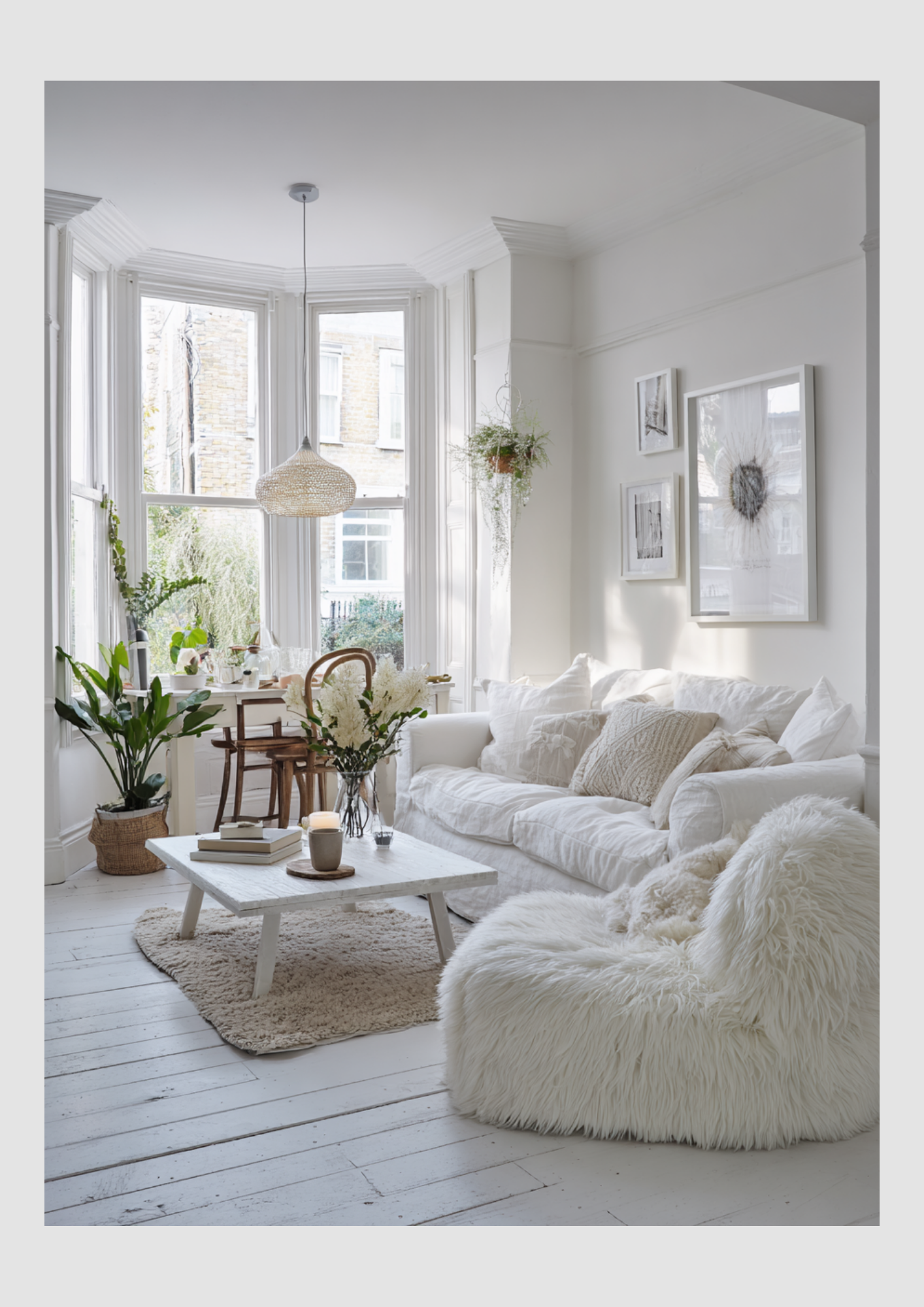
2. The Golden Rule: Texture is Non-Negotiable
The biggest mistake people make with white is keeping everything smooth. A flat white room feels like a hospital. To make it feel like a home, you must layer your textures.
Designer Tip: If the color palette is limited, the "feel" of the materials must be diverse. Think a chunky wool throw over a smooth linen sofa, paired with a reclaimed wood coffee table and a jute rug.
3. Sophisticated Color Pairings
White is the ultimate chameleon. Depending on what you pair it with, you can completely shift the energy of the room.
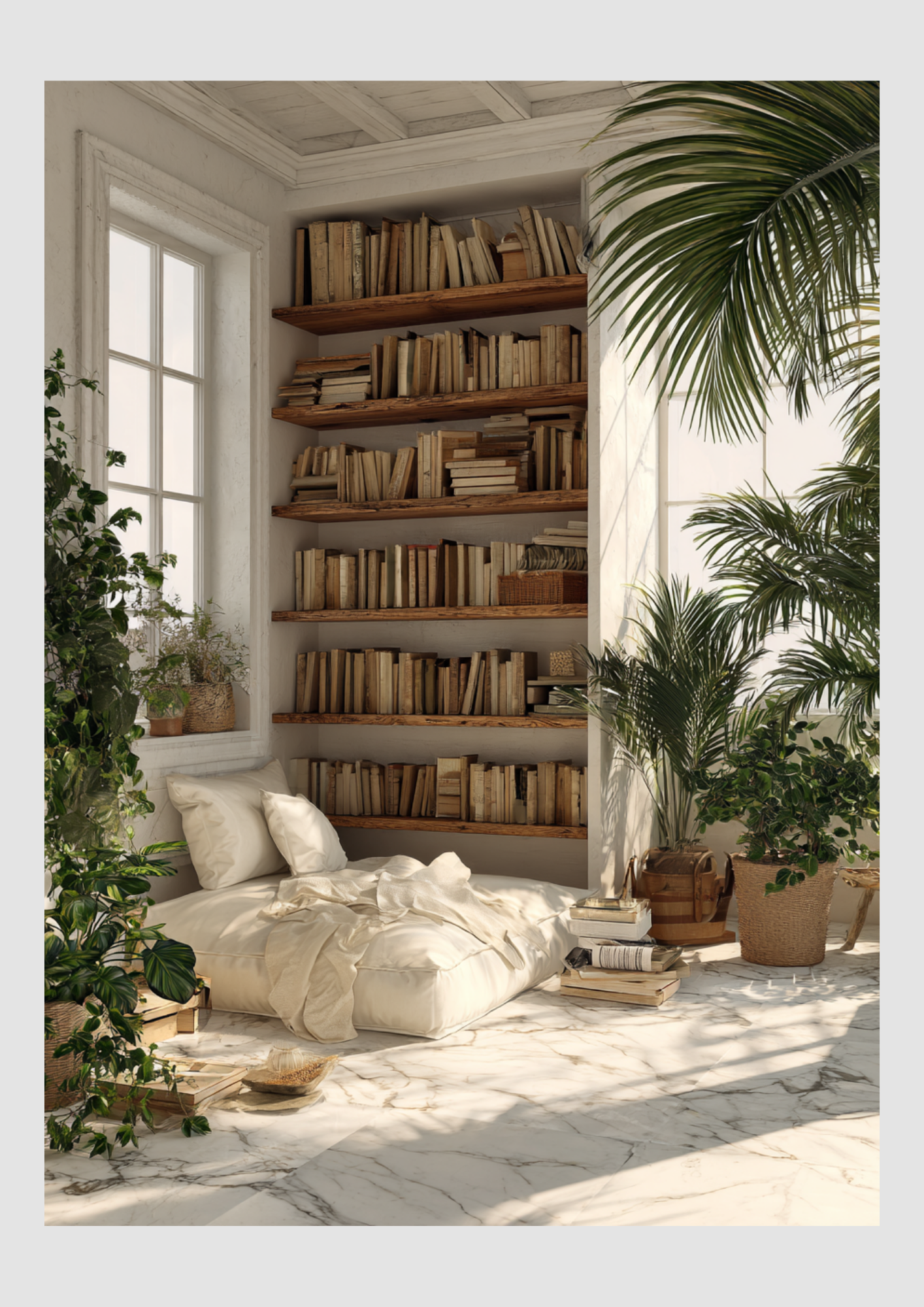
The Organic Modernist (White + Earth Tones)
Combine crisp white walls with terracotta, sand, and olive green. This palette feels grounded and warm. It’s perfect for those who want a "boho-chic" or Mediterranean vibe.
The High-Contrast Minimalist (White + Black/Charcoal)
This is for the bold. Use white as your base and introduce matte black hardware, light fixtures, or window frames. It’s sharp, sophisticated, and incredibly architectural.
The Serene Scandi (White + Light Woods)
Pairing white with ash, oak, or pine creates that iconic Scandinavian warmth (Hygge). It’s soft, approachable, and works beautifully in kitchens and dining areas.
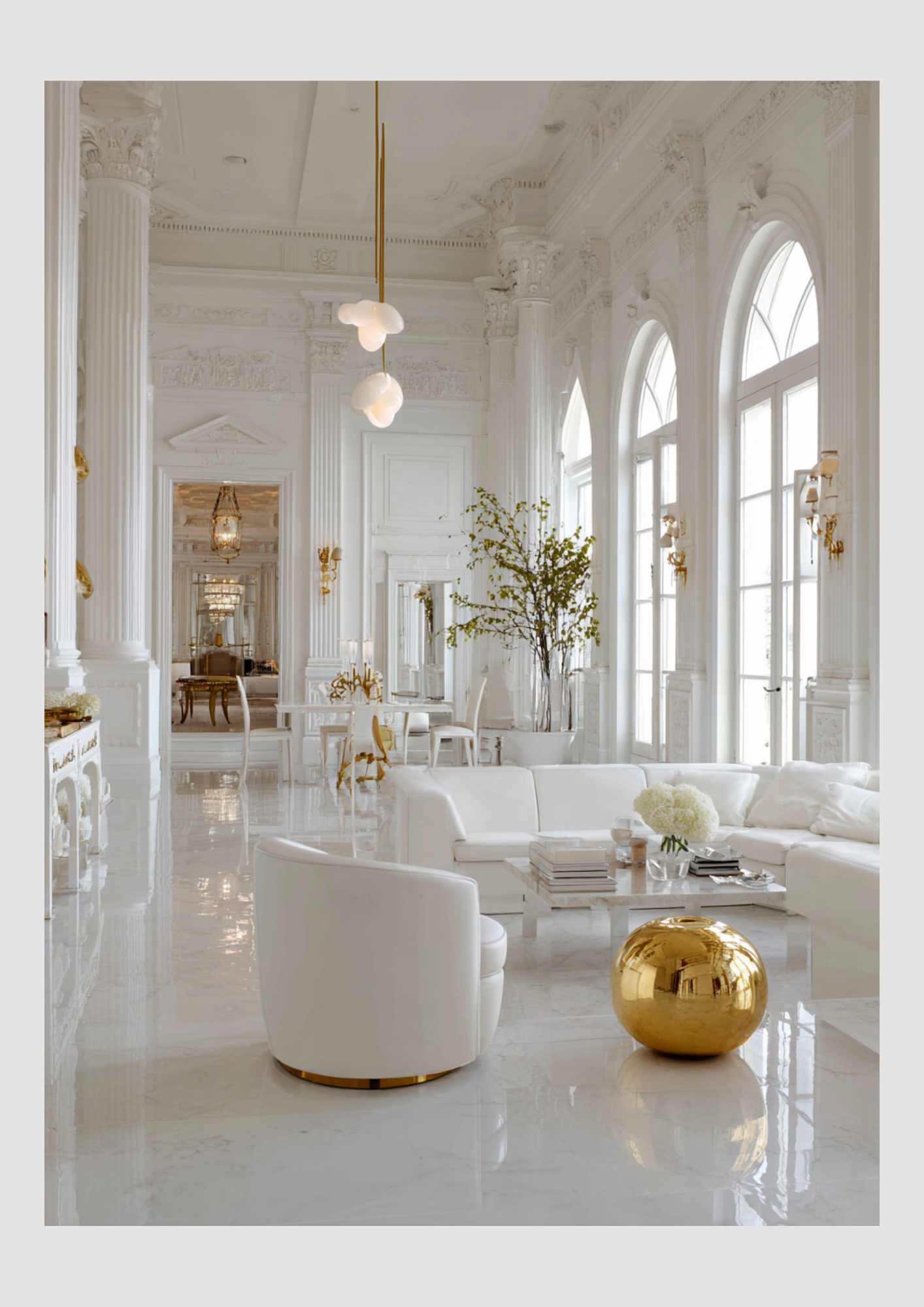
The Quiet Luxury (White + Champagne & Gold)
For a more "high-end" feel, mix different shades of white (cream, ivory, pearl) with brushed brass or gold accents. This creates a layered, monochromatic look that screams luxury without being loud.
4. Choosing the Right White
Before you head to the paint store, remember that there are thousands of "whites."
Cool Whites (Blue/Grey undertones): Best for modern spaces with lots of artificial light or south-facing rooms that get warm, yellow sunlight.
Warm Whites (Yellow/Red undertones): Best for north-facing rooms that can feel a bit "blue" or chilly. These add an instant glow.
Final Thought
A white interior isn't about hiding your personality; it's about giving your personality a stage to shine on. Your colorful books, your green plants, and your family photos will never look better than they do against a clean, white backdrop.
