Case Study: Rowen & Wren
Marrying Quiet Luxury Aesthetics with Frictionless Mobile E-Commerce
An independent UX/UI exploration into removing conversion barriers for premium, design-conscious homeware brands.
The Challenge & Strategy
The Brief
Rowen & Wren is a masterclass in curated British homeware, celebrated for its muted tones and understated elegance. However, highly minimalist aesthetics can occasionally introduce friction into the digital transactional journey.
The objective of this project was to optimize the "Purchase a Single Item via Guest Checkout" task flow—transforming user anxiety and multi-page drop-offs into a seamless, elegant, and intuitive mobile pipeline.
The Target Consumer
To guide the architectural choices, the redesign targets Chris: a busy, style-conscious consumer with a deep appreciation for high-quality goods but an exceptionally low tolerance for digital friction. Chris browses during short breaks and expects single-tap checkout methods over tedious account-creation forms.
The Design System

Visual Foundations & Accessibility
To elevate both readability and brand alignment, a high-contrast visual framework was established independently for this study:
Typography: The pairing of an elegant serif (Libre Baskerville) for editorial headers and a highly legible sans-serif (Inter) for functional data maintains heritage prestige while ensuring maximum layout clarity.
The Palette: A tailored interactive color system ensures that key actions stand out instantly, bridging the gap between organic brand tones and conversion-driven interface design.
The Interactive Flow
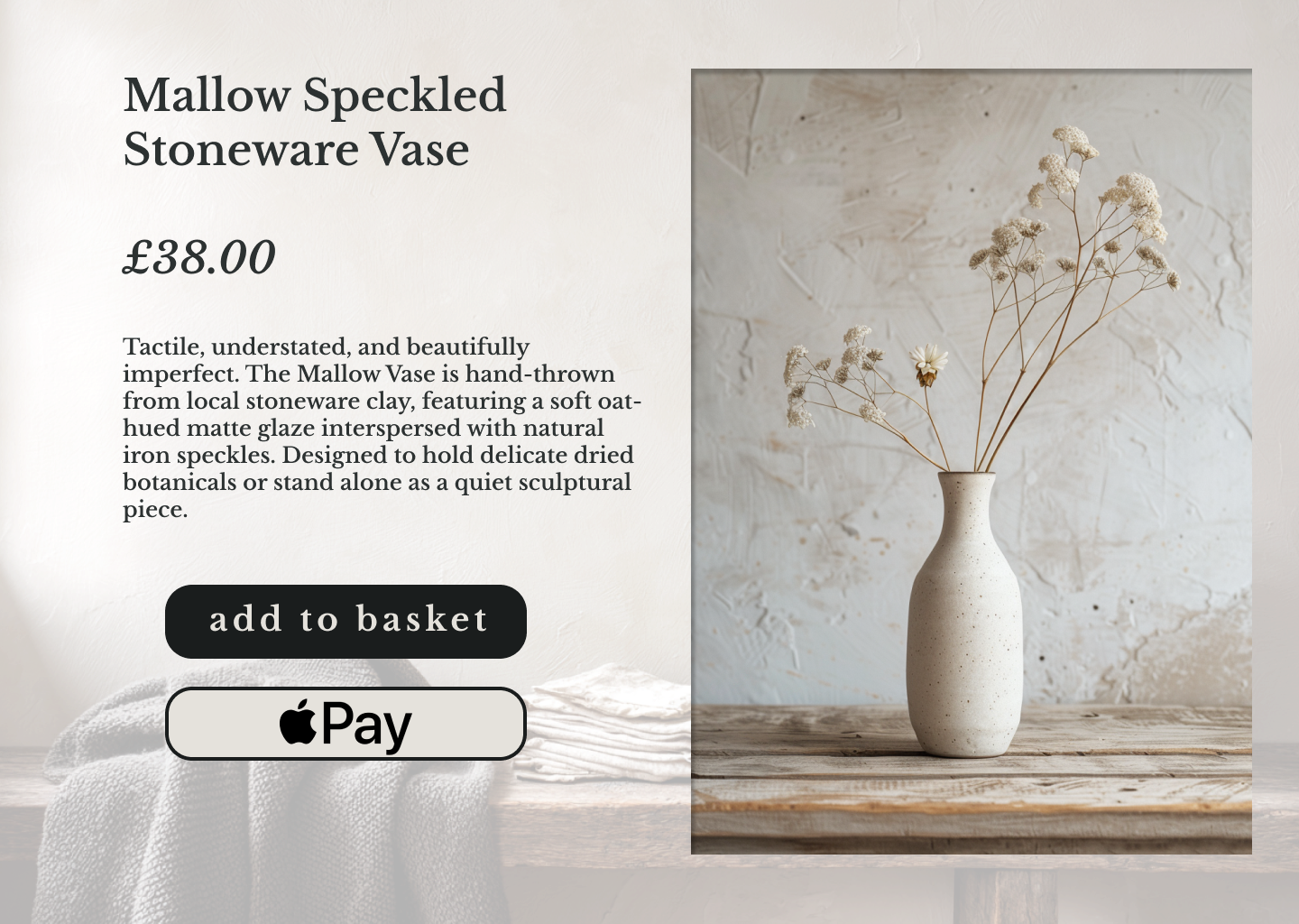
Optimizing First Impressions The product discovery layout is restructured to introduce clear pricing transparency without breaking visual elegance. By clothing the primary call-to-action in high-contrast Crisp Charcoal, the interface guides the user's hand instantly, while an integrated biometric bypass allows for one-click alternative checkout paths.
02 / The Express Cart Overlay
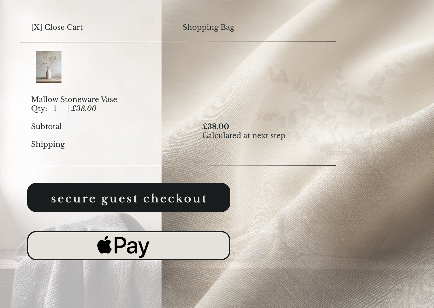
Context-Preserving Transitions Clicking "Add to Basket" triggers a tactile, right-sided slide-out cart overlay. This slide drawer preserves the user's shopping context through a beautiful textile split-view. By mapping out clear, transparent subtotals and upfront shipping expectations, it effectively mitigates pre-checkout anxiety.
03 / The Single-Page Accordion Checkout
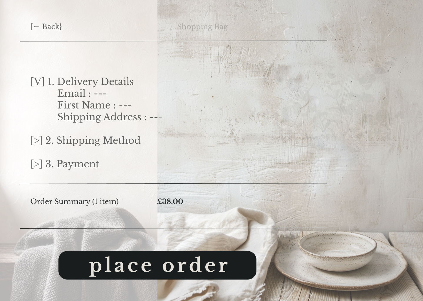
Eliminating Form Abandonment Traditional multi-page checkout check-points are entirely consolidated into a streamlined, single-page accordion pipeline. Utilizing progressive disclosure, the interface shields the user from cognitive overload by focusing strictly on active input fields, culminating in a commanding, friction-free final order placement.
The Outcome & Closing
Key Solutions Delivered:
Strategic UI Scalability: High-contrast typography and structured color blocks built for accessible touch targets.
Frictionless Cart Interaction: Context-aware overlays that protect the emotional connection to the brand.
Linear Checkout Pipeline: A progressive disclosure funnel that tunnels focus entirely toward single-page transaction completion.
Looking to elevate your brand’s digital experience?
Let’s collaborate to build interfaces that feel premium and convert seamlessly.